标签:
请把鼠标移动到右侧的元素上:
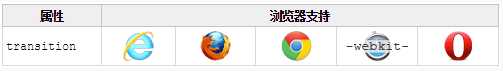
Internet Explorer 10、Firefox、Chrome 以及 Opera 支持 transition 属性。
Safari 需要前缀 -webkit-。
注释:Internet Explorer 9 以及更早的版本,不支持 transition 属性。
注释:Chrome 25 以及更早的版本,需要前缀 -webkit-。
CSS3 过渡是元素从一种样式逐渐改变为另一种的效果。
要实现这一点,必须规定两项内容:
应用于宽度属性的过渡效果,时长为 2 秒:
注释:如果时长未规定,则不会有过渡效果,因为默认值是 0。
效果开始于指定的 CSS 属性改变值时。CSS 属性改变的典型时间是鼠标指针位于元素上时:
规定当鼠标指针悬浮于
注释:当指针移出元素时,它会逐渐变回原来的样式。
如需向多个样式添加过渡效果,请添加多个属性,由逗号隔开:
向宽度、高度和转换添加过渡效果:
| 属性 | 描述 | CSS |
|---|---|---|
| transition | 简写属性,用于在一个属性中设置四个过渡属性。 | 3 |
| transition-property | 规定应用过渡的 CSS 属性的名称。 | 3 |
| transition-duration | 定义过渡效果花费的时间。默认是 0。 | 3 |
| transition-timing-function | 规定过渡效果的时间曲线。默认是 "ease"。 | 3 |
| transition-delay | 规定过渡效果何时开始。默认是 0。 | 3 |
下面的两个例子设置所有过渡属性:
在一个例子中使用所有过渡属性:
与上面的例子相同的过渡效果,但是使用了简写的 transition 属性:
例子:
<!DOCTYPE HTML>
<html>
<head>
</head>
<body>
<p class="animated_div">CSS3 过渡</p>
</body>
</html>
.animated_div
{
width:65px;
height:40px;
background:#92B901;
color:#ffffff;
position:absolute;
font-weight:bold;
font:12px "微软雅黑", Verdana, Arial, Helvetica, sans-serif;
padding:20px 10px 0px 10px;
float:left;
margin:5px;
-webkit-transition:-webkit-transform 1s,opacity 1s,background 1s,width 1s,height 1s,font-size 1s;
-webkit-border-radius:5px;
-o-transition-property:width,height,-o-transform,background,font-size,opacity;
-o-transition-duration:1s,1s,1s,1s,1s,1s;
-moz-transition-property:width,height,-o-transform,background,font-size,opacity;
-moz-transition-duration:1s,1s,1s,1s,1s,1s;
transition-property:width,height,transform,background,font-size,opacity;
transition-duration:1s,1s,1s,1s,1s,1s;
border-radius:5px;
opacity:0.4;
}
.animated_div:hover
{
-moz-transform: rotate(360deg);
-webkit-transform: rotate(360deg);
-o-transform: rotate(360deg);
transform: rotate(360deg);
opacity:1;
background:#1ec7e6;
width:90px;
height:60px;
font-size:16px;
}

标签:
原文地址:http://www.cnblogs.com/qiuzhimutou/p/4766444.html