标签:
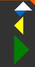
<div class="arrow-up">
     <!--向上的三角-->
</div>
<div class="arrow-down">
    <!--向下的三角-->
</div>
<div class="arrow-left">
    <!--向左的三角-->
</div>
<div class="arrow-right">
    <!--向右的三角-->
</div>
/*箭头向上*/
.arrow-up {
    width:0;
    height:0;
    border-left:30px solid transparent;
    border-right:30px solid transparent;
    border-bottom:30px solid #fff;
}

 /*箭头向下*/
.arrow-down {
    width:0;
    height:0;
    border-left:20px solid transparent;
    border-right:20px solid transparent;
    border-top:20px solid #0066cc;
}

 /*箭头向左*/
.arrow-left {
    width:0;
    height:0;
    border-top:30px solid transparent;
    border-bottom:30px solid transparent;
    border-right:30px solid yellow;
}

/*箭头向右*/
.arrow-right {
    width:0;
    height:0;
    border-top:50px solid transparent;
    border-bottom: 50px solid transparent;
    border-left: 50px solid green;
}
样式预览
标签:
原文地址:http://www.cnblogs.com/jingyong001/p/4779494.html