标签:
语法:
columns: column-width column-count;
column-width 列的宽度。
column-count 列数。
浏览器兼容:
Internet Explorer 10 和 Opera 支持 column 属性。
Firefox 支持替代的 -moz-column 属性。
Safari 和 Chrome 支持替代的 -webkit-column 属性。
例如以下代码:
<!DOCTYPE html>
<html>
<head lang="en">
<meta charset="UTF-8">
<title></title>
<style>
p{margin:0;padding:5px 10px;background:#eee;}
h1{margin:10px 0;font-size:16px;}
.test1{
width:628px;
border:10px solid #000;
-moz-columns:100px 4;
-webkit-columns:100px 4;
columns:100px 4;
}
.test2{
border:10px solid #000;
-moz-columns:400px;
-webkit-columns:400px;
columns:400px;
}
</style>
</head>
<body>
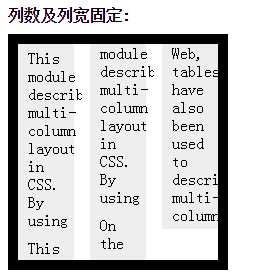
<h1>列数及列宽固定:</h1>
<div class="test1">
<p>This module describes multi-column layout in CSS. By using functionality described in this document, style sheets laid out in multiple columns. </p>
<p>This module describes multi-column layout in CSS. By using functionality described in this document, style sheets laid out in multiple columns. </p>
<p>On the Web, tables have also been used to describe multi-column layouts. The main benefit of usingn to another on various output devices including speech</p>
<p>On the Web, tables have also been used to describe multi-column layouts. The main benefit of usingn to another on various output devices including speech synthesizers and small mobile devices.</p>
</div>
<h1>列宽固定,根据内容自动分布列数:</h1>
<div class="test2">
<p>This module describes multi-column layout in CSS. By using functionality described in this document, style sheets can declare that the content of an element is to be laid out in multiple columns. </p>
<p>On the Web, tables have also been used to describe multi-column layouts. The main benefit of using CSS-based columns is flexibility; content can flow from one column to another, and the number of columns can vary depending on the size of the viewport. Removing presentation table markup from documents allows them to more easily be presented on various output devices including speech synthesizers and small mobile devices.</p>
</div>
</body>
</html>
第一个div:
标签:
原文地址:http://www.cnblogs.com/yttbbd/p/4842878.html