标签:
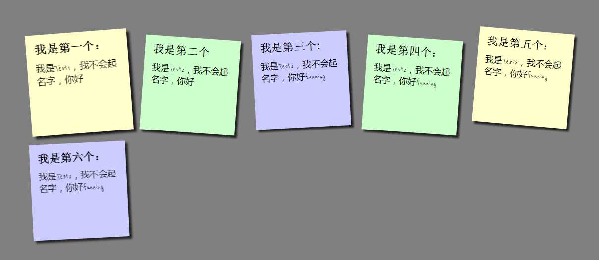
Html代码如下:
<!DOCTYPE html>
<html xmlns="http://www.w3.org/1999/xhtml">
<head>
    <meta http-equiv="Content-Type" content="text/html; charset=utf-8" />
    <link href="http://fonts.googleapis.com/css?family=Reenie+Beanie:regular" rel="stylesheet" type="text/css">
    <link rel="stylesheet" href="css/css1.css" type="text/css" />
    <title></title>
</head>
<body>
    <ul>
        <li>
            <a href="">
                <h2>我是第一个:</h2>
                <p>我是Test1,我不会起名字,你好</p>
            </a>
        </li>
        <li>
            <a href="">
                <h2>我是第二个</h2>
                <p>我是Test2,我不会起名字,你好</p>
            </a>
        </li>
        <li>
            <a href="">
                <h2>我是第三个:</h2>
                <p>我是Test2,我不会起名字,你好funning</p>
            </a>
        </li>
        <li>
            <a href="">
                <h2>我是第四个:</h2>
                <p>我是Test2,我不会起名字,你好funning</p>
            </a>
        </li>
        <li>
            <a href="#">
                <h2>我是第五个:</h2>
                <p>我是Test2,我不会起名字,你好funning</p>
            </a>
        </li>
        <li>
            <a href="#">
                <h2>我是第六个:</h2>
                <p>我是Test2,我不会起名字,你好funning</p>
            </a>
        </li>
    </ul>
</body>
</html>
CSS样式的代码:
* {
    margin: 0px;
    padding: 0px; /*设置全局的边距属性,都为0*/
}

body {
    font-family:Arial,sans-serif;   /*设置整体文章的字体*/
    font-size:100%;         /*字体大小,默认是100%,设置字体为百分比,可以在移动设备上,自动缩小文字大小*/
     background: #808080;    /*设置body的背景颜色为#808080,灰色*/
    margin:3em;             /*em表示可伸缩的字体,3em:3*文字大小*/
    color:#fff;             /*字体颜色,不包含超链接字体颜色*/
}
ul {
    overflow: hidden;       /*超出ul范围,因此内容*/
    padding: 3em;           /*调整ul的位置,使标签能够靠近中央显示,*/
}
ul, li {
    list-style: none;   /*去掉列表前的符号*/
    float: left;        /*设置为想左浮动,这样就可以把列表设置为*/
    margin:1em;             /*设置外边距为1em*/
}

    ul li h2 {
        font-size: 140%;    /*设置字体大小是当前大小的140%*/
        font-weight: bold;  /*字体宽度为粗体*/
        padding-bottom: 10px;/*底边内边距为10像素*/

    }

    ul li p {
        font-family: "Reenie Beanie",Arial sans-serif,微软雅黑;/*设置字体*/
        font-size: 110%;            /*大小为当前的110%*/
    }

    ul li a {
        display: block;                 /*将超链接转换为块*/
        width: 10em;                    /*宽度为10em*/
        height: 10em;                   /*高度为10em*/
        background: #ffc;
        text-decoration: none;          /*去掉超链接的下划线*/
        color: #000;                    /*字体颜色为黑色*/
                padding: 1em;              /*内边距为1em*/
        -moz-box-shadow:5px 5px 7px rgb(33,33,33,1);/*用于Firefox浏览器,给a超链接加阴影,x轴的偏移量为5像素,y轴的偏移量为7像素,rgb为颜色的一种写法(33,33,33)为颜色值,后面的1表示不透明*/
         -webkit-box-shadow: 5px 5px 7px rgba(33,33,33,7);/*Chrome,Safari浏览器*/
         box-shadow:5px 5px 5px rgba(33,33,33,7);
         -webkit-transform:rotate(-6deg);/*将a标签所转成的块,向左偏移6度*  transform:rotate()——旋转,scale()——放大,skew()倾斜,translate()——变动,位移,/
         -o-transform:rotate(-6deg);
         -moz-transform:rotate(-6deg);
          -webkit-transition:1.5s linear;   /*CSS的transition允许CSS的属性值在一定的时间区间内平滑地过渡,transition:property(设置过度效果的css属性名称) dutation(过渡完成的时间) timing-function(速度效果的曲线) delay(定义效果如何开始)*/

    }
       ul li:nth-child(even) a {            /*选择器,根据even,选择当前文档选择器选择li下的a超链接标签,选择第2/4/6...的li标签*/
            -o-transform: rotate(4deg);     /*向右旋转4度*/
            -webkit-transform: rotate(4deg);
            -moz-transform: rotate(4deg);
            position: relative;             /*绝对定位,为标签当前位置,距上5像素*/
            top: 5px;
            background:#cfc;
        }

        ul li:nth-child(3n) a {
            -o-transform: rotate(-3deg);       /*选择倍数为3的a超链接*/
            -webkit-transform: rotate(-3deg);
            -moz-transform: rotate(-3deg);
            position: relative;
            top: -5px;                          /*向上5像素*/
            background:#ccf;
        }

        ul li:nth-child(5n) a {                 /*选择倍数为5的超链接*/
            -o-transform: rotate(5deg);
            -webkit-transform: rotate(5deg);
            -moz-transform: rotate(5deg);
            position: relative;
            top: -10px;                         /*向上10素*/
        }
        ul li a:hover, ul li a:focus {          /*当鼠标移动到a时或焦点在a时,触发以下效果*/
            -moz-box-shadow:10px 10px 7px rgba(0,0,0,7);        /*阴影的颜色和大小*/
            -webkit-box-shadow:10px 10px 7px rgba(0,0,0,7);
            box-shadow:10px 10px 7px rgba(0,0,0,7);
            -webkit-transform:scale(1.25);                      /*根据中心放大a标签,为1.25倍*/
            -moz-transform:scale(1.25);
            -o-transform:scale(1.25);
            position:relative;                                  /*绝对定位*/
            z-index:5;                                          /*设置z-index为5是为了让正方形在放大的时候盖住其它的正方形,同时因为也设置了focus,所以也支持Tab键切换访问*/

             }
标签:
原文地址:http://www.cnblogs.com/c150824/p/4888724.html