标签:
#均值:总和/长度
mean()
#中位数:将数列排序,若个数为奇数,取排好序数列中间的值.若个数为偶数,取排好序数列中间两个数的平均值
median()
#R语言中没有众数函数
#分位数
quantile(data):列出0%,25%,50%,75%,100%位置处的数据
#可自己设置百分比
quantile(data,probs=0.975)
#方差:衡量数据集里面任意数值与均值的平均偏离程度
var()
#标准差:
sd()
#直方图,binwidth表示区间宽度为1
ggplot(heights.weights, aes(x = Height)) +geom_histogram(binwidth = 1)
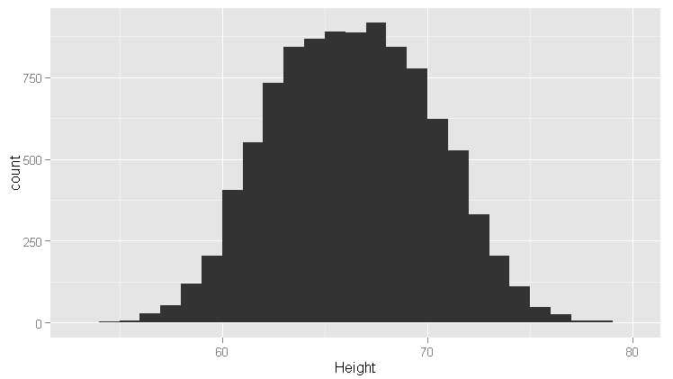
#发现上图是对称的,使用直方图时记住:区间宽度是强加给数据的一个外部结构,但是它却同时揭示了数据的内部结构
#把宽度改成5
ggplot(heights.weights, aes(x = Height)) +geom_histogram(binwidth = 5)
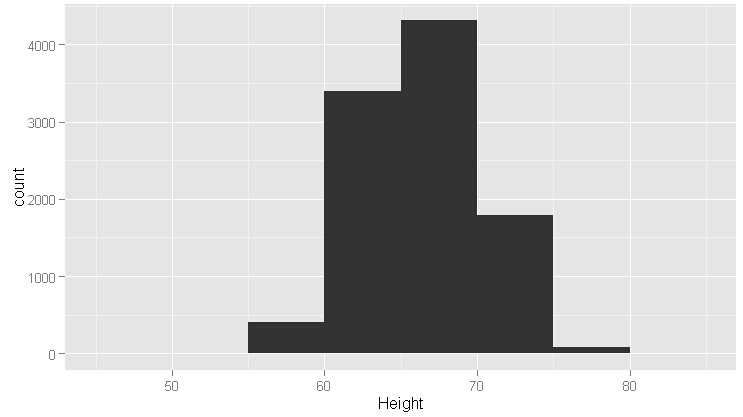
#从上图看,对称性不存在了,这叫过平滑,相反的情况叫欠平滑,如下图
ggplot(heights.weights, aes(x = Height)) +geom_histogram(binwidth = 0.01)
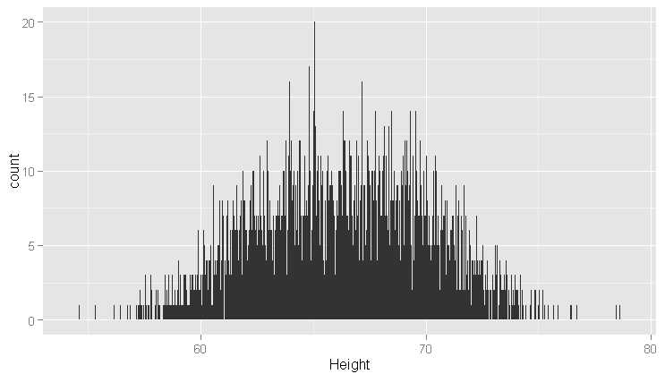
#因此合适的直方图需要调整宽度值.可以选择其他方式进行可视化,即密度曲线图
ggplot(heights.weights, aes(x = Height)) +geom_density()
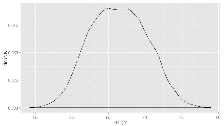
#如上图,峰值平坦,尝试按性别划分数据
ggplot(heights.weights, aes(x = Height, fill = Gender)) +geom_density()
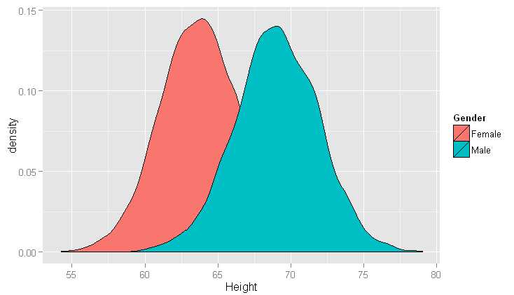
#混合模型,由两个标准分布混合而形成的一个非标准分布
#正态分布,钟形曲线或高斯分布
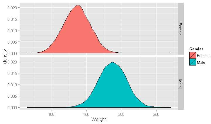
#按性别分片
ggplot(heights.weights, aes(x = Weight, fill = Gender)) +geom_density() +facet_grid(Gender ~ .)
#以下代码指定分布的均值和方差,m和s可以调整,只是移动中心或伸缩宽度
m <- 0
s <- 1
ggplot(data.frame(X = rnorm(100000, m, s)), aes(x = X)) +geom_density()
#构建出了密度曲线,众数在钟形的峰值处
#正态分布的众数同时也是均值和中位数
#只有一个众数叫单峰,两个叫双峰,两个以上叫多峰
#从一个定性划分分布有对称(symmetric)分布和偏态(skewed)分布
#对称(symmetric)分布:众数左右两边形状一样,比如正态分布
#这说明观察到小于众数的数据和大于众数的数据可能性是一样的.
#偏态(skewed)分布:说明在众数右侧观察到极值的可能性要大于其左侧,称为伽玛分布
#从另一个定性区别划分两类数据:窄尾分布(thin-tailed)和重尾分布(heavy-tailed)
#窄尾分布(thin-tailed)所产生的值通常都在均值附近,可能性有99%
#柯西分布(Cauchy distribution)大约只有90%的值落在三个标准差内,距离均值越远,分布特点越不同
#正态分布几乎不可能产生出距离均值有6个标准差的值,柯西分布有5%的可能性
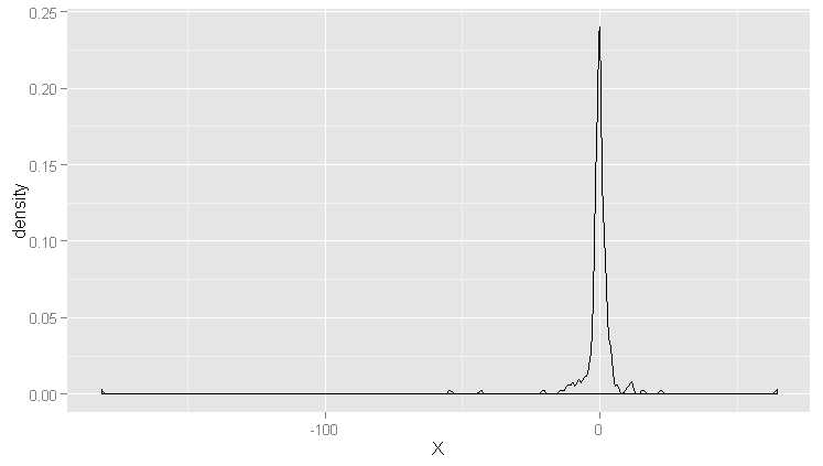
#产生正态分布及柯西分布随机数
set.seed(1)
normal.values <- rnorm(250, 0, 1)
cauchy.values <- rcauchy(250, 0, 1)
range(normal.values)
range(cauchy.values)
#画图
ggplot(data.frame(X = normal.values), aes(x = X)) +geom_density()
ggplot(data.frame(X = cauchy.values), aes(x = X)) +geom_density()
#正态分布:单峰,对称,钟形窄尾
#柯西分布:单峰,对称,钟形重尾
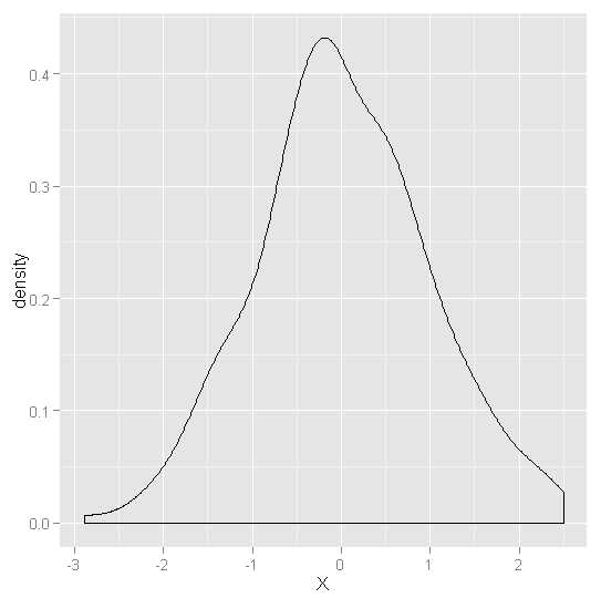
#产生gamma分布随机数
gamma.values <- rgamma(100000, 1, 0.001)
ggplot(data.frame(X = gamma.values), aes(x = X)) +geom_density()
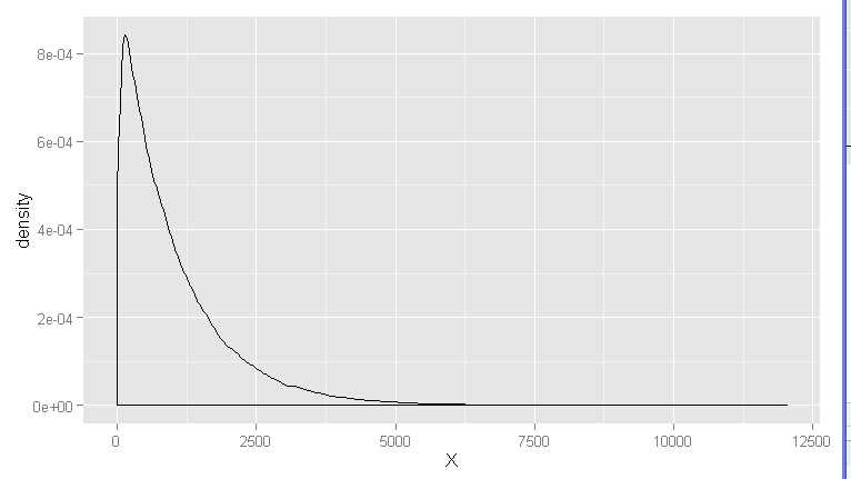
#游戏数据很多都符合伽玛分布
#伽玛分布只有正值
#指数分布:数据集中频数最高是0,并且只有非负值出现
#例如,企业呼叫中心常发现两次收到呼叫请求的间隔时间看上去符合指数分布
#散点图
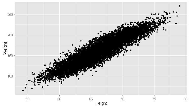
ggplot(heights.weights, aes(x = Height, y = Weight)) +geom_point()
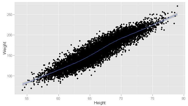
#加平滑模式
ggplot(heights.weights, aes(x = Height, y = Weight)) +geom_point() +geom_smooth()
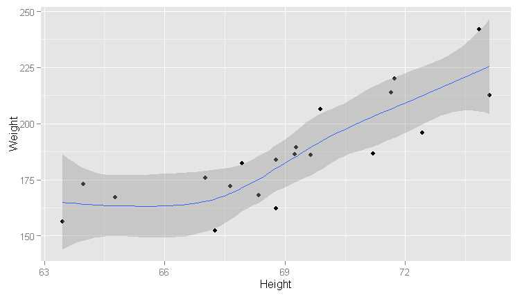
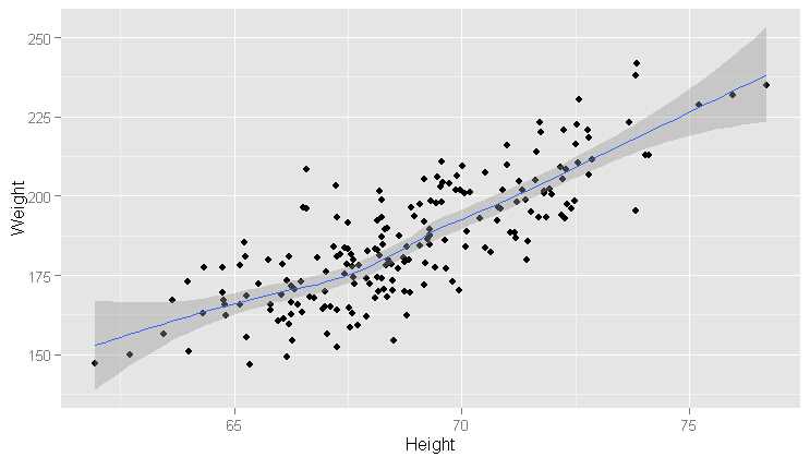
ggplot(heights.weights[1:20, ], aes(x = Height, y = Weight)) +geom_point() +geom_smooth()
ggplot(heights.weights[1:200, ], aes(x = Height, y = Weight)) +geom_point() +geom_smooth()
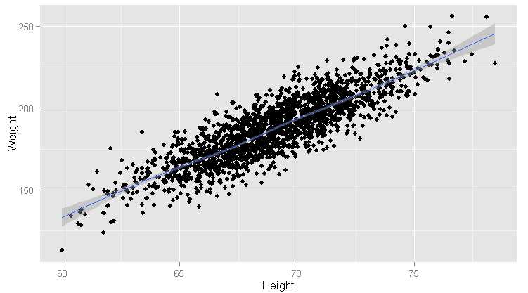
ggplot(heights.weights[1:2000, ], aes(x = Height, y = Weight)) +geom_point() +geom_smooth()
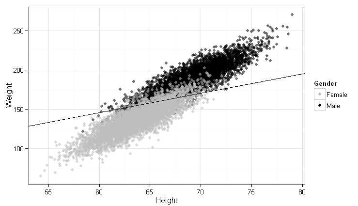
ggplot(heights.weights, aes(x = Height, y = Weight)) +
geom_point(aes(color = Gender, alpha = 0.25)) +
scale_alpha(guide = "none") +
scale_color_manual(values = c("Male" = "black", "Female" = "gray")) +
theme_bw()
# An alternative using bright colors.
ggplot(heights.weights, aes(x = Height, y = Weight, color = Gender)) +
geom_point()
#
# Snippet 35
#
heights.weights <- transform(heights.weights,
Male = ifelse(Gender == ‘Male‘, 1, 0))
logit.model <- glm(Male ~ Weight + Height,
data = heights.weights,
family = binomial(link = ‘logit‘))
ggplot(heights.weights, aes(x = Height, y = Weight)) +
geom_point(aes(color = Gender, alpha = 0.25)) +
scale_alpha(guide = "none") +
scale_color_manual(values = c("Male" = "black", "Female" = "gray")) +
theme_bw() +
stat_abline(intercept = -coef(logit.model)[1] / coef(logit.model)[2],
slope = - coef(logit.model)[3] / coef(logit.model)[2],
geom = ‘abline‘,
color = ‘black‘)
Machine Learning for hackers读书笔记(二)数据分析
标签:
原文地址:http://www.cnblogs.com/MarsMercury/p/4899165.html