标签:
工作中需要观察数据的变化趋势,用python写了一段小程序来用显示简单图表,分享出来方便有同样需求的人,matplotlib是个很不错的库。
#!encode=utf8
from matplotlib import pyplot as plt
import sys
ignore_num=(int)(sys.argv[1])
data=sys.argv[2]
show_type=0
if len(sys.argv)>3:
    show_type=(int)(sys.argv[3])
x=[]
valid_ppl=[]
train_ll=[]
valid_ll=[]
fi=open(data,"r")
line=fi.readline()
n=0
while line:
    if line.find("Values") >= 0:
        arr=line.split(" ")
        n+=1
        if n>ignore_num:
            x.append(n)
            train_ll.append(arr[6])
            valid_ll.append(arr[8])
            valid_ppl.append(arr[9])
    line=fi.readline()
if show_type==0:
    plt.plot(x,train_ll,color="blue",label="train_ll")
    plt.plot(x,valid_ll,color="red",label="valid_ll")
    plt.plot(x,valid_ppl,color="orange",label="valid_ppl")
elif show_type==1:
    plt.plot(x,train_ll,color="blue",label="train_ll")
    plt.plot(x,valid_ll,color="red",label="valid_ll")
else:
    plt.plot(x,valid_ppl,color="orange",label="valid_ppl")
plt.legend(loc=‘upper right‘)
plt.show()
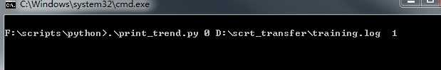
使用cmd命令窗口运行程序
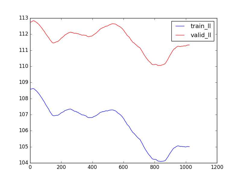
运行结果:
参考资料:http://www.scipy-lectures.org/intro/matplotlib/matplotlib.html 这个网页里写了pyplot的详细用法,以及如何用python绘制更丰富的图表,是非常好的学习资料。
python: 使用matplotlib的pyplot绘制图表
标签:
原文地址:http://www.cnblogs.com/ValiancyHe/p/4953989.html