标签:
知识点总结:
1、元素设置了绝对定位后会自动变为块级元素;
2、父元素设置为相对定位,子元素设为绝对定位,然后对子元素作如下设置会得到不同的效果:
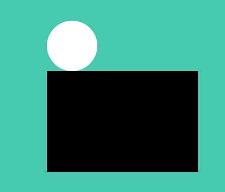
a、bottom:100%----------------->子元素的底端和父元素的顶端对齐重合(如下图所示:黑色框为父元素~白色圆为子元素~)
html代码:
<div id="father">
    <div id="child">
    </div>
</div>
css代码:
<style>
        #father {
            background: #000;
            width: 300px;
            height: 200px;
            position: relative;
            top:300px;//为了让父元不靠在屏幕左上方~稍微设置了left和top
            left: 600px;
        }

        #child {
            background: #fff;
            width: 100px;
            height: 100px;
            -webkit-border-radius: 50%;
            -moz-border-radius: 50%;
            border-radius: 50%;
            position: absolute;
            bottom: 100%;

        }
    </style>
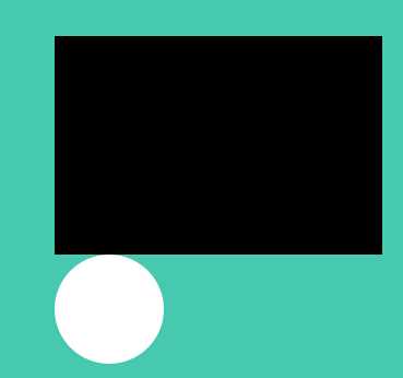
b、top:100%-------->子元素的顶端和父元素底端对齐(即子元素相对于父元素向下移动父元素的高度)
html代码如上所示,css代码如下:
<style>
        #father {
            background: #000;
            width: 300px;
            height: 200px;
            position: relative;
            top:300px;
            left: 600px;
        }

        #child {
            background: #fff;
            width: 100px;
            height: 100px;
            -webkit-border-radius: 50%;
            -moz-border-radius: 50%;
            border-radius: 50%;
            position: absolute;
            top: 100%;

        }
    </style>
c、至于bottom:0%和top:0%也依次类推
bottom:0% 即子元素以父元素的底部为基准向上推父元素高度的0%
top:0% 即子元素以父元素的顶部为基准向下推父元素高度的0%
基于transform和transition实现动画效果思路总结:
html代码如下:
   <ul>
        <li>
            <a href="#" class="tooltip tooltip-effect-5">
                Contact
                <span class="tooltip-content">
                    <i class="fa fa-envelope fa-fw"></i>
                </span>
            </a>
        </li>
    </ul>
一般而言我们设置元素的动画都是有事件触发的~比如初始时元素是一个状态~然后鼠标移到上面时开始动画~于是有:
1、设置元素开始时的显示效果:
css代码(采用less编写)
.tooltip-effect-5 .tooltip-content {//定义加了.tooltip-effect-5类的span的初始样式
  -webkit-transform: scale3d(0, 0, 0);
     -moz-transform: scale3d(0, 0, 0);
      -ms-transform: scale3d(0, 0, 0);
       -o-transform: scale3d(0, 0, 0);
          transform: scale3d(0, 0, 0);
  -webkit-transform-origin: center bottom;
     -moz-transform-origin: center bottom;
      -ms-transform-origin: center bottom;
       -o-transform-origin: center bottom;
          transform-origin: center bottom;

  -webkit-transition: all 0.3s;
     -moz-transition: all 0.3s;
      -ms-transition: all 0.3s;
       -o-transition: all 0.3s;
          transition: all 0.3s;


  i {
    -webkit-transform: translate3d(0, 20px, 0);
       -moz-transform: translate3d(0, 20px, 0);
        -ms-transform: translate3d(0, 20px, 0);
         -o-transform: translate3d(0, 20px, 0);
            transform: translate3d(0, 20px, 0);
    -webkit-transition: all 0.3s;
       -moz-transition: all 0.3s;
        -ms-transition: all 0.3s;
         -o-transition: all 0.3s;
            transition: all 0.3s;
               opacity: 0;
  }
}
2、定义鼠标hover时的样式:
css代码(采用less编写)
.tooltip:hover .tooltip-content,
.tooltip:hover .tooltip-content i {
  opacity: 1;
  //定义气泡最终的显示效果~在x、y、z上滑动为0,在x、y、z上旋转为0度,在x、y、z上缩放比例为1
  -webkit-transform: translate3d(0, 0, 0) rotate3d(1, 1, 1, 0) scale3d(1, 1, 1);
     -moz-transform: translate3d(0, 0, 0) rotate3d(1, 1, 1, 0) scale3d(1, 1, 1);
      -ms-transform: translate3d(0, 0, 0) rotate3d(1, 1, 1, 0) scale3d(1, 1, 1);
       -o-transform: translate3d(0, 0, 0) rotate3d(1, 1, 1, 0) scale3d(1, 1, 1);
          transform: translate3d(0, 0, 0) rotate3d(1, 1, 1, 0) scale3d(1, 1, 1);
}
3、这样定义好后在注意在 设置元素开始时的显示效果时我们还写了 transition: all 0.3s;的语句~这里写上all~那在鼠标hover时~程序会自动检测所有发生变换的属性~并按照定义的时间(0.3s)进行一个过渡的显示~于是就实现了动画~当然我们也可以手动添加希望发生过渡变化的属性~比如把上面的all改成opacity~那就只有opacity(透明度)会发生一个从0到1的过渡变化~过渡时间为0.3s。
另外小结一下transform后面跟的内容的含义:
1、translate3d()-------设置x、y、z 上平移的距离单位为像素
注意:虽然三轴上的变换也可以分别用translateX,translateY,translateZ来设置~不过推荐使用translate3d~这样不仅方便设置三轴上的变换~而且在手持设备上也会开启 加速
2、rotate3d(1,1,1,45deg)--------设置x、y、z 上的旋转的角度~前三个参数为0~1的数值~最后一个参数规定旋转的度数~那前三个参数可以理解为旋转规定度数的百分之几
3、scale3d(1,1,1)-----------设置x、y、z 上的缩放比~三个参数的取值也是0~1
源码地址:https://github.com/x-shadow-x/toolTip
在线预览:http://x-shadow-x.github.io/toolTip/
css3---transform&transition之toolTip动画效果的实现
标签:
原文地址:http://www.cnblogs.com/Liujunyan/p/4955634.html