标签:
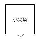
1、用:before和:after实现小尖角效果
<div class="div"></div>
.div{
    background: #fff;
    border: 2px solid #000;
    height: 100px;
    width: 100px;
    position: relative;
}
.div:after,.div:before{
    border:0 solid transparent;
    position: absolute;
    top: 100%;
    content: ‘‘;
}
.div:before{
    border-width: 12px;
    border-top-color: #000;
    left: 38px;
}
.div:after{
    border-width: 10px;
    border-top-color: #fff;
    left: 40px;
}
2、怎么只给盒子一侧加box-shadow
<div class="box-shadow">一侧阴影</div>
.box-shadow {
    position: absolute;
    top: 50%;
    left: 50px;
    width: 100px;
    height: 100px;
    background-color: #188eee;
}
.box-shadow:after {
    position: absolute;
    left: 10px;
    bottom:0;
    width: 80px;
    height: 1px;
    display: block;
    z-index: -1;
    content: "";
    -webkit-box-shadow: 0px 0px 10px 5px #000;
       -moz-box-shadow: 0px 0px 10px 5px #000;
            box-shadow: 0px 0px 10px 5px #000;
}

3、在不改变box-sizing的情况下,怎么使用text-indent和padding-left来缩进内容
text-indent:首行缩进、不影响width(ie67下和inline-block使用有兼容性问题http://www.cnblogs.com/dothin/p/4979521.html)
用法:缩进,隐藏logo文字
.logo{
    text-indent: -9999px;
    width: 300px;
    height: 100px;
    background: transparent url("imgs/logo.png") no-repeat;
}
padding-left:整体缩进,影响width
4、行溢出内容以省略号形式显示
{width: px; overflow: hidden; text-overflow: ellipsis; white-space: nowarp;}
鼠标移入显示:hover{ text-overflow: inherit; overflow: visible;}
5、表格溢出省略号显示
table{
    width:400px;
    border-collapse: collapse;
    table-layout: fixed;/*保持单元格的等宽*/
}
td{
    border: 1px solid #ccc;
   white-space:nowrap;
    overflow:hidden;
    text-overflow:ellipsis;
}
6、强制长英文单词换行
word-wrap: break-word; /*不会切断单词*/
word-break:break-all;/*要切断单词*/
7、用background-size:0 200%;给背景加渐变动画
<div class="button">背景切换</div>
.button {
    padding:10px 5px;
    border-radius: 4px;
    color: #fff;
    font: 16px sans-serif;
    width: 160px;
    text-align: center;
    background-image: linear-gradient(#155aaa, #188eee);
    background-size: auto 200%;
    background-position: 0 100%;
    -webkit-transition: background-position  .3s;
    -o-transition: background-position  .3s;
    transition: background-position  .3s;
}
.button:hover {
    background-position: 0 0;
}
8、我们可以用text-shadow给文本加阴影,那么你试过模糊文本吗
.text {
   color: transparent;
   text-shadow: 0 0 5px rgba(0,0,0,0.5);
}
9、强制显示页面滚动条
html {
    height: 101%
}
10、跨浏览器的min-height用法
.container {
    min-height: 400px;
    height: auto !important;
    height: 400px;
}
11、怎么给body顶部加固定阴影效果
body:before {
    content: "";
    position: fixed;
    top: -10px;
    left: 0;
    width: 100%;
    height: 10px;
    -webkit-box-shadow: 0px 0px 10px rgba(0,0,0,.8);
    -moz-box-shadow: 0px 0px 10px rgba(0,0,0,.8);
    box-shadow: 0px 0px 10px rgba(0,0,0,.8);
    z-index: 9999;
}
12、活用:not来排除元素
在ie时代,要给一串li除了最后或者第一个以外都加border-right(border-left),我们需要单独给最后一个或者第一个添加class才可以实现,
现在是css3时代了,我们完全没必要这么做,仅仅只需要一个:not和一个:last-child或者:first-child
li:not(:last-child){border-right:1px solid red;}瞬间心情舒畅~~
13、居中所有元素
html, body {
  height: 100%;
  margin: 0;
}
body {
  -webkit-align-items: center;
  -ms-flex-align: center;
  align-items: center;
  display: -webkit-flex;
  display: flex;
}
其他居中方法:http://www.cnblogs.com/dothin/p/4971703.html
14、用负的 nth-child 选择元素1到元素n
li {
  /*……*/
}
/* 选择从1到n的元素 */
li:nth-child(-n+3) {
  /*……*/
}
15、清除浮动的常见做法有哪些
1)加高度(但是扩张性不好)
2)父级浮动(不固定宽度的情况下,宽度会变为自适应内容)
3)display:inline-block 清浮动方法(不固定宽度的情况下,宽度会变为自适应内容)
4):after伪类 清浮动方法(主流方法)
.clear:after{content:‘‘;display:block;clear:both;}
.clear{zoom:1;}
5)overflow:hidden 清浮动方法(不允许溢出内容,在需要有溢出的时候这种方法不可行
6)position:absolute、fixed 清浮动。(不固定宽度的情况下,宽度会变为自适应内容,还可以使内联元素支持宽高)
所以以下内容不需要清浮动:
绝对定位或固定定位元素、浮动元素、固定高度的元素、添加了overflow溢出隐藏的元素
16、给元素加360翻转效果
.product li img {
    height:270px;
    width:200px;
    -webkit-transform: rotateY(360deg);
    -ms-transform: rotateY(360deg);
    transform: rotateY(360deg);
    -webkit-transition:-webkit-transform 1s;
    -ms-transition:-ms-transform 1s;
    transition:transform 1s;
}
.product li:hover img {
    -webkit-transform: rotateY(0);
    -ms-transform: rotateY(0);
    transform: rotateY(0);
}
/*要使鼠标移出也翻转,所以360deg写在前面*/
标签:
原文地址:http://www.cnblogs.com/dothin/p/4987201.html