标签:
上两张图自勉一下(来自刘墉先生的文章,最近看他的作品):然后移动端该愈来愈受到重视,未来的市场我不知道,不过我知道手机的功能越来越强大是不争的事实!移动端布局的积累也需要从现在做起!
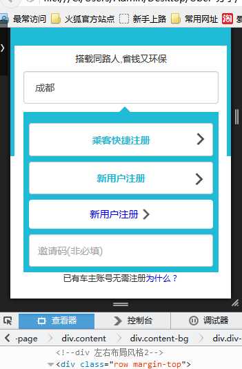
需求一:实现下图效果,注意不同手机的型号:原生称为适配,我们称为自适应不变形
思路一:btn+ima布局风格

<div class="row margin-top"> <div class="col-sm-12"> <div class="form-group text-centr"> <button type="submit" class="btn btn-default ubBtn"> 乘客快捷注册 <!-- <i class="check" style="padding-left:3.0rem"> </i> --> <!-- <img src="./image/checks.png" style="width:20px;height:20px;position: relative;right: -1.6rem;"> --> </button> <img src="./image/checks.png" style="width: 20px; height: 20px; position: absolute; top: 3.6rem; right: 0.5rem;"> </div> </div> </div>
思路二:div 左右布局风格
<div class="row margin-top">
                        <div class="col-sm-8">
                            <button type="submit" class="btn btn-default ubBtn2" >
                                新用户注册
                            </button>
                        </div>
                        <div class="col-sm-4">
                                <img src="./image/checks.png" style="width: 20px; height: 20px;float: right;margin-top: -1rem;margin-right: 0.3rem;">
                         </div>
                </div>
思路三:div 左右布局风格2
<div class="row margin-top"> <div class="col-sm-8"> <a href="#" class="btn btn-a">新用户注册 <span class="msg-span"> </span> </a> </div> <!-- <div class="col-sm-4"> <img src="./image/checks.png" style="width: 20px; height: 20px;float: right;margin-top: -1rem;margin-right: 0.3rem;"> </div> --> </div>
这个需要<span>有占位,然后如果左侧文字不定 做出来效果也不是很理想,适合固定的界面模式 然后设置span的左边距离
思路四:ul li a span布局
思路五:期待补充中
统一css样式整理:
.wrap-page{background:#ffffff;}
.nav-box{text-align:center;margin-top: 1.0rem}
.success{width:100%;margin:2.65625rem auto;}
.share-txt{font-size: 0.4375rem}
.logo{width: 3.109375rem;margin: 2.5625rem auto auto auto;}
.top-blank{height:0.6875rem;}
.top{background:#1FBAD6;height:10.0rem;}
.content{position: fixed;left: 0.2rem;right: 0.2rem;top: 5.0rem;background: #ffffff;margin: auto 0;width: 96%;}
.content-bg{width: 92%;margin: auto 0;position: relative;left: 0.4rem;}
.div-select{background: #1FBAD6;margin-top: 0.4rem;padding: 0.25rem}
.footer{height: 5.0rem}
.margin-top{margin-top: 0.25rem;}
.ubBtn{width:100%;margin:auto;display:block;height: 1.48rem;color:#1FBAD6;font-weight: 600}
.ubBtn2{width:100%;margin:auto;display:block;height: 1.48rem;color:#1FBAD6;font-weight: 600}
.check{background: url(../image/checks.png) right;background-repeat: no-repeat;background-size: 0.55rem 0.55rem;}
.box4{margin: 0 auto;width: 10px;height: 0px;border: 20px solid transparent;border-bottom-color: #1FBAD6;}
.btn-a{background:#ffffff;line-height: 28px;width: 100%;}
.msg-span{background: url(../image/checks.png) right;background-repeat: no-repeat;background-size: 0.55rem 0.55rem;}
标签:
原文地址:http://www.cnblogs.com/zxyun/p/5069467.html
