标签:
效果图
如何用css画三角形?
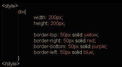
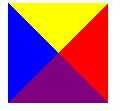
1).利用css控制border的边框属性, 画出四个小三角形
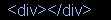
html代码

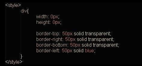
css代码
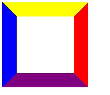
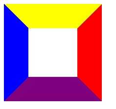
效果:

从css很容易看出来, div的边框 border-top, border-right, border-bottom, border-left (上右下左)这三个边框, 都是梯形.
那么, 如果梯形的上底无限接近0的时候, 是不是就越来越接近三角形?
如下:
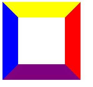
当width = 200px, height = 200px 的时候,(width为中间白色矩形的宽, height为它的高)
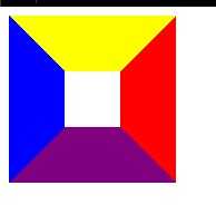
当width = 150px, height = 150px 的时候,
当width = 100px, height = 100px 的时候,
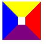
当width = 50px, height = 50px 的时候,
当width = 25px, height = 25px 的时候,
当width = 5px, height = 5px 的时候,
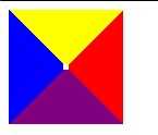
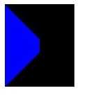
最后, 当width = 0px, height = 0px 的时候,
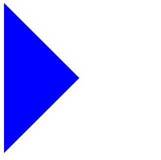
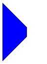
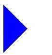
2). 将不需要的三角形透明化
border-color有一取值: transparent (透明), 所以只需要把其他的三角形的border-color设置成 "transparent"就可以了.
html代码
css代码
效果:

注意:Internet Explorer 6(以及更早的版本)不支持属性值 "transparent"。
在IE6中的效果:
将css改成:
border-color:transparent transparent transparent blue;
border-width:50px;
border-style:dashed dashed dashed solid;
在IE6中的效果:
听了hinong兄弟的话, 加了 "overflow:hidden;", 在IE6显示就正常了.
效果:
演示代码:
<!DOCTYPE html PUBLIC "-//W3C//DTD XHTML 1.0 Strict//EN" "http://www.w3.org/TR/xhtml1/DTD/xhtml1-strict.dtd">
<html xmlns="http://www.w3.org/1999/xhtml" lang="zh-CN">
<head>
<title>new</title>
<meta http-equiv="Content-Type" content="text/html; charset=utf-8" />
<meta name="description" content="Akira.Juggling" />

<style>
    div{
        width: 0px;
        height: 0px;

        border-top: 50px solid transparent;
        border-right: 50px solid transparent;
        border-bottom: 50px solid transparent;
        border-left: 50px solid blue;
    }
</style>

</head>
    <body>
        <div></div>
    </body>
</html>
标签:
原文地址:http://www.cnblogs.com/shouce/p/5081459.html