标签:
代码如下:

 1  <Style x:Key="ButtonStyle" TargetType="Button">
 2         <Setter Property="Template">
 3             <Setter.Value>
 4                 <ControlTemplate TargetType="Button">
 5                     <!--StackPanel是用来控制当Button长度变化时,位置的适应-->
 6                     <StackPanel x:Name="spPanel" Orientation="Horizontal" HorizontalAlignment="{TemplateBinding HorizontalAlignment}" >
 7                         <Grid>
 8                             <Grid.Background>
 9                                 <ImageBrush Stretch="Fill" ImageSource="btn-n.png"/>
10                             </Grid.Background>
11                             <Grid.ColumnDefinitions>
12                                 <ColumnDefinition></ColumnDefinition>
13                                 <ColumnDefinition></ColumnDefinition>
14                             </Grid.ColumnDefinitions>
15                             <Border x:Name="logoImg" Width="60" Height="51">
16                                 <Border.Background>
17                                     <ImageBrush Stretch="None" ImageSource="btn-icon-up.png"/>
18                                 </Border.Background>
19                             </Border>
20                             <!--Viewbox是控制当文字的长度超出最长限制时,对文字进行缩小处理-->
21                             <Viewbox Grid.Column="1" MaxWidth="350">
22                                 <Label x:Name="lblContent" Padding="0,0,5,0" VerticalContentAlignment="Center" Content="{TemplateBinding Content}"/>
23                             </Viewbox>
24                         </Grid>
25                     </StackPanel>
26                 </ControlTemplate>
27             </Setter.Value>
28         </Setter>
29     </Style>
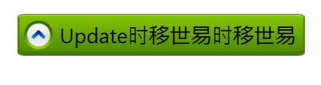
效果如下图:

当内容变长时:
使用到的知识:
1. StackPanel:用来控制Button的位置,可以设置居中,或左右对齐;
2. Viewbox:用来实现内容超长时,将文字缩小
**精简过并加上触发器的代码:
 1  <Style x:Key="ButtonStyle" TargetType="Button">
 2         <Setter Property="Template">
 3             <Setter.Value>
 4                 <ControlTemplate TargetType="Button">
 5                     <!--StackPanel是用来控制当Button长度变化时,位置的适应-->
 6                     <StackPanel x:Name="spPanel" Orientation="Horizontal" HorizontalAlignment="{TemplateBinding HorizontalAlignment}" >
 7                         <StackPanel.Background>
 8                             <ImageBrush Stretch="Fill" ImageSource="btn-n.png"/>
 9                         </StackPanel.Background>
10                         <Border x:Name="logoImg" Width="53" Height="43" Margin="5,0,0,0">
11                             <Border.Background>
12                                 <ImageBrush Stretch="UniformToFill" ImageSource="btn-icon-up.png"/>
13                             </Border.Background>
14                         </Border>
15                         <!--Viewbox是控制当文字的长度超出最长限制时,对文字进行缩小处理-->
16                         <Viewbox Grid.Column="1" MaxWidth="350" Margin="5,0">
17                             <Label x:Name="lblContent"  VerticalContentAlignment="Center" Content="{TemplateBinding Content}"/>
18                         </Viewbox>
19                         <!--</Grid>-->
20                     </StackPanel>
21                     <ControlTemplate.Triggers>
22                         <Trigger Property="IsMouseOver" Value="true">
23                             <Setter TargetName="spPanel" Property="Background">
24                                 <Setter.Value>
25                                     <ImageBrush Stretch="Fill"  ImageSource="btn-h.png"/>
26                                 </Setter.Value>
27                             </Setter>
28                             <Setter TargetName="logoImg" Property="Background">
29                                 <Setter.Value>
30                                     <ImageBrush Stretch="UniformToFill" ImageSource="btn-icon-right.png"/>
31                                 </Setter.Value>
32                             </Setter>
33                         </Trigger>
34                     </ControlTemplate.Triggers>
35                 </ControlTemplate>
36             </Setter.Value>
37         </Setter>
38     </Style>
WPF自定义Button样式(按钮长度随Content长度自适应)
标签:
原文地址:http://www.cnblogs.com/tommy-huang/p/5091602.html
