标签:
CSS3 2D Transforms Methods
translate()rotate()scale()skewX()skewY()matrix()1> translate
translate() method moves an element from its current position (according to the parameters given for the X-axis and the Y-axis).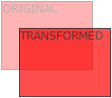
2> rotate
rotate() method rotates an element clockwise or counter-clockwise according to a given degree.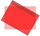
Example
1 div {
2     -ms-transform: rotate(20deg); /* IE 9 */
3     -webkit-transform: rotate(20deg); /* Safari */
4     transform: rotate(20deg);
5 }
3> scale
scale() method increases or decreases the size of an element (according to the parameters given for the width and height).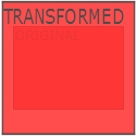
4> skewX(沿X轴形变)
skewX() method skews an element along the X-axis by the given angle.5> skewY(沿Y轴形变)
skewY() method skews an element along the Y-axis by the given angle.6> skew(沿X和Y轴形变)
skew() method skews an element along the X and Y-axis by the given angles.7> matrix
matrix() method combines all the 2D transform methods into one.Example
1 div {
2     -ms-transform: matrix(1, -0.3, 0, 1, 0, 0); /* IE 9 */
3     -webkit-transform: matrix(1, -0.3, 0, 1, 0, 0); /* Safari */
4     transform: matrix(1, -0.3, 0, 1, 0, 0);
5 }
CSS3 3D Transforms
rotateX()rotateY()rotateZ()1> rotateX
rotateX() method rotates an element around its X-axis at a given degree.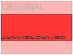
2> rotateY
rotateY() method rotates an element around its Y-axis at a given degree.
3> rotateZ
rotateZ() method rotates an element around its Z-axis at a given degree:Example
1 div {
2     -webkit-transform: rotateZ(90deg); /* Safari */
3     transform: rotateZ(90deg);
4 }
CSS3 Transitions
Note: If the duration part is not specified, the transition will have no effect, because the default value is 0.
syntax
transition: property duration timing-function delay|initial|inherit;
Example
1 input[type=text] {
2     width: 100px;
3     -webkit-transition: ease-in-out, width .35s ease-in-out; /* Safari 3.1 to 6.0 */
4     transition: width .35s ease-in-out;
5 }
6
7 input[type=text]:focus {
8     width: 250px;
9 }
1> transition-property
syntax
transition-property: none|all|property|initial|inherit;
Example
1 div {
2     -webkit-transition-property: width, height; /* Safari */
3     transition-property: width, height;
4 }
5
6 div:hover {
7     width: 300px;
8     height: 300px;
9 }
2> transition-duration
syntax
transition-duration: time|initial|inherit;
Example
1 div {
2     -webkit-transition-duration: 5s; /* Safari */
3     transition-duration: 5s;
4 }
3> transition-delay
syntax
transition-delay: time|initial|inherit;
Example
1 div {
2     -webkit-transition-delay: 2s; /* Safari */
3     transition-delay: 2s;
4 }
4> transition-timing-function
syntax
transition-timing-function: ease|linear|ease-in|ease-out|ease-in-out|cubic-bezier()|initial|inherit;
| Value | Description |
|---|---|
| ease | Default value. Specifies a transition effect with a slow start, then fast, then end slowly (equivalent to cubic-bezier(0.25,0.1,0.25,1)) |
| linear | Specifies a transition effect with the same speed from start to end (equivalent to cubic-bezier(0,0,1,1)) |
| ease-in | Specifies a transition effect with a slow start (equivalent to cubic-bezier(0.42,0,1,1)) |
| ease-out | Specifies a transition effect with a slow end (equivalent to cubic-bezier(0,0,0.58,1)) |
| ease-in-out | Specifies a transition effect with a slow start and end (equivalent to cubic-bezier(0.42,0,0.58,1)) |
| cubic-bezier(n,n,n,n) | Define your own values in the cubic-bezier function. Possible values are numeric values from 0 to 1 |
| initial | Sets this property to its default value. |
| inherit | Inherits this property from its parent element. |
Example
 1 /* For Safari 3.1 to 6.0 */
 2 #div1 {-webkit-transition-timing-function: linear;}
 3 #div2 {-webkit-transition-timing-function: ease;}
 4 #div3 {-webkit-transition-timing-function: ease-in;}
 5 #div4 {-webkit-transition-timing-function: ease-out;}
 6 #div5 {-webkit-transition-timing-function: ease-in-out;}
 7
 8 /* Standard syntax */
 9 #div1 {transition-timing-function: linear;}
10 #div2 {transition-timing-function: ease;}
11 #div3 {transition-timing-function: ease-in;}
12 #div4 {transition-timing-function: ease-out;}
13 #div5 {transition-timing-function: ease-in-out;}
CSS3 Animations
The @keyframes Rule
1> animation
syntax
animation: name duration timing-function delay iteration-count direction fill-mode play-state;
Example
1 div {
2     -webkit-animation: mymove 5s infinite; /* Chrome, Safari, Opera */
3     animation: mymove 5s infinite;
4 }
2> animation-name
syntax
animation-name: keyframename|none|initial|inherit;
Example
 1 /* The animation code */
 2 @keyframes example {
 3     from {background-color: red;}
 4     to {background-color: yellow;}
 5 }
 6
 7 /* The element to apply the animation to */
 8 div {
 9     width: 100px;
10     height: 100px;
11     background-color: red;
12     animation-name: example;
13     animation-duration: 4s;
14 }
3> animation-duration
4> animation-timing-function
5> animation-delay
6> animation-iteration-count
7> animation-direction
8> animation-fill-mode
9> animation-play-state
标签:
原文地址:http://www.cnblogs.com/hzj680539/p/5093324.html