标签:
<html>
    <head>
        <title>css3动画border旋转时的应用。</title>
        <meta charset="UTF-8"/>
        <style type="text/css">
        body{
            background: #ccc;
        }
            .he{
                width: 100px;
                height: 100px;
                margin: 200px auto;
                border: 10px solid black;
                border-left-color: #fff;
                border-radius: 70px;
                animation: namemf 1s linear infinite;
                -webkit-animation:namemf 1s linear infinite;
                -ms-animation: namemf 1s linear infinite;
            }
            @keyframes namemf{
                from{
                    transform:rotate(0deg) ;
                }
                to{
                    transform: rotate(360deg);
                }
            }
            @-webkit-keyframes namemf{
                from{
                    transform:rotate(0deg) ;
                }
                to{
                    transform: rotate(360deg);
                }
            }
            @-ms-keyframes namemf{
                from{
                    transform:rotate(0deg) ;
                }
                to{
                    transform: rotate(360deg);
                }
            }

        </style>
    </head>
    <body>
        <div class="he">

        </div>
    </body>
</html>
效果图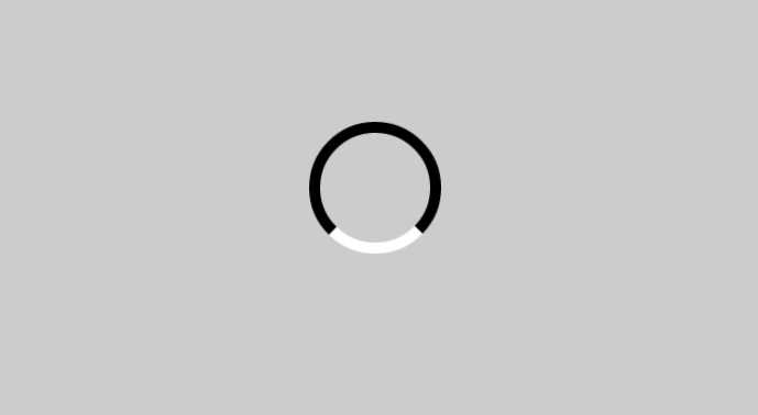
上面代码中要注意的地方:
border-radius: 70px;为70px时div才能显示为圆形,因为上下左右的border多出了20px
border-left-color: #fff;可以独立设置一边的颜色
 animation: namemf 1s linear infinite;中linear为匀速运动
       ease:动画以低速开始,然后加快,在结束前变慢。
       ease-in:动画以低速开始
       ease-out:动画以低速结束
标签:
原文地址:http://www.cnblogs.com/yunyi1895/p/5147755.html