标签:
Retina屏的移动设备如何实现真正1px的线?
在retina屏下面,如果你写了这样的meta <meta name="viewport" content="initial-scale=1, maximum-scale=1, minimum-scale=1, user-scalable=no">
你将永远无法写出1px宽度的东西,除此之外,inline的SVG等元素,也会按照逻辑像素来渲染,整个页面的清晰度会打折;
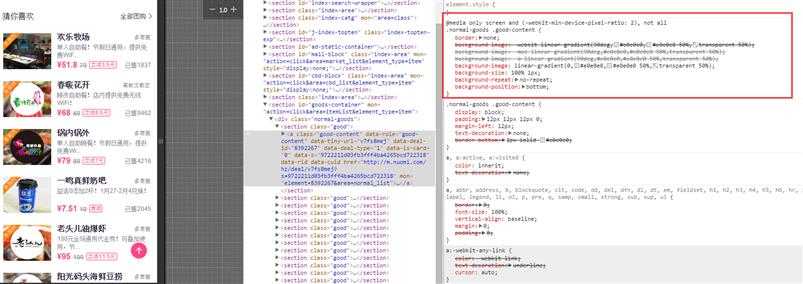
先看看 “诸子百家 ” 是如何实现的;
@media only screen and (-webkit-min-device-pixel-ratio:2),only screen and (min-device-pixel-ratio:2) {
.normal-goods .good-content {
border: none;
background-image: -webkit-linear-gradient(90deg,#e0e0e0,#e0e0e0 50%,transparent 50%);
background-image: -moz-linear-gradient(90deg,#e0e0e0,#e0e0e0 50%,transparent 50%);
background-image: -o-linear-gradient(90deg,#e0e0e0,#e0e0e0 50%,transparent 50%);
background-image: linear-gradient(0,#e0e0e0,#e0e0e0 50%,transparent 50%);
background-size: 100% 1px;
background-repeat: no-repeat;
background-position: bottom
}
}
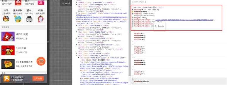
.index-rec .home-tuan-list .cnt {
    padding: 7px 10px 10px 0;
    display: box;
    display: -webkit-box;
    display: -ms-flexbox;
    height: 78px;
    background-image: url(//www.dpfile.com/mod/app-m-style/1.7.2/css/img/repeat-x.png);
    background-repeat: repeat-x;
    background-position: 0 bottom;
    background-size: auto 1px
}
<script>
	if (/iP(hone|od|ad)/.test(navigator.userAgent)) {  //  就是放到html根节点上的   ios8现在普及率高了,可以省略
		var v = (navigator.appVersion).match(/OS (\d+)_(\d+)_?(\d+)?/), version = parseInt(
				v[1], 10);
		if (version >= 8) {
			document.documentElement.classList.add(‘hairlines‘)
		}
	};
</script>
.r1bt {
    border-top: 1px solid rgba(32,35,37,.15)
}

.r1bb {
    border-bottom: 1px solid rgba(32,35,37,.15)
}

.r1bl {
    border-left: 1px solid rgba(32,35,37,.15)
}

.r1br {
    border-right: 1px solid rgba(32,35,37,.15)
}

.r1b {
    border: 1px solid rgba(32,35,37,.15)
}

.hairlines .r1bt,.hairlines .r1bb,.hairlines .r1bl,.hairlines .r1br,.hairlines .r1b {
    border-width: .5px!important
}
/*retain 1px border start*/
.retainbt,.retainbb,.retainbl,.retainbr,.retainb { position: relative;position: relative !important}
.retainbt:before,.retainbb:after {pointer-events: none;position: absolute;content: ""; height: 1px; background: rgba(32,35,37,.24);left: 0;right: 0}
.retainbt:before {top: 0}
.retainbb:after {bottom: 0}
.retainbl:before,.retainbr:after {pointer-events: none;position: absolute;content: ""; width: 1px; background: rgba(32,35,37,.24); top: 0; bottom: 0}
.retainbl:before {left: 0}
.retainbr:after {right: 0}
.retainb:after {position: absolute;content: "";top: 0;left: 0; -webkit-box-sizing: border-box; box-sizing: border-box; width: 100%; height: 100%; border: 1px solid rgba(32,35,37,.24); pointer-events: none}

@media (-webkit-min-device-pixel-ratio:1.5),(min-device-pixel-ratio:1.5),(min-resolution: 144dpi),(min-resolution:1.5dppx) {
.retainbt:before,.retainbb:after {-webkit-transform:scaleY(.5);transform: scaleY(.5) }
.retainbl:before,.retainbr:after {-webkit-transform: scaleX(.5); transform: scaleX(.5) }
.retainb:after { width: 200%; height: 200%;-webkit-transform: scale(.5); transform: scale(.5) }
.retainbt:before,.retainbl:before,.retainb:after {-webkit-transform-origin: 0 0;transform-origin: 0 0}
.retainbb:after,.retainbr:after { -webkit-transform-origin: 100% 100%;transform-origin: 100% 100%}
}

@media (-webkit-device-pixel-ratio:1.5) {
.retainbt:before,.retainbb:after { -webkit-transform: scaleY(.6666); transform: scaleY(.6666) }
.retainbl:before,.retainbr:after {-webkit-transform: scaleX(.6666); transform: scaleX(.6666)}
.retainb:after {width: 150%; height: 150%;-webkit-transform: scale(.6666); transform: scale(.6666) }
}

@media (-webkit-device-pixel-ratio:3) {
.retainbt:before,.retainbb:after { -webkit-transform: scaleY(.3333); transform: scaleY(.3333)}
.retainbl:before,.retainbr:after { -webkit-transform: scaleX(.3333); transform: scaleX(.3333)}
.retainb:after {width: 300%;height: 300%; -webkit-transform: scale(.3333);transform: scale(.3333)}
}
<script type="text/javascript">
        //根据屏幕大小及dpi调整缩放和大小
        (function() {
            var scale = 1.0;
            var ratio = 1;
            if (window.devicePixelRatio >= 2) {
                scale *= 0.5;
                ratio *= 2;
            }
            var text = ‘<meta name="viewport" content="initial-scale=‘ + scale + ‘, maximum-scale=‘ + scale +‘, minimum-scale=‘ + scale + ‘, width=device-width, user-scalable=no" />‘;
            document.write(text);
            document.documentElement.style.fontSize = 50*ratio + "px";
        })();
    </script>
我们把美团的 改变一下也可以
美团的 改变一下
 <meta name="viewport" content="target-densitydpi=device-dpi">  <!--安卓自带的 device-width 先不加 否则iphone 随进线条出现问题 -->
<script>
+function(win,doc,undefined) {//根据屏幕大小及dpi调整缩放和大小
	var scale = 1.0,ratio = 1,dc=doc,viewporttexts=‘‘;
	if (win.devicePixelRatio && devicePixelRatio >= 1.5) {
		ratio = devicePixelRatio;
		scale = scale/(devicePixelRatio);
	}
	//var texts = ‘<meta  name="viewport" content="initial-scale=‘ + scale + ‘, maximum-scale=‘ + scale +‘, minimum-scale=‘ + scale + ‘, width=device-width, user-scalable=no" />‘;
	// dc.write(texts);
	  viewporttexts = ‘ width=device-width, initial-scale=‘ + scale + ‘, maximum-scale=‘ + scale +‘, minimum-scale=‘ + scale + ‘,user-scalable=no‘;
      doc.querySelector(‘meta[name="viewport"]‘).setAttribute("content",viewporttexts);

	   console.log(‘111‘);
      dc.documentElement.style.fontSize =doc.getElementsByTagName("html")[0].style.fontSize=Math.ceil(50*ratio) + "px";
}(window,document);
 </script>
<script>
!function(N, M) {
    function L() {
        var a = I.getBoundingClientRect().width;
        a / F > 540 && (a = 540 * F);
        var d = a / 10;
        I.style.fontSize = d + "px",
        D.rem = N.rem = d
    }
    var K, J = N.document, I = J.documentElement, H = J.querySelector(‘meta[name="viewport"]‘), G = J.querySelector(‘meta[name="flexible"]‘), F = 0, E = 0, D = M.flexible || (M.flexible = {});
    if (H) {
        console.warn("将根据已有的meta标签来设置缩放比例");
        var C = H.getAttribute("content").match(/initial\-scale=([\d\.]+)/);
        C && (E = parseFloat(C[1]),
        F = parseInt(1 / E))
    } else {
        if (G) {
            var B = G.getAttribute("content");
            if (B) {
                var A = B.match(/initial\-dpr=([\d\.]+)/)
                  , z = B.match(/maximum\-dpr=([\d\.]+)/);
                A && (F = parseFloat(A[1]),
                E = parseFloat((1 / F).toFixed(2))),
                z && (F = parseFloat(z[1]),
                E = parseFloat((1 / F).toFixed(2)))
            }
        }
    }
    if (!F && !E) {
        var y = N.navigator.userAgent
          , x = (!!y.match(/android/gi),
        !!y.match(/iphone/gi))
          , w = x && !!y.match(/OS 9_3/)
          , v = N.devicePixelRatio;
        F = x && !w ? v >= 3 && (!F || F >= 3) ? 3 : v >= 2 && (!F || F >= 2) ? 2 : 1 : 1,
        E = 1 / F
    }
    if (I.setAttribute("data-dpr", F),
    !H) {
        if (H = J.createElement("meta"),
        H.setAttribute("name", "viewport"),
        H.setAttribute("content", "initial-scale=" + E + ", maximum-scale=" + E + ", minimum-scale=" + E + ", user-scalable=no"),
        I.firstElementChild) {
            I.firstElementChild.appendChild(H)
        } else {
            var u = J.createElement("div");
            u.appendChild(H),
            J.write(u.innerHTML)
        }
    }
    N.addEventListener("resize", function() {
        clearTimeout(K),
        K = setTimeout(L, 300)
    }, !1),
    N.addEventListener("pageshow", function(b) {
        b.persisted && (clearTimeout(K),
        K = setTimeout(L, 300))
    }, !1),
    "complete" === J.readyState ? J.body.style.fontSize = 12 * F + "px" : J.addEventListener("DOMContentLoaded", function() {
        J.body.style.fontSize = 12 * F + "px"
    }, !1),
    L(),
    D.dpr = N.dpr = F,
    D.refreshRem = L,
    D.rem2px = function(d) {
        var c = parseFloat(d) * this.rem;
        return "string" == typeof d && d.match(/rem$/) && (c += "px"),
        c
    }
    ,
    D.px2rem = function(d) {
        var c = parseFloat(d) / this.rem;
        return "string" == typeof d && d.match(/px$/) && (c += "rem"),
        c
    }
}(window, window.lib || (window.lib = {}));
</script>
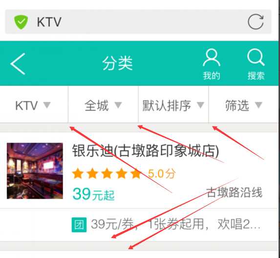
美团KTV 全城 默认排序 刷选的 分割线 ;iphone5s 刷选的那条是正常的鹅;前面3条1px多了点;ip6上则不是;
上面 有的 竖线始终 感觉 宽度是 不是1px;宽了一点点;首页美食类目进去;每个店铺边框 偶尔几条线条是1px多了一点点;

喜欢那种就用那种好了;
/**
 * HiDPI Canvas Polyfill (1.0.9)
 *
 * Author: Jonathan D. Johnson (http://jondavidjohn.com)
 * Homepage: https://github.com/jondavidjohn/hidpi-canvas-polyfill
 * Issue Tracker: https://github.com/jondavidjohn/hidpi-canvas-polyfill/issues
 * License: Apache 2.0
*/
;(function(prototype) {

	var pixelRatio = (function(context) {
			var backingStore = context.backingStorePixelRatio ||
						context.webkitBackingStorePixelRatio ||
						context.mozBackingStorePixelRatio ||
						context.msBackingStorePixelRatio ||
						context.oBackingStorePixelRatio ||
						context.backingStorePixelRatio || 1;

			return (window.devicePixelRatio || 1) / backingStore;
		})(prototype),

		forEach = function(obj, func) {
			for (var p in obj) {
				if (obj.hasOwnProperty(p)) {
					func(obj[p], p);
				}
			}
		},

		ratioArgs = {
			‘fillRect‘: ‘all‘,
			‘clearRect‘: ‘all‘,
			‘strokeRect‘: ‘all‘,
			‘moveTo‘: ‘all‘,
			‘lineTo‘: ‘all‘,
			‘arc‘: [0,1,2],
			‘arcTo‘: ‘all‘,
			‘bezierCurveTo‘: ‘all‘,
			‘isPointinPath‘: ‘all‘,
			‘isPointinStroke‘: ‘all‘,
			‘quadraticCurveTo‘: ‘all‘,
			‘rect‘: ‘all‘,
			‘translate‘: ‘all‘,
			‘createRadialGradient‘: ‘all‘,
			‘createLinearGradient‘: ‘all‘
		};

	if (pixelRatio === 1) return;

	forEach(ratioArgs, function(value, key) {
		prototype[key] = (function(_super) {
			return function() {
				var i, len,
					args = Array.prototype.slice.call(arguments);

				if (value === ‘all‘) {
					args = args.map(function(a) {
						return a * pixelRatio;
					});
				}
				else if (Array.isArray(value)) {
					for (i = 0, len = value.length; i < len; i++) {
						args[value[i]] *= pixelRatio;
					}
				}

				return _super.apply(this, args);
			};
		})(prototype[key]);
	});

	 // Stroke lineWidth adjustment
	prototype.stroke = (function(_super) {
		return function() {
			this.lineWidth *= pixelRatio;
			_super.apply(this, arguments);
			this.lineWidth /= pixelRatio;
		};
	})(prototype.stroke);

	// Text
	//
	prototype.fillText = (function(_super) {
		return function() {
			var args = Array.prototype.slice.call(arguments);

			args[1] *= pixelRatio; // x
			args[2] *= pixelRatio; // y

			this.font = this.font.replace(
				/(\d+)(px|em|rem|pt)/g,
				function(w, m, u) {
					return (m * pixelRatio) + u;
				}
			);

			_super.apply(this, args);

			this.font = this.font.replace(
				/(\d+)(px|em|rem|pt)/g,
				function(w, m, u) {
					return (m / pixelRatio) + u;
				}
			);
		};
	})(prototype.fillText);

	prototype.strokeText = (function(_super) {
		return function() {
			var args = Array.prototype.slice.call(arguments);

			args[1] *= pixelRatio; // x
			args[2] *= pixelRatio; // y

			this.font = this.font.replace(
				/(\d+)(px|em|rem|pt)/g,
				function(w, m, u) {
					return (m * pixelRatio) + u;
				}
			);

			_super.apply(this, args);

			this.font = this.font.replace(
				/(\d+)(px|em|rem|pt)/g,
				function(w, m, u) {
					return (m / pixelRatio) + u;
				}
			);
		};
	})(prototype.strokeText);
})(CanvasRenderingContext2D.prototype);
;(function(prototype) {
	prototype.getContext = (function(_super) {
		return function(type) {
			var backingStore, ratio,
				context = _super.call(this, type);

			if (type === ‘2d‘) {

				backingStore = context.backingStorePixelRatio ||
							context.webkitBackingStorePixelRatio ||
							context.mozBackingStorePixelRatio ||
							context.msBackingStorePixelRatio ||
							context.oBackingStorePixelRatio ||
							context.backingStorePixelRatio || 1;

				ratio = (window.devicePixelRatio || 1) / backingStore;

				if (ratio > 1) {
					this.style.height = this.height + ‘px‘;
					this.style.width = this.width + ‘px‘;
					this.width *= ratio;
					this.height *= ratio;
				}
			}

			return context;
		};
	})(prototype.getContext);
})(HTMLCanvasElement.prototype);
标签:
原文地址:http://www.cnblogs.com/surfaces/p/5158582.html