标签:
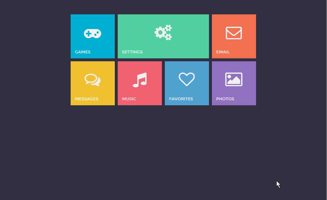
今天看到了一个摸拟Win8界面的设计,觉得非常有意思,并且方法也并不难,就研究了一下记录之。主要方法如下:
$(document).ready(function () {
	var $box = $(‘.box‘);
	$(‘.metro li‘).each(function () {
		var color = $(this).css(‘backgroundColor‘);
		var content = $(this).html();
		$(this).click(function () {
			$box.css(‘backgroundColor‘, color);
			$box.addClass(‘open‘);
			$box.find(‘p‘).html(content);
		});
		$(‘.close‘).click(function () {
			$box.removeClass(‘open‘);
			$box.css(‘backgroundColor‘, ‘transparent‘);
		});
	});
});
styles.css:

  1 @import url(http://fonts.useso.com/css?family=Montserrat:400,700);
  2
  3 body {
  4     background: #363B48;
  5     font-family: Montserrat;
  6     overflow:hidden;
  7     -webkit-touch-callout: none;
  8     -webkit-user-select: none;
  9     -khtml-user-select: none;
 10     -moz-user-select: none;
 11     -ms-user-select: none;
 12     user-select: none;
 13 }
 14
 15 h2 {
 16   margin:150px auto 50px;
 17   text-align:center;
 18   font-size:18px;
 19   text-transform:uppercase;
 20   background:#2e333f;
 21   padding:25px;
 22   display:block;
 23   cursor:default;
 24   width:370px;
 25   color:#cacaca;
 26   border:1px solid rgba(173, 173, 173, 0.15);
 27 }
 28
 29 .metro {
 30     width: 630px;
 31     margin: 0 auto 0;
 32 }
 33
 34
 35 .metro li {
 36     -webkit-transform: perspective(600px);
 37     -webkit-transform-style: preserve-3d;
 38     -webkit-transform-origin-x: 50%;
 39     -webkit-transform-origin-y: 50%;
 40     -ms-transform: perspective(600px);
 41     -ms-transform-style: preserve-3d;
 42     -ms-transform-origin-x: 50%;
 43     -ms-transform-origin-y: 50%;
 44     transform: perspective(600px);
 45     transform-style: preserve-3d;
 46     transform-origin-x: 50%;
 47     transform-origin-y: 50%;
 48     cursor: default;
 49     position: relative;
 50     text-align: center;
 51     margin: 0 10px 10px 0;
 52     width: 150px;
 53     height: 150px;
 54     color: #ffffff;
 55     float: left;
 56     -webkit-transition: .2s -webkit-transform, 1s opacity;
 57     -ms-transition: .2s -ms-transform, 1s opacity;
 58     transition: .2s transform, 1s opacity;
 59     cursor:pointer;
 60 }
 61
 62 .metro li i {
 63     font-size: 54px;
 64     margin: 35px 0 0;
 65 }
 66
 67 .metro li span {
 68     color: rgba(255, 255, 255, 0.8);
 69     text-transform: uppercase;
 70     position: absolute;
 71     left: 15px;
 72     bottom: 15px;
 73     font-size: 14px;
 74 }
 75
 76 .metro li:first-child {
 77     background: #00b6de;
 78 }
 79
 80 .metro li:nth-child(2) {
 81     background: #56dea7;
 82     width: 310px;
 83 }
 84
 85 .metro li:nth-child(3) {
 86     background: #ff7659;
 87     margin: 0;
 88 }
 89
 90 .metro li:nth-child(4) {
 91     background: #f8cd36;
 92 }
 93
 94 .metro li:nth-child(5) {
 95     background: #f26175;
 96 }
 97
 98 .metro li:nth-child(6) {
 99     background: #5ca7df;
100 }
101
102 .metro li:last-child {
103     background: #9e7ac2;
104     margin: 0;
105 }
106
107 .metro li:nth-child(5):active, .metro li:first-child:active {
108     -webkit-transform: scale(0.95);
109     -ms-transform: scale(0.95);
110     transform: scale(0.95);
111 }
112
113 .metro li:nth-child(7):active, .metro li:nth-child(2):active {
114     -webkit-transform: perspective(600px) rotate3d(1, 0, 0, -10deg);
115     -ms-transform: perspective(600px) rotate3d(1, 0, 0, -10deg);
116     transform: perspective(600px) rotate3d(1, 0, 0, -10deg);
117 }
118
119 .metro li:nth-child(3):active {
120     -webkit-transform: perspective(600px) rotate3d(0, 1, 0, 10deg);
121     -ms-transform: perspective(600px) rotate3d(0, 1, 0, 10deg);
122     transform: perspective(600px) rotate3d(0, 1, 0, 10deg);
123 }
124
125 .metro li:nth-child(4):active {
126     -webkit-transform: perspective(600px) rotate3d(0, 1, 0, -10deg);
127     -ms-transform: perspective(600px) rotate3d(0, 1, 0, -10deg);
128     transform: perspective(600px) rotate3d(0, 1, 0, -10deg);
129 }
130
131 .metro li:nth-child(6):active {
132     -webkit-transform: perspective(600px) rotate3d(1, 0, 0, 10deg);
133     -ms-transform: perspective(600px) rotate3d(1, 0, 0, 10deg);
134     transform: perspective(600px) rotate3d(1, 0, 0, 10deg);
135 }
136
137 /* POPUP */
138
139 .box {
140     display: table;
141     top: 0;
142     visibility: hidden;
143     -webkit-transform: perspective(1200px) rotateY(180deg) scale(0.1);
144     -ms-transform: perspective(1200px) rotateY(180deg) scale(0.1);
145     transform: perspective(1200px) rotateY(180deg) scale(0.1);
146     top: 0;
147     left: 0;
148     z-index: -1;
149     position: absolute;
150     width: 100%;
151     height: 100%;
152     opacity: 0;
153     transition: 1s all;
154 }
155
156 .box p {
157     display: table-cell;
158     vertical-align: middle;
159     font-size: 64px;
160     color: #ffffff;
161     text-align: center;
162     margin: 0;
163     opacity: 0;
164     transition: .2s;
165     -webkit-transition-delay: 0.2s;
166     -ms-transition-delay: 0.2s;
167     transition-delay: 0.2s;
168 }
169
170 .box p i {
171     font-size: 128px;
172     margin:0 0 20px;
173     display:block;
174 }
175
176 .box .close {
177   display:block;
178   cursor:pointer;
179   border:3px solid rgba(255, 255, 255, 1);
180   border-radius:50%;
181   position:absolute;
182   top:50px;
183   right:50px;
184   width:50px;
185   height:50px;
186   -webkit-transform:rotate(45deg);
187   -ms-transform:rotate(45deg)
188   transform:rotate(45deg);
189   transition: .2s;
190   -webkit-transition-delay: 0.2s;
191   -ms-transition-delay: 0.2s;
192   transition-delay: 0.2s;
193   opacity:0;
194 }
195
196 .box .close:active {
197     top:51px;
198 }
199
200 .box .close::before {
201   content: "";
202   display: block;
203   position: absolute;
204   background-color: rgba(255, 255, 255, 1);
205   width: 80%;
206   height: 6%;
207   left: 10%;
208   top: 47%;
209 }
210
211 .box .close::after {
212   content: "";
213   display: block;
214   position: absolute;
215   background-color: rgba(255, 255, 255, 1);
216   width: 6%;
217   height: 80%;
218   left: 47%;
219   top: 10%;
220 }
221
222 .box.open {
223     left: 0;
224     top: 0;
225     visibility: visible;
226     opacity: 1;
227     z-index: 999;
228     -webkit-transform: perspective(1200px) rotateY(0deg) scale(1);
229     -ms-transform: perspective(1200px) rotateY(0deg) scale(1);
230     transform: perspective(1200px) rotateY(0deg) scale(1);
231     width: 100%;
232     height: 100%;
233 }
234
235 .box.open .close, .box.open p {
236     opacity: 1;
237 }
运行效果如下,我发现点击关闭后在主页面上还会出现一行“白框”,这个日后还会测试调整代码。
标签:
原文地址:http://www.cnblogs.com/caidupingblogs/p/5255286.html
