标签:
一共收集整理了图形20个,比较实用,同时也为了熟悉CSS的代码。整合了一下,有错误欢迎指出。

#square {width: 100px;height: 100px;background: red;}
#rectangle {width: 200px;height: 100px;background: red;}
#triangle-topleft {width: 0;height: 0;border-top: 100px solid red; border-right: 100px solid transparent;}
#triangle-topright {width: 0;height: 0;border-top: 100px solid red; border-left: 100px solid transparent;}
#triangle-bottomleft {width: 0;height: 0;border-bottom: 100px solid red; border-right: 100px solid transparent;}
#triangle-bottomright {width: 0;height: 0;border-bottom: 100px solid red; border-left: 100px solid transparent;}
#parallelogram {width: 150px;height: 100px;-webkit-transform: skew(20deg); -moz-transform: skew(20deg); -o-transform: skew(20deg);background: red;}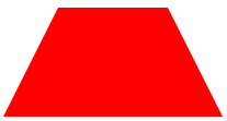
#trapezoid {border-bottom: 100px solid red;border-left: 50px solid transparent;border-right: 50px solid transparent;height: 0;width: 100px;}
#star-six {width: 0;height: 0;border-left: 50px solid transparent;border-right: 50px solid transparent;border-bottom: 100px solid red;position: relative;}#star-six:after {width: 0;height: 0;border-left: 50px solid transparent;border-right: 50px solid transparent;border-top: 100px solid red;position: absolute;content: "";top: 30px;left: -50px;}
#star-five { margin: 50px 0; position: relative; display: block; color: red; width: 0px; height: 0px; border-right: 100px solid transparent; border-bottom: 70px solid red; border-left: 100px solid transparent; -moz-transform: rotate(35deg); -webkit-transform: rotate(35deg); -ms-transform: rotate(35deg); -o-transform: rotate(35deg);}#star-five:before { border-bottom: 80px solid red; border-left: 30px solid transparent; border-right: 30px solid transparent; position: absolute; height: 0; width: 0; top: -45px; left: -65px; display: block; content: ‘‘; -webkit-transform: rotate(-35deg); -moz-transform: rotate(-35deg); -ms-transform: rotate(-35deg); -o-transform: rotate(-35deg); }#star-five:after { position: absolute; display: block; color: red; top: 3px; left: -105px; width: 0px; height: 0px; border-right: 100px solid transparent; border-bottom: 70px solid red; border-left: 100px solid transparent; -webkit-transform: rotate(-70deg); -moz-transform: rotate(-70deg); -ms-transform: rotate(-70deg); -o-transform: rotate(-70deg); content: ‘‘;}
#pentagon { position: relative; width: 54px; border-width: 50px 18px 0; border-style: solid; border-color: red transparent;}#pentagon:before { content: ""; position: absolute; height: 0; width: 0; top: -85px; left: -18px; border-width: 0 45px 35px; border-style: solid; border-color: transparent transparent red;}
#hexagon {width: 100px;height: 55px;background: red;position: relative;}#hexagon:before {content: "";position: absolute;top: -25px; left: 0;width: 0;height: 0;border-left: 50px solid transparent;border-right: 50px solid transparent;border-bottom: 25px solid red;}#hexagon:after {content: "";position: absolute;bottom: -25px; left: 0;width: 0;height: 0;border-left: 50px solid transparent;border-right: 50px solid transparent;border-top: 25px solid red;}
#heart { position: relative; width: 100px; height: 90px;}#heart:before,#heart:after { position: absolute; content: ""; left: 50px; top: 0; width: 50px; height: 80px; background: red; -moz-border-radius: 50px 50px 0 0; border-radius: 50px 50px 0 0; -webkit-transform: rotate(-45deg); -moz-transform: rotate(-45deg); -ms-transform: rotate(-45deg); -o-transform: rotate(-45deg); transform: rotate(-45deg); -webkit-transform-origin: 0 100%; -moz-transform-origin: 0 100%; -ms-transform-origin: 0 100%; -o-transform-origin: 0 100%; transform-origin: 0 100%;}#heart:after { left: 0; -webkit-transform: rotate(45deg); -moz-transform: rotate(45deg); -ms-transform: rotate(45deg); -o-transform: rotate(45deg); transform: rotate(45deg); -webkit-transform-origin: 100% 100%; -moz-transform-origin: 100% 100%; -ms-transform-origin: 100% 100%; -o-transform-origin: 100% 100%; transform-origin :100% 100%;}
#infinity { position: relative; width: 212px; height: 100px;} #infinity:before,#infinity:after { content: ""; position: absolute; top: 0; left: 0; width: 60px; height: 60px; border: 20px solid red; -moz-border-radius: 50px 50px 0 50px; border-radius: 50px 50px 0 50px; -webkit-transform: rotate(-45deg); -moz-transform: rotate(-45deg); -ms-transform: rotate(-45deg); -o-transform: rotate(-45deg); transform: rotate(-45deg);} #infinity:after { left: auto; right: 0; -moz-border-radius: 50px 50px 50px 0; border-radius: 50px 50px 50px 0; -webkit-transform: rotate(45deg); -moz-transform: rotate(45deg); -ms-transform: rotate(45deg); -o-transform: rotate(45deg); transform: rotate(45deg);}15.蛋
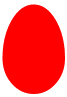
#egg { display:block; width: 126px; height: 180px; background-color: red; -webkit-border-radius: 63px 63px 63px 63px / 108px 108px 72px 72px; border-radius: 50% 50% 50% 50% / 60% 60% 40% 40%;}
#talkbubble { width: 120px; height: 80px; background: red; position: relative; -moz-border-radius: 10px; -webkit-border-radius: 10px; border-radius: 10px;}#talkbubble:before { content:""; position: absolute; right: 100%; top: 26px; width: 0; height: 0; border-top: 13px solid transparent; border-right: 26px solid red; border-bottom: 13px solid transparent;}
#burst-8 { background: red; width: 80px; height: 80px; position: relative; text-align: center; -webkit-transform: rotate(20deg); -moz-transform: rotate(20deg); -ms-transform: rotate(20deg); -o-transform: rotate(20eg); transform: rotate(20deg);}#burst-8:before { content: ""; position: absolute; top: 0; left: 0; height: 80px; width: 80px; background: red; -webkit-transform: rotate(135deg); -moz-transform: rotate(135deg); -ms-transform: rotate(135deg); -o-transform: rotate(135deg); transform: rotate(135deg);}
#burst-8 { background: red; width: 80px; height: 80px; position: relative; text-align: center; -webkit-transform: rotate(20deg); -moz-transform: rotate(20deg); -ms-transform: rotate(20deg); -o-transform: rotate(20eg); transform: rotate(20deg);}#burst-8:before { content: ""; position: absolute; top: 0; left: 0; height: 80px; width: 80px; background: red; -webkit-transform: rotate(135deg); -moz-transform: rotate(135deg); -ms-transform: rotate(135deg); -o-transform: rotate(135deg); transform: rotate(135deg);}
#cut-diamond { border-style: solid; border-color: transparent transparent red transparent; border-width: 0 25px 25px 25px; height: 0; width: 50px; position: relative; margin: 20px 0 50px 0;}#cut-diamond:after { content: ""; position: absolute; top: 25px; left: -25px; width: 0; height: 0; border-style: solid; border-color: red transparent transparent transparent; border-width: 70px 50px 0 50px;}
#yin-yang {width: 96px;height: 48px;background: #eee;border-color: red;border-style: solid;border-width: 2px 2px 50px 2px;border-radius: 100%;position: relative;}#yin-yang:before {content: "";position: absolute;top: 50%;left: 0;background: #eee;border: 18px solid red;border-radius: 100%;width: 12px;height: 12px;}#yin-yang:after {content: "";position: absolute;top: 50%;left: 50%;background: red;border: 18px solid #eee;border-radius:100%;width: 12px;height: 12px;}

原文地址http://blogread.cn/it/article/7891?f=wb标签:
原文地址:http://www.cnblogs.com/GaZeon/p/5286821.html