标签:
<!DOCTYPE html PUBLIC "-//W3C//DTD XHTML 1.0 Transitional//EN" "http://www.w3.org/TR/xhtml1/DTD/xhtml1-transitional.dtd">
<html>
<head>
<!--声明当前页面的编码集charset=gbk中文编码gb2312,charset=utf-8 国际编码-->
<meta http-equiv="Content-Type" content="text/html; charset=utf-8">
<!--当前页面的三要素-->
<title>标题</title>
<meta name="Keywords" content="关键词,关键词">
<meta name="description" content="描述">
<!--css , js-->
<style type="text/css">
#Con{width:900px; /*宽度*/ height:500px;/*高度*/ background:#9933FF;/*背景颜色*/
position:relative;}
#content{width:900px; height:500px; background:#669999;}
#content div{width:225px; height:500px; background:#3366FF;
float:left;/*在水平方向显示*/ position:relative;/*相对定位*/
overflow:hidden;}
#content div span{width:225px; height:500px; display:block; position:absolute; top:0px; left:225px;}
input#but1:checked ~ #content div span:nth-child(1){background-image:url("images/1.jpg");}
input#but2:checked ~ #content div span:nth-child(2){background-image:url("images/2.jpg");}
input#but3:checked ~ #content div span:nth-child(3){background-image:url("images/3.jpg");}
input#but4:checked ~ #content div span:nth-child(4){background-image:url("images/4.jpg");}*/
#content div:nth-child(1) span{background-position:0px 0px;}
#content div:nth-child(2) span{background-position:-225px 0px;}
#content div:nth-child(3) span{background-position:-450px 0px;}
#content div:nth-child(4) span{background-position:-675px 0px;}
input#but1:checked ~ #content div span:nth-child(1),
input#but2:checked ~ #content div span:nth-child(2),
input#but3:checked ~ #content div span:nth-child(3),
input#but4:checked ~ #content div span:nth-child(4)
{left:0px;-webkit-transition:left 0.5s ease;}
label{width:30px; height:30px; background:#33FFFF; display:block; border-radius:15px;
text-align:center;/*水平方向显示*/line-height:30px;/*在竖直方向距中*/
position:absolute;z-index:333;top:450px;}
input#but1 + label{left:700px;}
input#but2 + label{left:750px;}
input#but3 + label{left:800px;}
input#but4 + label{left:850px;}
input:checked + label{background:#fff;border:5px solid #33FFFF;border-radius:20px;}
input{display:none;/*隐藏*/}
</style>
</head>
<body>
<!--Div 盒子模型,高度,宽度,放置内容-->
<div id="Con">
<!--按扭开始-->
<input type="radio" name="but" id="but1" checked/>
<label for="but1">1</label>
<input type="radio" name="but" id="but2"/>
<label for="but2">2</label>
<input type="radio" name="but" id="but3"/>
<label for="but3">3</label>
<input type="radio" name="but" id="but4"/>
<label for="but4">4</label>
<div id="content">
<div>
<span></span>
<span></span>
<span></span>
<span></span>
</div>
<div>
<span></span>
<span></span>
<span></span>
<span></span>
</div>
<div>
<span></span>
<span></span>
<span></span>
<span></span>
</div>
<div>
<span></span>
<span></span>
<span></span>
<span></span>
</div>
</div>
</div>
</body>
</html>
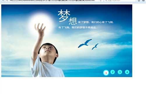
效果图:
标签:
原文地址:http://www.cnblogs.com/jiechen/p/5380637.html