标签:
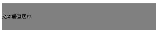
设置其文本的行高line-height与其父容器高度相等即可。如
<style>
    .test{
            background-color: grey;
            line-height:90px;
        }
</style>
<body>
    <div class="test">文本垂直居中</div>
</body>
效果图如下
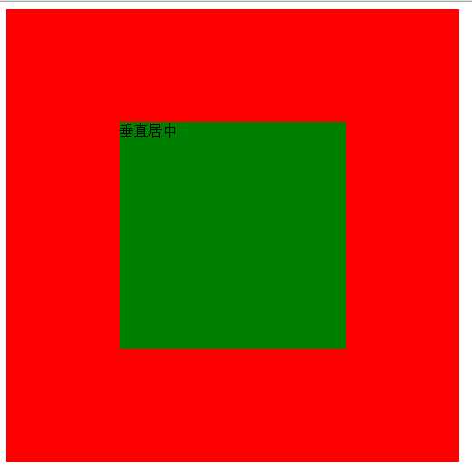
<style>
        .container{
            width: 500px;
            height: 500px;
            position: relative;
            background-color: red;
        }
        .absolute-center{
            width: 50%;
            height: 50%;
            overflow: auto;
            margin:auto;
            position: absolute;
            top:0;
            left:0;
            bottom:0;
            right:0;
            background-color: green;
        }
    </style>

<body>
<div class="container">
    <div class="absolute-center">垂直居中</div>
</div>
</body>
效果图如下:
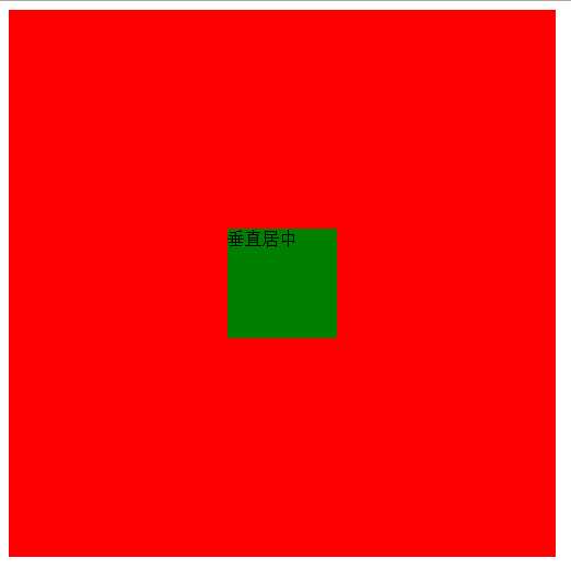
<!DOCTYPE html>
<html>
<head lang="en">
    <meta charset="UTF-8">
    <title></title>
    <style>
        .container{
            width: 500px;
            height: 500px;
            position: relative;
            background-color: red;
        }
        .absolute-center{
            width:100px;
            height: 100px;
            position: absolute;
            top:50%;
            margin-top:-50px;
            left:50%;
            margin-left:-50px;
            background-color: green;
        }
    </style>
</head>
<body>
<div class="container">
    <div class="absolute-center">垂直居中</div>
</div>
</body>
</html>
效果图如下:
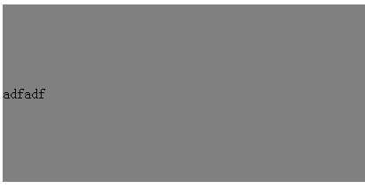
如果想让其在可视区内永远居中,则需要设置其定位为position:fixed;z-index:999;
<!DOCTYPE html>
<html>
<head lang="en">
    <meta charset="UTF-8">
    <title></title>
    <style>
        .parent{
            position: relative;
            height: 300px;
            background-color: grey;
        }
        .child{
            position: absolute;
            top:50%;
            transform:translateY(-50%);
            background-color: green;
        }
    </style>
</head>
<body>
<div class="parent">
    <div class="child">adfadf</div>
</div>
</body>
</html>
<!DOCTYPE html>
<html>
<head lang="en">
    <meta charset="UTF-8">
    <title></title>
    <style>
        .parent{
            display: table-cell;
            vertical-align: middle;
            background-color: grey;
            height: 100px;

        }
        .child{
            background-color: blue;
        }
    </style>
</head>
<body>
<div class="parent">
    <div class="child">table-cell实现的居中</div>
</div>
</body>
</html>
如果已经定位或浮动的元素仍然想用此方法来实现垂直居中,需要在其外面再加一个父盒子包起来便可实现。若要IE7支持,则需要改为<table>表格布局。
vertical-align:middle的解释是元素的中垂点与父元素的基线加1/2父元素中字母X的高度对齐。由于字符X在em框中并不是垂直居中的,且各个字体的字符X的高低位置不一致。所以,当字体大小较大时,这种差异就更明显。当font-size为0时,相当于把字符X的字体大小设置为0,于是可以实现完全的垂直居中。如下代码:
<!DOCTYPE html>
<html>
<head lang="en">
    <meta charset="UTF-8">
    <title></title>
    <style>
        .parent{
            line-height: 500px;
            fon-size:0;
            background-color: grey;
            width: 500px;

        }
        .child{
            vertical-align: middle;
        }
    </style>
</head>
<body>
<div class="parent">
    <img src="img/shop.png"  class="child"/>
</div>
</body>
</html>
效果图如下:
新增元素设置高度为父级高度,宽度为0,且同样设置垂直居中vertical-align:middle的inline-block元素。由于两个元素之间空白被解析,所以需要在父级设置font-size:0,在子级再将font-size设置为所需值;若结构要求不严格,则可以将两个元素一行显示,则不需要设置font-size:0。代码如下:
<!DOCTYPE html>
<html>
<head lang="en">
    <meta charset="UTF-8">
    <title></title>
    <style>
        .parent{
            height: 100px;
            font-size:0;
            background-color: grey;
            width: 200px;
        }
        .child{
            display: inline-block;
            font-size:20px;
            vertical-align: middle;
            background-color: blue;
        }
        .childSbling{
            display: inline-block;
            height: 100%;
            vertical-align: middle;
        }
    </style>
</head>
<body>
<div class="parent">
    <div class="child">adfadf</div>
    <i class="childSbling"></i>
</div>
</body>
</html>
效果图如下:
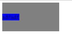
<!DOCTYPE html>
<html>
<head lang="en">
    <meta charset="UTF-8">
    <title></title>
    <style>
        .parent{
            display: flex;
            align-items: center;
            background-color: grey;
            height: 200px;
        }

    </style>
</head>
<body>
<div class="parent">
    <div class="child">adfadf</div>
</div>
</body>
</html>
效果如下:
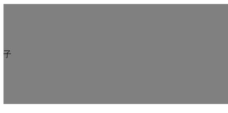
<!DOCTYPE html>
<html>
<head lang="en">
    <meta charset="UTF-8">
    <title></title>
    <style>
        .parent{
            display: flex;
            background-color: grey;
            height: 200px;
        }
        .child{
            margin:auto 0;
        }
    </style>
</head>
<body>
<div class="parent">
    <div class="child">子</div>
</div>
</body>
</html>
效果如下:
标签:
原文地址:http://www.cnblogs.com/haoxl/p/5452236.html