标签:
  1 <!DOCTYPE html>
  2 <html>
  3     <head>
  4         <meta charset="utf-8">
  5         <title></title>
  6         <style>
  7             body{
  8                 margin: 0;
  9             }
 10             ul{
 11                 margin: 0;
 12                 padding: 0;
 13                 list-style: none;
 14             }
 15             .wrap{
 16                 width: 198px;
 17                 height: 198px;
 18                 padding: 198px;
 19                 border: 1px solid black;
 20                 margin: 200px auto;
 21                 perspective: 300px;
 22             }
 23             .wrap ul{
 24                 width: 198px;
 25                 height: 198px;
 26                 position: relative;
 27                 transition: 10s;
 28                 transform-style: preserve-3d;
 29                 transform-origin: center center -99px;
 30             }
 31             .wrap ul li{
 32                 width: 198px;
 33                 height: 198px;
 34                 position: absolute;
 35                 font: 50px/100px "微软雅黑";
 36                 text-align: center;
 37                 color: #fff;
 38                 background-image: url(bg.jpg);
 39                 background-repeat: no-repeat;
 40             }
 41             .wrap ul li:nth-of-type(1){
 42                 background-color: red;
 43                 left: 0;
 44                 top: -198px;
 45                 transform-origin: bottom;
 46                 transform: rotateX(90deg);
 47                 background-position: -393px -393px;
 48             }
 49             .wrap ul li:nth-of-type(2){
 50                 background-color: yellow;
 51                 left: -198px;
 52                 top: 0;
 53                 transform-origin: right;
 54                 transform: rotateY(-90deg);
 55                 background-position: 0 -198px;
 56             }
 57             .wrap ul li:nth-of-type(3){
 58                 background-color: blue;
 59                 left: 0;
 60                 top: 0;
 61                 transform: translateZ(0px);
 62                 background-position: -197px -196px;
 63             }
 64             .wrap ul li:nth-of-type(4){
 65                 background-color: green;
 66                 left: 198px;
 67                 top: 0;
 68                 transform-origin: left;
 69                 transform: rotateY(90deg);
 70                 background-position: -393px -196px;
 71             }
 72             .wrap ul li:nth-of-type(5){
 73                 background-color: pink;
 74                 left: 0;
 75                 top: 198px;
 76                 transform-origin: top;
 77                 transform: rotateX(-90deg);
 78                 background-position: -589px -196px;
 79             }
 80             .wrap ul li:nth-of-type(6){
 81                 background-color: purple;
 82                 left: 0;
 83                 top: 0;
 84                 transform: translateZ(-198px);
 85                 background-position: -393px 0;
 86             }
 87             .wrap:hover ul{
 88                 transform:rotateX(720deg) rotateY(720deg) rotateZ(720deg);
 89             }
 90         </style>
 91     </head>
 92     <body>
 93         <div class="wrap">
 94             <ul>
 95                 <li>1</li>
 96                 <li>2</li>
 97                 <li>3</li>
 98                 <li>4</li>
 99                 <li>5</li>
100                 <li>6</li>
101             </ul>
102         </div>
103     </body>
104 </html>
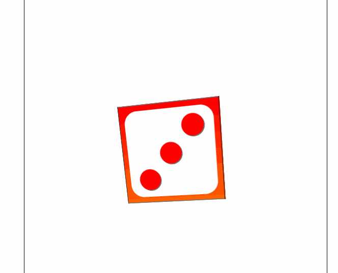
效果图:
标签:
原文地址:http://www.cnblogs.com/jiechen/p/5467575.html