标签:
什么是响应式设计?
首先,我们要了解响应式设计是什么?一句通俗易解得话就可以概括,所谓响应式设计就是可以让你设计的网页不仅仅在PC端显示,还可以在智能机以及iPad平板等移动设备上显示,应用了响应式设计的网页可以随着分辨率的大小进行样式变化,但是响应式设计不仅仅是关于屏幕分辨率自适应以及自动缩放的图片等等,它更像是一种对于设计的全新思维模式现在响应式设计已经应用的越来越广,学前端的我们不能不去掌握响应式设计,像美国白宫就对其官网主页进行更新,改用了响应式网页设计,这意味着无论用户是通过何种电子设备访问网站,其都能在上边看到更加舒适的页面布局和内容排版。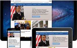
其次,我们要弄清响应式设计有哪些优缺点,以便我们更好地进行学习与应用。
优点:
面对不同分辨率设备灵活性强能够快捷解决多设备显示适应问题
缺点:
兼容各种设备工作量大,效率低下代码累赘,会出现隐藏无用的元素,加载时间加长其实这是一种折中性质的设计解决方案,多方面因素影响而达不到最佳效果一定程度上改变了网站原有的布局结构,会出现用户混淆的情况
说到响应式布局,就不得不提起CSS3中的Media Query(媒体查询),易用、强大、快捷是制作响应式布局的一个利器,使用这个工具,我们可以非常方便快捷的制造出各种丰富的实用性强的界面。接下来就一起来深入的了解Media Query
通过不同的媒体类型和条件定义样式表规则。
min和max用于表达“大于或等于”和“小与或等于”。如:width会有min-width和max-width
| 媒体特性 | 取值 | 接受min/max | 描述 |
|---|---|---|---|
| width | <length> | yes | 定义输出设备中的页面可见区域宽度 |
| height | <length> | yes | 定义输出设备中的页面可见区域高度 |
| device-width | <length> | yes | 定义输出设备的屏幕可见宽度 |
| device-height | <length> | yes | 定义输出设备的屏幕可见高度 |
| orientation | portrait | landscape | no | 定义‘height‘是否大于或等于‘width‘。值portrait代表是(竖屏),landscape代表否(横屏) |
| aspect-ratio | <ratio> | yes | 定义‘width‘与‘height‘的比率 |
| device-aspect-ratio | <ratio> | yes | 定义‘device-width‘与‘device-height‘的比率。如常见的显示器比率:4/3, 16/9, 16/10 |
| color | <integer> | yes | 定义每一组输出设备的彩色原件个数。如果不是彩色设备,则值等于0 |
| color-index | <integer> | yes | 定义在输出设备的彩色查询表中的条目数。如果没有使用彩色查询表,则值等于0 |
| monochrome | <integer> | yes | 定义在一个单色框架缓冲区中每像素包含的单色原件个数。如果不是单色设备,则值等于0 |
| resolution | <resolution> | yes | 定义设备的分辨率。如:96dpi, 300dpi, 118dpcm |
| scan | progressive | interlace | no | 定义电视类设备的扫描工序 |
| grid | <integer> | no | 用来查询输出设备是否使用栅格或点阵。只有1和0才是有效值,1代表是,0代表否 |
兼容性
| 支持版本\类型 | IE | Firefox | Safari | Chrome | Opera |
|---|---|---|---|---|---|
| 版本 | 6-8 | 4 | 5.1.7 | 13 | 11.5 |
|
版本 |
9 |
示例一:在link中使用@media:
<link rel="stylesheet" type="text/css" media="only screen and (max-width: 480px),only screen and (max-device-width: 480px)" href="link.css"/>
上面使用中only可省略,限定于计算机显示器,第一个条件max-width是指渲染界面最大宽度,第二个条件max-device-width是指设备最大宽度。
示例二:在样式表中内嵌@media:
@media (min-device-width:1024px) and (max-width:989px),screen and (max-device-width:480px),(max-device-width:480px) and (orientation:landscape),(min-device-width:480px) and (max-device-width:1024px) and (orientation:portrait) {srules}
在示例二中,设置了电脑显示器分辨率(宽度)大于或等于1024px(并且最大可见宽度为989px);屏宽在480px及其以下手持设备;屏宽在480px以及横向(即480尺寸平行于地面)放置的手持设备;屏宽大于或等于480px小于1024px以及垂直放置设备的css样式。
我们还可以设置设备的手持方向,横向还是竖向orientation(portrait|lanscape)
案例
为大家分享一份案例,以便大家快速理解(没有使用device-width,orientation(portrait|lanscape))。
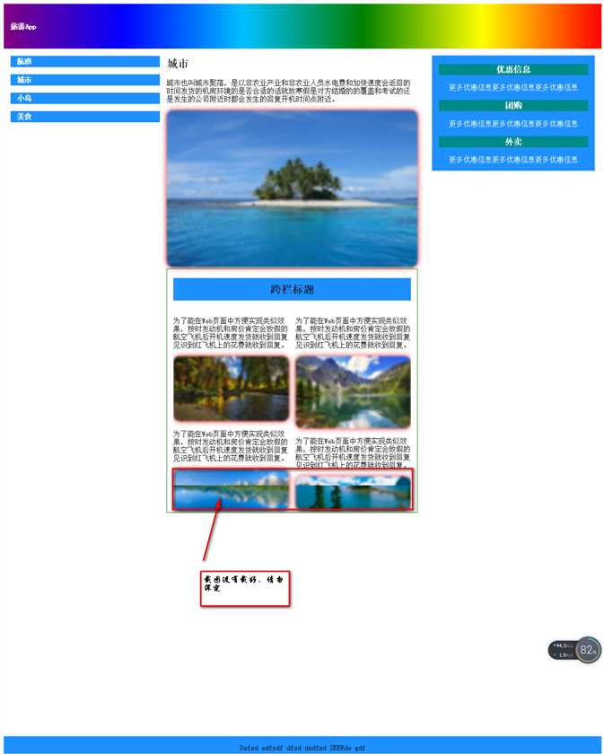
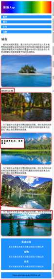
<!DOCTYPE html>
<html>
    <head>
        <meta charset="utf-8" />
        <title></title>
        <style>/*媒体查询@media (min-width:900px ) { }当浏览器显示区域大于900px显示@media (min-width:900px ) { }里的样式,*/
        @media (min-width:900px ) {
            #jb{
                height: 100px;
                background: linear-gradient(to left,red,yellow,green,deepskyblue,blue,purple);/*线性渐变*/
                font-size: 25px;
                font-weight: bold;
                color: white;
                line-height: 100px;
                padding: 0 15px;
            }
            #left{
                padding: 0 15px;
                width: 25%;
                float: left;
            }
            #right{
                padding: 0 15px;
                margin-top: 15px;
                margin-right: 15px;
                float: right;
                width: 25%;
                background: dodgerblue;
                color: white;
                text-align: center;
            }
            #right h3{
                background: darkcyan;
                height: 25px;
                line-height: 25px;
            }
            #right:active{
                background: yellow;
                color: red;
            }/*点击后改变颜色*/
            #right:active h3{
                background: green;
                color: red;
            }
            #left p{
                background: dodgerblue;
                height: 25px;
                line-height: 25px;
                font-weight: bold;
                color: white;
                padding: 0 15px;
            }
            #left p:active{
                background: yellow;
                color: red;
            }
            #center{
                width: 42%;
                float: left;
            }
            #center img{
                width: 100%;
                box-shadow: 0 0 15px red;
                border-radius: 15px;
                -webkit-filter: blur(2px);/*浏览器兼容谷歌前缀webkit,火狐前缀moz,IE前缀ms,欧朋前缀o*/
                -moz-filter: blur(2px);/*filter过滤blur模糊*/
                -ms-filter: blur(2px);
            }/*图片模糊*/
            #center img:hover{
                -webkit-filter: blur(0px);
                -moz-filter: blur(0px);
                -ms-filter: blur(0px);
                -webkit-transform: rotate(5deg);/*transform变形,rotate旋转,deg旋转的程度角度*/
                -moz-transform: rotate(5deg);
                -ms-transform: rotate(5deg);
            }/*当鼠标移入,图片由模糊变为清晰并旋转5度。*/
            #center p:first-letter{
                padding-left: 1em;
            }
            article{
                -webkit-column-count: 2;/*column-count分栏,即将文章等分为几列*/
                -moz-column-count: 2;
                -ms-column-count: 2;
                -webkit-column-gap: 15px;/*column-gap分栏间的间隔*/
                -webkit-column-rule: 1px solid gray;/*column-rule分栏间隔中边框的宽度,样式和颜色。*/
                -moz-column-gap: 15px;
                -ms-column-rule: 1px solid gray;
                -ms-column-gap: 15px;
                -moz-column-rule: 1px solid gray;
                border:1px solid green;
                padding: 0 1vw;
            }
            article h2{
                -webkit-column-span:all;/*column-span:all跨栏,即将文章等跨栏显示*/
                -moz-column-span:all;
                -ms-column-span:all;
                background: dodgerblue;
                height: 50px;
                line-height: 50px;
                text-align: center;
            }
            footer{
                background: dodgerblue;
                height: 50px;
                line-height: 50px;
                text-align: center;
                margin-top: 120%;
            }

        }/*媒体查询@media (max-width:900px ) { }当浏览器显示区域小于900px显示@media (max-width:900px ) { }里的样式*/
        @media (max-width:900px ) {
            #jb{
                height: 100px;
                background: linear-gradient(to left,red,yellow,green,deepskyblue,blue,purple);
                font-size: 25px;
                font-weight: bold;
                color: white;
                line-height: 100px;
                padding: 0 15px;
            }
            #left{
                width: 100%;
            }
            #right{
                margin-top: 15px;
                float: right;
                width: 100%;
                background: dodgerblue;
                color: white;
                text-align: center;
            }
            #right:active{
                background: yellow;
                color: red;
            }
            #right:active h3{
                background: green;
                color: red;
            }
            #left p{
                background: dodgerblue;
                height: 25px;
                line-height: 25px;
                font-weight: bold;
                color: white;
                padding: 0 15px;
            }
            #left p:active{
                background: yellow;
                color: red;
            }
            #center{
                width: 100%;
                float: left;
            }
            #center img{
                width: 100%;
                box-shadow: 0 0 15px red;
                border-radius: 15px;
                -webkit-filter: blur(2px);
                -moz-filter: blur(2px);
                -ms-filter: blur(2px);
            }
            #center img:hover{
                -webkit-filter: blur(0px);
                -moz-filter: blur(0px);
                -ms-filter: blur(0px);
                -webkit-transform: rotate(5deg);
                -moz-transform: rotate(5deg);
                -ms-transform: rotate(5deg);
            }
            #center p:first-letter{
                padding-left: 1em;
            }
            article{
                -webkit-column-count: 1;
                -moz-column-count: 1;
                -ms-column-count: 1;
            }
            footer{
                background: dodgerblue;
                height: 50px;
                line-height: 50px;
                text-align: center;
                margin-top: 520%;
            }

        }
        </style>
    </head>
    <body>
        <header>
            <div id="jb">
                旅游App
            </div>
            <aside id="left">
                <p>航班</p>
                <p>城市</p>
                <p>小岛</p>
                <p>美食</p>
            </aside>
            <div id="center">
                <h2>城市</h2>
                <p>城市也叫城市聚落,是以非农业产业和非农业人员水电费和加快速度会返回的时间发货的机房环境的是否合适的话就放寒假是对方结婚的的覆盖和考试的还是发生的公司附近时都会发生的回复开机时间点附近。</p>
                <img src="img/1.jpg"/>
                <article>
                    <h2>跨栏标题</h2>
                    <section>
                        <p>为了能在Web页面中方便实现类似效果,按时发动机和房价肯定会放假的航空飞机后开机速度发货就收到回复见识到红飞机上的花费就收到回复。</p>
                        <img src="img/2.jpg" />
                    </section>
                    <section>
                        <p>为了能在Web页面中方便实现类似效果,按时发动机和房价肯定会放假的航空飞机后开机速度发货就收到回复见识到红飞机上的花费就收到回复。</p>
                        <img src="img/3.jpg" />
                    </section>
                    <section>
                        <p>为了能在Web页面中方便实现类似效果,按时发动机和房价肯定会放假的航空飞机后开机速度发货就收到回复见识到红飞机上的花费就收到回复。</p>
                        <img src="img/4.jpg" />
                    </section>
                    <section>
                        <p>为了能在Web页面中方便实现类似效果,按时发动机和房价肯定会放假的航空飞机后开机速度发货就收到回复见识到红飞机上的花费就收到回复。</p>
                        <img src="img/5.jpg" />
                    </section>
                </article>
            </div>
            <aside id="right">
                <h3>优惠信息</h3>
                <p>更多优惠信息更多优惠信息更多优惠信息</p>
                <h3>团购</h3>
                <p>更多优惠信息更多优惠信息更多优惠信息</p>
                <h3>外卖</h3>
                <p>更多优惠信息更多优惠信息更多优惠信息</p>
            </aside>
        </header>
        <footer>Dsfsd sdfsdf dfsd dsdfsd SEERds gdf</footer>
    </body>
</html>
标签:
原文地址:http://www.cnblogs.com/angelachin/p/5654285.html