标签:
<!DOCTYPE html>
<html lang="en">
<head>
	<meta charset="UTF-8">
  <meta name="viewport" content="width=device-width, user-scalable=no, initial-scale=1.0, maximum-scale=1.0, minimum-scale=1.0">
	<title>Document</title>
</head>
<style type="text/css">
.dot {
  animation: sploosh 1.5s cubic-bezier(0.165, 0.84, 0.44, 1);
}
.dot2 {
  animation: sploosh2 1.5s cubic-bezier(0.165, 0.84, 0.44, 1);
}
.dot3 {
  animation: sploosh3 1.5s cubic-bezier(0.165, 0.84, 0.44, 1);
}
.dot,.dot2,.dot3{
  height: 100px;
  width: 100px;
  font-size: 20px;
  color: #fff;
  line-height: 100px;
  text-align: center;
  border-radius: 100%;
  position: absolute;
  z-index: 10;
  animation-iteration-count:infinite;
  background: transparent;
}
@keyframes sploosh {
  0% {
    box-shadow: 0 0 0 0px rgba(255, 220, 1, 0.7);
    background: rgba(255, 220, 1, 0.7);
  }
  100% {
    box-shadow: 0 0 0 30px rgba(255, 220, 1, 0);
    background: rgba(255, 220, 1, 0);
  }
}
@keyframes sploosh2 {
  0% {
    box-shadow: 0 0 0 0px rgba(255, 220, 1, 0.7);
    background: rgba(255, 220, 1, 0.7);
  }
  100% {
    box-shadow: 0 0 0 20px rgba(255, 220, 1, 0);
    background: rgba(255, 220, 1, 0.3);
  }
}
@keyframes sploosh3 {
  0% {
    box-shadow: 0 0 0 0px rgba(255, 220, 1, 0.7);
    background: rgba(255, 220, 1, 0.7);
  }
  100% {
    box-shadow: 0 0 0 10px rgba(255, 220, 1, 0);
    background: rgba(255, 220, 1, 1);
  }
}
</style>
<body>
	<div style="height:100px;width:100px;border-radius:100%;position: relative;margin:200px auto; ">
    <div class="dot">
      <div class="dot2">
          <div class="dot3">每日签到</div>
      </div>
    </div>
  </div>
</body>
</html>
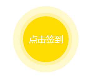
效果图:
标签:
原文地址:http://www.cnblogs.com/beiz/p/5726692.html