标签:
一.线性渐变linear-gradient
1.使用方法:
background:-webkit-linear-gradient(red,blue);
background:-moz-linear-gradient(red,blue);
background:linear-gradient(red,blue);
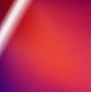
2.拓展应用
光斑:
<style>
.box{width: 300px;height: 300px;transition: 1s;
    background:-webkit-linear-gradient(-30deg,rgba(255,255,255,0) 0,rgba(255,255,255,0) 150px,rgba(255,255,255,0.9) 170px,rgba(255,255,255,0.9) 180px,rgba(255,255,255,0) 210px) no-repeat -220px 0,url("img/new_bg.png") no-repeat;}
.box:hover{background-position: 300px 0,-100px -100px;}
</style>


<body>
<div class="box"></div>
</body>
二.径向渐变radial-gradient
1.使用方法:
background:-webkit-radial-gradient(red,blue);
background:-webkit-radial-gradient(100px 50px,circle,red,blue); //形状: ellipse、circle或者具体数值或百分比,也可以是关键字(最近端,最近角,最远端,最远角,包含或覆盖 (closest-side, closest-corner, farthest-side, farthest-corner, contain or cover)); firefox目前只支持关键字
三.兼容问题
<style>
    .box{width:300px;height:300px;
        background:-webkit-linear-gradient(red,blue); //saifari Google
        background:-moz-linear-gradient(red,blue); //兼容FF
        background:linear-gradient(red,blue); //IE11 10
        filter:progid:DXImageTransform.Microsoft.gradient(startColorstr=‘red‘,endColorstr=‘blue‘,GradientType=‘0‘);}    //兼容IE 9以下至6   只能兼容线性渐变  GradientType=‘0‘或者‘1’
</style>

<body>
<div class="box"></div>
</body>
标签:
原文地址:http://www.cnblogs.com/seven077/p/5787130.html