标签:
css3照片墙+曲线阴影
最近在学习jquery,晚上想复习下以前学过的知识,看到网上有关于css3照片墙的,感觉挺好玩的,就做了做。(以下图片均来自网络)
一、css3照片墙
html部分:
<!DOCTYPE html>
<html>
	<head>
		<meta charset="UTF-8">
		<title>css3照片墙</title>
		<link rel="stylesheet" type="text/css" href="css/style.css"/>
	</head>
	<body>
		<div class="content">
			<img class="pic1" src="images/1.jpg" />
			<img class="pic2" src="images/2.jpg" />
			<img class="pic3" src="images/3.jpg" />
			<img class="pic4" src="images/4.jpg" />
			<img class="pic5" src="images/5.jpg" />
			<img class="pic6" src="images/6.jpg" />
			<img class="pic7" src="images/7.jpg" />
			<img class="pic8" src="images/8.jpg" />
			<img class="pic9" src="images/9.jpg" />
			<img class="pic10" src="images/10.jpg" />
		</div>
	</body>
</html>
css部分:
body{
  background: url(../images/bg5.jpg) no-repeat top center fixed;
  background-size: 100% auto;
}
.content{
	width: 900px;
    height: 600px;
    margin: 100px auto;
    position: relative;
}
img{
	width: 20%;
    height: auto;
    z-index: 1;
    position: absolute;
    padding: 10px 10px 15px 10px;
    background-color: white;
    border: 1px solid #ccc;
    /*动画的时间*/
    -webkit-transition: 0.5s;
    -moz-transition: 0.5s;
    transition: 0.5s;
}
img:hover{
  z-index: 2;
  /*缩放倍数*/
  -webkit-transform: scale(1.5);
    -moz-transform: scale(1.5);
    transform: scale(1.5);
    /*阴影效果*/
    box-shadow: 10px 10px 20px #000;
}
/*下面对每一个图片进行旋转处理*/
.pic1{
	left: 100px;
	top: 50px;
	-webkit-transform: rotate(-20deg);
    -moz-transform: rotate(-20deg);
	transform: rotate(-20deg);
}
.pic2{
	left: 280px;
	top: 60px;
	-webkit-transform: rotate(100deg);
    -moz-transform: rotate(10deg);
	transform: rotate(10deg);
}
.pic3{
	left: 450px;
	top: 50px;
	-webkit-transform: rotate(20deg);
    -moz-transform: rotate(20deg);
	transform: rotate(20deg);
}
.pic4{
	left:630px;
	top: 60px;
	-webkit-transform: rotate(-20deg);
    -moz-transform: rotate(-20deg);
	transform: rotate(-20deg);
}
.pic5{
	left: 130px;
    top: 240px;
	-webkit-transform: rotate(45deg);
    -moz-transform: rotate(45deg);
	transform: rotate(45deg);
}
.pic6{
	left: 320px;
    top: 240px;
	-webkit-transform: rotate(20deg);
    -moz-transform: rotate(20deg);
	transform: rotate(20deg);
}
.pic7{
	left: 520px;
	top: 240px;
	-webkit-transform: rotate(-10deg);
    -moz-transform: rotate(-10deg);
	transform: rotate(-10deg);
}
.pic8{
	left: 140px;
    top: 420px;
	-webkit-transform: rotate(20deg);
    -moz-transform: rotate(20deg);
	transform: rotate(20deg);
}
.pic9{
	left: 330px;
    top: 420px;
	-webkit-transform: rotate(10deg);
    -moz-transform: rotate(10deg);
	transform: rotate(10deg);
}
.pic10{
	left: 525px;
    top: 420px;
	-webkit-transform: rotate(-30deg);
    -moz-transform: rotate(-30deg);
	transform: rotate(-30deg);
}
此时的显示结果为,当鼠标移动上去的时候,图片会回到之前的位置,并且变为原来的1.5倍
二、css3曲线阴影
html部分:
<!DOCTYPE html>
<html>
	<head>
		<meta charset="UTF-8">
		<title>css3中的曲线阴影效果</title>
		<link rel="stylesheet" type="text/css" href="css/test.css" />
	</head>

	<body>
		<div class="demo sty">
			<h1>曲线阴影效果</h1>
		</div>
		<ul class="box">
			<li><img src="images/2.jpg" /></li>
			<li><img src="images/4.jpg" /></li>
			<li><img src="images/5.jpg" /></li>
		</ul>
	</body>

</html>
css部分:
*{
	margin: 0;
	padding: 0;
	list-style: none;
}
.demo{
	width: 980px;
    height: 200px;
    margin: 50px auto;
    line-height: 200px;
    font-size: 24px;
    text-align: center;
    background-color: #fff;
}
.sty{
	position: relative;
	box-shadow: 0 1px 4px rgba(0,0,0,0.3),
				0 0 40px rgba(0,0,0,0.1) inset;
	border-radius: 10px;
}

.box{
	width: 980px;
    height: 300px;
    margin: 0 auto;
}
.box li img{
	display: block;
	width: 290px;
	height: 200px;
	border-radius: 8px;
}
.box li{
    position: relative;
    float: left;
    width: 290px;
	height: 200px;
    background-color: #fff;
    padding: 5px;
    margin-right: 25px;
    box-shadow: 0 0px 4px rgba(0,0,0,0.3) ,
    			0 0 60px rgba(0,0,0,0.1) inset;
    border-radius: 8px;
}
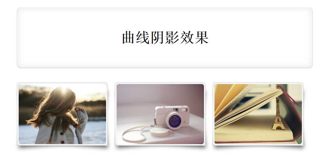
此时的效果为如下图:(只是简单的增加了圆角和一点阴影)
学完了css3中的变形和:before和:after,我们还可以增添如下代码:
//不满足之前的效果,我们还可以通过:before或是:after来增添效果
.sty:after , .sty:before{
	position: absolute;
		content: ‘‘;
		top: 50%;
		bottom: -1px;
		left: 10px;
		right: 10px;
		background:#fff;
		z-index: -1;
		box-shadow: 0 0 20px rgba(0,0,0,0.3);
}

.box li:before{
	position: absolute;
	content: ‘‘;
	width: 90%;
	height: 80%;
	left: 18px;
	bottom: 11px;
	z-index: -2;
	background: transparent;
	box-shadow: 0 8px 20px rgba(0,0,0,0.6);
	transform: skew(-12deg) rotate(-5deg);
}
.box li:after{
	position: absolute;
	content: ‘‘;
	width: 90%;
	height: 80%;
	left: 18px;
	bottom: 11px;
	z-index: -2;
	background: transparent;
	box-shadow: 0 8px 20px rgba(0,0,0,0.6);
	transform: skew(12deg) rotate(5deg);
}
最终显示结果为:
标签:
原文地址:http://www.cnblogs.com/foodoir/p/5851334.html