标签:
块级元素和行内元素:
1.块级元素总是单独占用一行,设置宽高有效,在没有设置宽高时,宽度将父元素左右撑满,高度依据本身里面的内容。
2.行内元素总是排成一行,设置宽高无效,大小为能够包容本身内容的最小宽高。
3.行内元素之间的水平margin取两者之和
4.块级元素之间的垂直margin取两者之最大值
5.IE中如果子元素的高度加上margin值超过了父元素的高度,父元素高度会自动扩大,但这是不合规范的。
6.行内元素的margin-top,margin-bottom,padding-top,padding-bottom无效,也就是该元素只能水平方向发生位移,垂直方向的位移由该行的最大line-height决定
float属性:
1.设置float的元素没有类型限制,块级元素或行内元素都可以
2.float设置为left或right,元素就会向父元素的左或有靠紧
3.盒子的宽度不再伸展,而是收缩,根据里面的内容的宽度确定
4.float的元素已经脱离标准文档流
5.float的元素自动变成inline-block元素
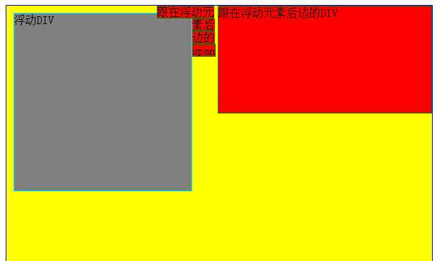
6.浮动元素之后的非浮动元素,如果是div元素,则div元素的背景,边框在浮动元素之下,内容不在下边,如果是span元素,则span元素在浮动元素上边

  <div style="width: 600px; height: 500px; border: solid 1px blue; ">
        <div style="float: left; width: 250px; height: 250px; border: solid 1px Aqua;  margin: 10px 0 0 10px;">
            浮动DIV
        </div>
        <div style=" border: solid 1px green; width: 300px; height: 150px;">
            跟在浮动元素后边的DIV
        </div>
        <span style=" border: solid 1px green; margin: 0 0 0 -50px;">跟在浮动元素后边的span</span>
  </div>
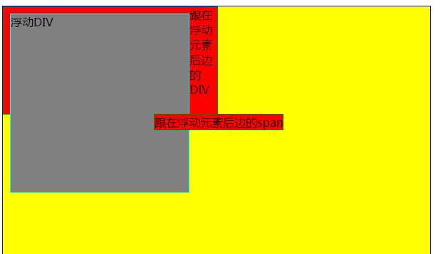
这个是IE <=7的例外情况
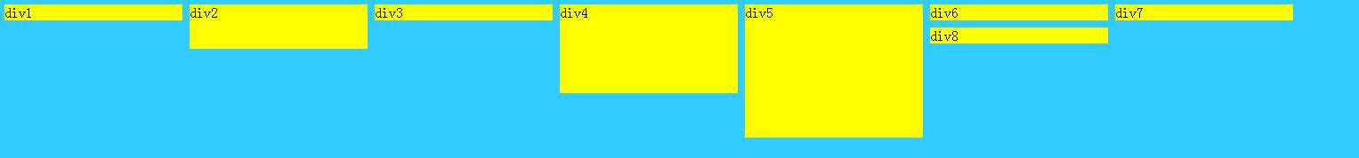
7.多个元素同方向浮动时,注意元素的高度影响浮动的效果
<!DOCTYPE html PUBLIC "-//W3C//DTD XHTML 1.0 Transitional//EN" "http://www.w3.org/TR/xhtml1/DTD/xhtml1-transitional.dtd">
<html xmlns="http://www.w3.org/1999/xhtml">
<head>
<meta http-equiv="Content-Type" content="text/html; charset=utf-8" />
<title>无标题文档</title>
<style>
    body{
        background-color:#3CF;
    }
    div{
        background-color:yellow;
        margin:4px;
        float:left;
        width:200px;
    }
    #div2{
        height:50px;
    }
    #div4{
        height:100px;
    }
    #div5{
        height:150px;
    }
</style>
</head>

<body>
    <div id="div1">div1</div>
    <div id="div2">div2</div>
    <div id="div3">div3</div>
    <div id="div4">div4</div>
    <div id="div5">div5</div>
    <div id="div6">div6</div>
    <div id="div7">div7</div>
    <div id="div8">div8</div>
</body>
</html>
8.元素脱离文档流,但该元素的内容仍在文档流中
(1)元素在脱离文档流就是说,float使html元素脱离文档流浮动起来,导致其后面的(在文档流中的)元素占据了float元素的原位置。
(2)内容仍然在文档流就是说,虽然承载内容的元素脱离了文档流,但是其内部内容(包括背景颜色)仍然在文档流中,后续的元素即使占据了该元素的位置,也要为了其中的内容留空间。
<!DOCTYPE html PUBLIC "-//W3C//DTD XHTML 1.0 Transitional//EN" "http://www.w3.org/TR/xhtml1/DTD/xhtml1-transitional.dtd">
<html xmlns="http://www.w3.org/1999/xhtml">
<head>
<meta http-equiv="Content-Type" content="text/html; charset=utf-8" />
<title>无标题文档</title>
</head>
<body>
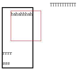
<div id="A" style="border:1px solid red; width:100px; height:100px;float:left;">hahahhhah</div>TTTTTTTTTTT
<div id="B" style="border:1px solid black; width:100px; height:200px;">rrrr<p>sss</p></div>
</body>
</html>
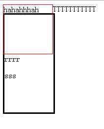
边框不会忽视浮动元素的文本,文本不会忽视浮动的元素的边框
<!DOCTYPE html PUBLIC "-//W3C//DTD XHTML 1.0 Transitional//EN" "http://www.w3.org/TR/xhtml1/DTD/xhtml1-transitional.dtd">
<html xmlns="http://www.w3.org/1999/xhtml">
<head>
<meta http-equiv="Content-Type" content="text/html; charset=utf-8" />
<title>无标题文档</title>
<style>

</style>
</head>

<body>
    <div  id="A" style="border:1px solid red; width:100px; height:100px;float:left;margin:30px;">hahahhhah</div>TTTTTTTTTTT
    <div  id="B" style="border:3px solid black; width:100px; height:200px;">rrrr<p>sss</p></div>
</body>
</html>
其他非浮动元素的位置是相对于浮动元素忽略外边距的初始位置定位的
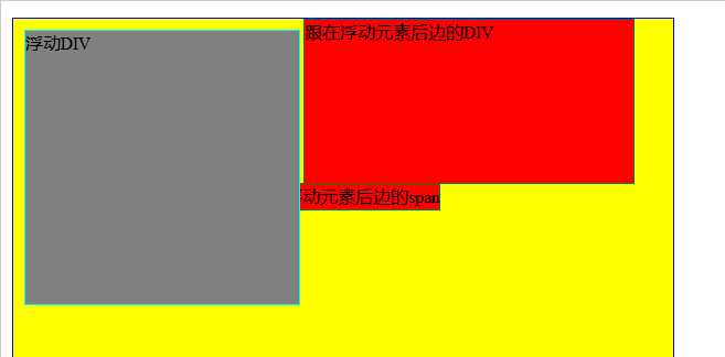
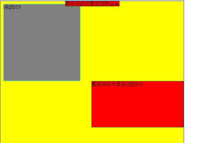
clear属性:
1.clear属性可设置为left,right,both;表示当前元素的左边,右边,左右不出现浮动元素
2.clear属性的设置要放到非浮动的盒子里,不要放到浮动盒子,对行内元素无效
3.既可以为盒元素设置float,同时也可以设置clear
<div style="width: 600px; height: 500px; border: solid 1px blue; ">
        <div style="float: left; width: 250px; height: 250px; border: solid 1px Aqua;  margin: 10px 0 0 10px;">
            浮动DIV
        </div>
        <div style=" border: solid 1px green; width: 300px; height: 150px;float:right;">
            跟在浮动元素后边的DIV
        </div>
        <span style=" border: solid 1px green; margin: 0 0 0 -50px;">跟在浮动元素后边的span</span>
</div>
<div style="width: 600px; height: 500px; border: solid 1px blue; ">
        <div style="float: left; width: 250px; height: 250px; border: solid 1px Aqua;  margin: 10px 0 0 10px;">
            浮动DIV
        </div>
        <div style=" border: solid 1px green; width: 300px; height: 150px;float:right;clear:left;">
            跟在浮动元素后边的DIV
        </div>
        <span style=" border: solid 1px green; margin: 0 0 0 -50px;">跟在浮动元素后边的span</span>
</div>
4.子元素都为浮动元素时,父元素的高度自适应问题
当所有的子元素都浮动时,就没有内容来撑开父元素了
<!DOCTYPE html PUBLIC "-//W3C//DTD XHTML 1.0 Transitional//EN" "http://www.w3.org/TR/xhtml1/DTD/xhtml1-transitional.dtd">
<html xmlns="http://www.w3.org/1999/xhtml">
<head>
<meta http-equiv="Content-Type" content="text/html; charset=utf-8" />
<title>无标题文档</title>
<style>
    body{
        margin:15px;
    }

    .father{
        padding:5px;
        background-color:#ffff99;
        border:2px solid black;
    }

    .father div{
        padding:10px;
        margin:15px;
        border:2px dashed black;
        background-color:#90baff;
    }

    .son1{
        float:left;
    }

    .son2{
        float:left;
    }

    .son3{
        float:left;
    }

    .father .clear{
        margin:0;
        padding:0;
        clear:both;
        border:0;
    }
</style>
</head>

<body>
    <div class="father">
        <div class="son1">Box-1</div>
        <div class="son2">Box-2</div>
        <div class="son3">Box-3<br />Box-3<br />Box-3</div>
        <div class="clear"></div>
    </div>
</body>
</html>
当son1,son2,son3都float时,它们脱离标准文档流而存在,父元素的范围是由标准流决定的和浮动内容无关。为了撑开父元素,可以再增加一个子元素,并且设定它的clear属性。
当然,为了撑开父元素,可以手动设置父元素的宽高,不过那样太死板了吧。
还有另外一种方法实现父元素自适应宽高:
<style>
    .clearfix:after{
        visibility: hidden;
        display: block;
        font-size: 0;
        content: ".";
        clear: both;
    }
</style>

 <div class="clearfix" style="border: 2px solid red;">
        <div style="float: left; width: 80px; height: 80px; border: 1px solid blue;">
            TEST DIV
        </div>
</div>
标签:
原文地址:http://www.cnblogs.com/bibiafa/p/5867915.html