标签:
我用的是chrome49,如果你用的不是。可以尝试换下浏览器前缀。IE在这方面的实现又特例独行了。不想提及…,这篇是为后续做准备。
background-image:-webkit-linear-gradient(red,blue);
或者
background-image: -webkit-gradient(linear,center top,center bottom,from(#ace),to(#f96));
#lol
{
width:300px;
height:400px;
border:1px solid black;
background-repeat:no-repeat;
}
<body>
<div id="lol"></div>
</body>
-webkit-linear-gradient( [<point> || <angle>,]? <stop>, <stop> [, <stop>]* ) ,这里有正则表达式的东西
[<point> || <angle>,]?是指[<point> || <angle>,]出现0个或1个,<point> || <angle>是指要么是<point> 要么是<angle>,综合在一起就是,要么出现<point>,要么出现<angle>,要么都不出现。
<stop>, <stop>是指必须要出现的。
[, <stop>]*是指出现0个或任意多个, <stop>
<point>为单个值时,有top、left、right、bottom,默认是top,当其为top时,就是从上到下的渐变,为left就是,从左到右的渐变,其余不一一列举
background-image:-webkit-linear-gradient(left,red,blue);
<point>为两个值时,第一参数有top、bottom,第二个参数是left、right,指定的是起点,如果为top left,即左上角,则它的终点是bottom right,即右下角。其余不一一列举
background-image:-webkit-linear-gradient(top left,red,blue);
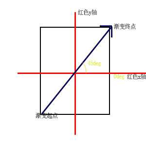
<angle>指的是角度,background-image:-webkit-linear-gradient(45deg,red,blue),如图所示:
<stop>必须有两个分别是起点和终点,
简单写法是只写颜色background-image:-webkit-linear-gradient(red,blue);等同于复杂写法background-image:-webkit-linear-gradient(red 0%,blue 100%),当然你可以指定非%的单位
第二个参数是指在什么地方插入颜色,全部不写的话可以这样算,不算起点和终点还剩x个点,x点将整个区域分x+1段,那么每段占100/(x+1), background-image:-webkit-linear-gradient(red,orange,blue),每段占50%,所以等同于background-image:-webkit-linear-gradient(red 0%,orange 50%,blue 100%)。不是全部不写和这个类似。
-webkit-gradient(<type>,<startPoint>,<endPoint>,<startColor>[,<color-stop>]*,<endColor>)
<type>指的是渐变类型,有linear和radial两种
<startPoint>指定起始点,需指定两个值,分别是水平,和垂直,水平有right(0%)、center(50%)、right(100%)、数值,垂直有top、center、bottom、数值。是基于div的长度和高度的。
<endPoint>指定终点,需指定两个值,分别是水平,和垂直,水平有left(0%)、center(50%)、right(100%)、数值,垂直有top、center、bottom、数值。是基于div的长度和高度的。
<startColor>指定起始颜色,列如:from(red),
[,<color-stop>]*,是指0个或多个,<color-stop>,<color-stop>写为color-stop(0.5,red),分别是位置和颜色
<endColor>指的终点颜色,列如:to(#f96)
background:-webkit-gradient(linear,center top,center bottom,from(#ace),color-stop(0.5,red),to(#f96));
相当于 background:-webkit-linear-gradient(top,#ace,red,#f96);
标签:
原文地址:http://www.cnblogs.com/resolvent/p/5937026.html