标签:定位 代码 尺寸 head icon ssi cal 1.2 css3
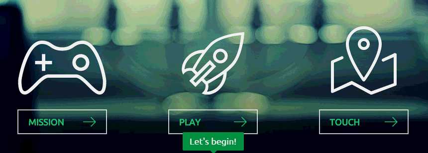
动画效果预览
网址:http://www.iuvo.si/
1.首先分析幽灵按钮动画用到的动画效果有旋转,放大,淡入淡出
1> 涉及 css3的 transform
rotate() 元素顺时针旋转
scale() 元素尺寸的放大或缩小
2> css3 过渡效果 transition
3> css 定位 position
left:距离左边多少,正值向右,负值向左
right:距离右边多少,正值向左,负值向右
top:距离顶部多少,正值向下,负值向上
bottom:距离底部多少,正值向上,负值向下
2.实现幽灵按钮的步骤
1> 页面元素布局
2> 添加图片并加入过渡效果
3> 设置按钮过渡效果
4> 设置顶部、底部线条效果
5> 设置左右线条动画效果
6> 优化效果,响应式
代码如下
html代码
<!doctype html>
<html lang="en">
<head>
	<meta charset="UTF-8">
	<title>Document</title>
	<link rel="stylesheet" href="css/style.css">
	<script src="js/jquery-1.8.3.min.js"></script>
	<script src="js/script.js"></script>
</head>
<body>
	<div class="box">
		<div class="link mission-link">
			<span class="icon animated"></span>
			<a class="button" data-title="My mission is clear">
			<span class="line line-top"></span>
			<span class="line line-right"></span>
			<span class="line line-bottom"></span>
			<span class="line line-left"></span>
			Mission
			</a>
		</div>
		<div class="link play-link">
			<span class="icon animated"></span>
			<a class="button" data-title="This is my playground">
			<span class="line line-top"></span>
			<span class="line line-right"></span>
			<span class="line line-bottom"></span>
			<span class="line line-left"></span>
			Play
			</a>
		</div>
		<div class="link touch-link">
			<span class="icon animated"></span>
			<a class="button" data-title="This is my playground demos">
			<span class="line line-top"></span>
			<span class="line line-right"></span>
			<span class="line line-bottom"></span>
			<span class="line line-left"></span>
			Touch
			</a>
		</div>
		<p class="tip"><em></em><span></span></p>
	</div>
</body>
</html>
css代码
*{margin:0;
  padding:0;}

body{background:#333;}

.box{width:800px;
     height:280px;
     margin:50px auto;
     overflow:hidden;}

.box .link{display:inline-block;
           width:205px;
           height:220px;
            margin:0 20px;
           position:relative;}

.link .icon{display:block;
            width:100%;
            height:180px;
            -moz-transition:ease-out 0.2s;
            -o-transition:ease-out 0.2s;
            -webkit-transition:ease-out 0.2s;
            transition:ease-out 0.2s;}

.link .icon:hover{transform:rotate(360deg) scale(1.2);
                  -moz-transform:rotate(360deg) scale(1.2);
                  -o-transform:rotate(360deg) scale(1.2);
                  -webkit-transform:rotate(360deg) scale(1.2);}

.mission-link .icon{background:url(../images/mission.png) no-repeat center 0;}

.play-link .icon{background:url(../images/play.png) no-repeat center 0;}

.touch-link .icon{background:url(../images/touch.png) no-repeat center 0;}

.button{display:block;
	      width:180px;
        height:50px;
        border:2px solid rgba(255,255,255,0.8);
        line-height:50px;
        padding-left:20px;
        box-sizing:border-box;
        -webkit-box-sizing:border-box;
        -o-box-sizing:border-box;
        -moz-box-sizing:border-box;
        margin:0 auto;
        font-weight:bold;
        font-size:18px;
        text-decoration:none;
        text-transform:uppercase;
        font-family:Arial;
        color:#2DCB70;
        background:url(../images/allow.png) no-repeat 130px center;
        -moz-transition:ease 0.4s;
        -o-transition:ease 0.4s;
        -webkit-transition:ease 0.4s;
        transition:ease 0.4s;
        position:relative;}

.button:hover{border:2px solid #fff;
              background-position:140px center;}

.button .line{position:absolute;
               background:none;
              -moz-transition:ease 0.4s;
              -o-transition:ease 0.4s;
              -webkit-transition:ease 0.4s;
              transition:ease 0.4s;}

.button:hover .line{background:#fff;}

.button .line-top{width:0px;
                  height:2px;
                  left:-110%;
                  top:-2px;}

.button:hover .line-top{width:100%;
                        left:-2px;}


.button .line-right{width:2px;
                    height:0px;
                    right:-2px;
                    top:-110%;}

.button:hover .line-right{height:100%;
                          top:-2px;}


.button .line-bottom{width:2px;
                     height:0px;
                     left:-2px;
                     bottom:-110%;}

.button:hover .line-bottom{height:100%;
                           bottom:-2px;}

.button .line-left{width:0px;
                   height:2px;
                   right:-110%;
                   bottom:-2px;}

.button:hover .line-left{width:100%;
                         right:-2px;}

.box .tip{position:absolute;
           padding:0px 14px;
           height:35px;
           line-height:35px;
           background:#2DCB70;
           color:#fff;
           top:160px;
           font-size:16px;
           font-weight:normal;
           text-transform:none;
           margin:0 auto;
           opacity:0;
           border-radius:3px}

.tip em{font-style:normal;}

.tip span{position:absolute;
          width:0;
          height:0;
          overflow:hidden;
          border:7px solid transparent;
          border-top-color:#2DCB70;
          left:50%;
          margin-left:-3px;
          bottom:-14px;}
js代码
$(function(){
    $(‘.link .button‘).hover(function(){
        var title=$(this).attr(‘data-title‘);
        $(‘.tip em‘).text(title);
        var pos=$(this).offset().left;
        var dis=($(‘.tip‘).outerWidth()-$(this).outerWidth())/2;
        var l=pos-dis;
        $(‘.tip‘).css({‘left‘:l+‘px‘}).animate({‘top‘:180,‘opacity‘:1},300);
    },function(){
        $(‘.tip‘).animate({‘top‘:160,‘opacity‘:0},300);
    })
})
以上
标签:定位 代码 尺寸 head icon ssi cal 1.2 css3
原文地址:http://www.cnblogs.com/jolee/p/5982480.html