标签:min www 地方 style img bsp 网上 div 复制粘贴
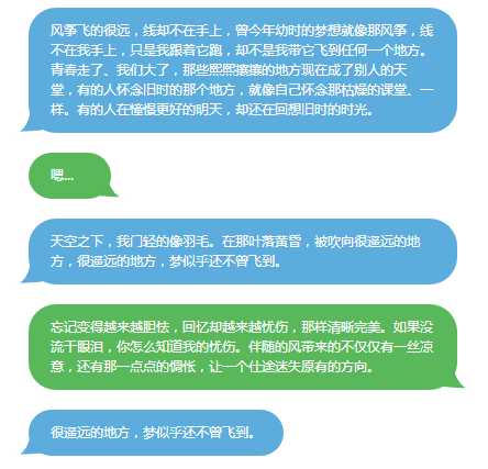
接着前面的学习,对话建立了,下面就写对话框气泡,和微信的差不多那种。尖角对话气泡网上一堆,圆尖角的修改了一个。IE8以下不能用,其他都可以用,直接上html代码,将<style>内容用到你的程序里面就能达到一样的效果,没用js文件,没用图片。强大的CSS3,真的很强大。
html代码
<style>
.Message_Left {
    width: auto;
    height: auto;
    margin-left: 200px;
    max-width:390px;
    min-width:90px;
    display:inline-block;
    *display:inline;
    background-color:#5cacdd;
    color: #fff;
    font-size: 12px;
    font-family: 微软雅黑;
    line-height: 18px;
    padding: 12px 20px 12px 20px;
    box-sizing: border-box;
    border-radius: 25px;
    position: relative;
    word-break: break-all;
}
.Message_Right {
    width: auto;
    height: auto;
    margin-left: 200px;
    max-width:390px;
    min-width:75px;
    display:inline-block;
    *display:inline;
    background-color: #59B859;
    color: #fff;
    font-size: 12px;
    font-family: 微软雅黑;
    line-height: 18px;
    padding: 12px 20px 12px 20px;
    box-sizing: border-box;
    border-radius: 25px;
    position: relative;
    word-break: break-all;
}


.Message_Left:before {
    content:"";
    position:absolute;
    z-index:-1;
    bottom:-1px;
    left:-37px;
    height:24px;
    border-right:50px solid #5cacdd;
    background:#5cacdd;
    -webkit-border-bottom-right-radius:90px 5px;
    -moz-border-radius-bottomright:90px 5px;
    border-bottom-right-radius:90px 5px ;
    -webkit-transform:translate(0, -2px);
    -moz-transform:translate(0, -2px);
    -ms-transform:translate(0, -2px);
    -o-transform:translate(0, -2px);
    transform:translate(0, -2px);
}
.Message_Left:after {
    content:"";
    position:absolute;
    z-index:-1;
    bottom:-2px;
    left:-8px;
    width:40px;
    height:25px;
    background:#fff;
    -webkit-border-bottom-right-radius:30px 50px;
    -moz-border-radius-bottomright:30px 50px;
    border-bottom-right-radius:30px 50px;
    -webkit-transform:translate(-30px, -2px);
    -moz-transform:translate(-30px, -2px);
    -ms-transform:translate(-30px, -2px);
    -o-transform:translate(-30px, -2px);
    transform:translate(-30px, -2px);
}


.Message_Right:before {
    content:"";
    position:absolute;
    z-index:-2;
    bottom:-1px;
    right:-45px;
    height:31px;
    border-left:60px solid #59B859;
    background:#59B859;
    -webkit-border-bottom-right-radius:80px 50px 0px 0px;
    -moz-border-radius-bottomright:80px 50px;
    border-bottom-left-radius:90px 5px ;
    -webkit-transform:translate(0, -2px);
    -moz-transform:translate(0, -2px);
    -ms-transform:translate(0, -2px);
    -o-transform:translate(0, -2px);
    transform:translate(0, -2px);
}
.Message_Right:after {
    content:"";
    position:absolute;
    z-index:-1;
    bottom:-2px;
    right:-95px;
    width:70px;
    height:32px;
    background:#fff;
    -webkit-border-bottom-right-radius:40px 50px 0px 0px;
    -moz-border-radius-bottomright:40px 50px;
    border-bottom-left-radius:30px 50px;
    -webkit-transform:translate(-30px, -2px);
    -moz-transform:translate(-30px, -2px);
    -ms-transform:translate(-30px, -2px);
    -o-transform:translate(-30px, -2px);
    transform:translate(-30px, -2px);
}


</style>

<body style=‘background-color:#fff‘>
<div class="Message_Left">
风筝飞的很远,线却不在手上,曾今年幼时的梦想就像那风筝,线不在我手上,只是我跟着它跑,却不是我带它飞到任何一个地方。
青春走了、我们大了,那些熙熙攘攘的地方现在成了别人的天堂,有的人怀念旧时的那个地方,就像自己怀念那枯燥的课堂、一样。有的人在憧憬更好的明天,却还在回想旧时的时光。
</div>

<br><br>

<div class="Message_Right">
嗯...
</div>

<br><br>

<div class="Message_Left">
天空之下,我门轻的像羽毛。在那叶落黄昏,被吹向很遥远的地方,很遥远的地方,梦似乎还不曾飞到。
</div>

<br><br>

<div class="Message_Right">
忘记变得越来越胆怯,回忆却越来越忧伤,那样清晰完美。如果没流干眼泪,你怎么知道我的忧伤。伴随的风带来的不仅仅有一丝凉意,还有那一点点的惆怅,让一个仕途迷失原有的方向。
</div>

<br><br>

<div class="Message_Left">
    很遥远的地方,梦似乎还不曾飞到。
</div>

</body>
直接复制粘贴成一个html文件就可以看到效果,不足的就是部分圆角不好设置透明,还得改改。
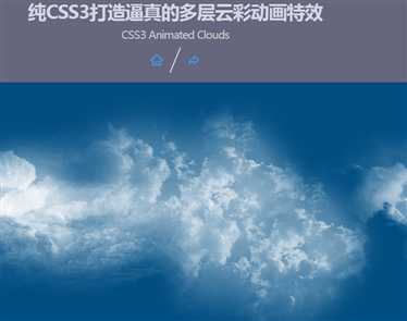
介绍个强大的css3代码,纯css3做的,动画的背景,看看:http://www.jb51.net/jiaoben/445132.html,演示地址:http://demo.jb51.net/js/2016/CSS3_dcyc/
这个当背景很不错,上面套一个半透明div,效果不错。没用js文件,就3张图片,只有1k大小,会飘动,会变天。
学习还在继续,通过写小程序学到了不少东西,差不多了打个包发上来。
标签:min www 地方 style img bsp 网上 div 复制粘贴
原文地址:http://www.cnblogs.com/qiaoke/p/6044827.html