标签:lan state pre text 解决 记录 事件 接下来 oat
转载请注明出处:http://www.cnblogs.com/landptf/p/6290810.html
今天给大家带来一个很简单但是很常用的控件ButtonExtendM,在开发中我们经常会用到图片加文字的组合控件,像这样:


以上图片都是从微信上截取的。(暂时没有找到icon在下,文字在上的例子)
下面我们通过一个控件来实现上下左右全部的样式,只需改动一个属性值即可改变icon的位置,是不是很方便,先看下demo效果图:
没错上图的三种不同的样式都是通过同一个控件实现的,下面我们看下代码
第一步 自定义属性
在res/values/目录下新建attrs.xml文件,
添加如下属性
 1 <attr name="backColor" format="color" />
 2     <attr name="backColorPress" format="color" />
 3     <attr name="textColor" format="color" />
 4     <attr name="textColorPress" format="color" />
 5
 6     <declare-styleable name="ButtonExtendM">
 7         <attr name="backColor"/>
 8         <attr name="backColorPress"/>
 9         <attr name="textColor"/>
10         <attr name="textColorPress"/>
11         <attr name="iconDrawable" format="reference" />
12         <attr name="iconDrawablePress" format="reference" />
13         <attr name="text" format="string" />
14         <attr name="textSize" format="float" />
15         <attr name="spacing" format="dimension" />
16         <attr name="style">
17             <enum name="iconLeft" value="0" />
18             <enum name="iconRight" value="1" />
19             <enum name="iconUp" value="2" />
20             <enum name="iconBottom" value="3" />
21         </attr>
22     </declare-styleable>
第二步 新建布局文件view_button_extend_m.xml
 1 <RelativeLayout xmlns:android="http://schemas.android.com/apk/res/android"
 2     android:layout_width="wrap_content"
 3     android:layout_height="wrap_content">
 4
 5     <ImageView
 6         android:id="@+id/iv_icon"
 7         android:layout_width="wrap_content"
 8         android:layout_height="wrap_content"/>
 9
10     <TextView
11         android:id="@+id/tv_content"
12         android:layout_width="wrap_content"
13         android:layout_height="wrap_content"
14         android:visibility="gone"
15         android:text="@string/button_extend_m_default_text"/>
16
17 </RelativeLayout>
第三步 新建ButtonExtendM.java继承RelativeLayout
  1 package com.landptf.view;
  2
  3 import android.content.Context;
  4 import android.content.res.ColorStateList;
  5 import android.content.res.TypedArray;
  6 import android.graphics.drawable.Drawable;
  7 import android.util.AttributeSet;
  8 import android.view.Gravity;
  9 import android.view.LayoutInflater;
 10 import android.view.MotionEvent;
 11 import android.view.View;
 12 import android.widget.ImageView;
 13 import android.widget.RelativeLayout;
 14 import android.widget.TextView;
 15
 16 import com.landptf.R;
 17 import com.landptf.util.ConvertM;
 18
 19 /**
 20  * Created by landptf on 2016/10/31.
 21  * 扩展Button,支持文字和icon分上下左右四种方式显示
 22  * 默认为左右结构,图片在左,文字在右
 23  */
 24 public class ButtonExtendM extends RelativeLayout {
 25     /**
 26      * 左右结构,图片在左,文字在右
 27      */
 28     public static final int STYLE_ICON_LEFT = 0;
 29     /**
 30      * 左右结构,图片在右,文字在左
 31      */
 32     public static final int STYLE_ICON_RIGHT = 1;
 33     /**
 34      * 上下结构,图片在上,文字在下
 35      */
 36     public static final int STYLE_ICON_UP = 2;
 37     /**
 38      * 上下结构,图片在下,文字在上
 39      */
 40     public static final int STYLE_ICON_DOWN = 3;
 41
 42     /**
 43      * 定义控件
 44      */
 45     private ImageView ivIcon;
 46     private TextView tvContent;
 47     /**
 48      * 上下文
 49      */
 50     private Context mContext;
 51     /**
 52      * View的背景色
 53      */
 54     private int backColor = 0;
 55     /**
 56      * View被按下时的背景色
 57      */
 58     private int backColorPress = 0;
 59     /**
 60      * icon的背景图片
 61      */
 62     private Drawable iconDrawable = null;
 63     /**
 64      * icon被按下时显示的背景图片
 65      */
 66     private Drawable iconDrawablePress = null;
 67     /**
 68      * View文字的颜色
 69      */
 70     private ColorStateList textColor = null;
 71     /**
 72      * View被按下时文字的颜色
 73      */
 74     private ColorStateList textColorPress = null;
 75     /**
 76      * 两个控件之间的间距,默认为8dp
 77      */
 78     private int spacing = 8;
 79     /**
 80      * 两个控件的位置结构
 81      */
 82     private int mStyle = STYLE_ICON_LEFT;
 83     /**
 84      * 标示onTouch方法的返回值,用来解决onClick和onTouch冲突问题
 85      */
 86     private boolean isCost = true;
 87
 88     private OnClickListener onClickListener = null;
 89
 90     public interface OnClickListener {
 91         void onClick(View v);
 92     }
 93
 94     /**
 95      * 设置View的Click事件
 96      *
 97      * @param l
 98      */
 99     public void setOnClickListener(OnClickListener l) {
100         this.onClickListener = l;
101         isCost = false;
102     }
103
104     public ButtonExtendM(Context context) {
105         super(context);
106         mContext = context;
107     }
108
109     public ButtonExtendM(Context context, AttributeSet attrs) {
110         this(context, attrs, 0);
111     }
112
113     public ButtonExtendM(Context context, AttributeSet attrs, int defStyle) {
114         super(context, attrs, defStyle);
115         mContext = context;
116         init(context, attrs, defStyle);
117
118     }
119
120     private void init(Context context, AttributeSet attrs, int defStyle) {
121         //加载布局
122         LayoutInflater.from(context).inflate(R.layout.view_button_extend_m, this, true);
123         //初始化控件
124         ivIcon = (ImageView) findViewById(R.id.iv_icon);
125         tvContent = (TextView) findViewById(R.id.tv_content);
126         setGravity(Gravity.CENTER);
127         TypedArray a = getContext().obtainStyledAttributes(
128                 attrs, R.styleable.ButtonExtendM, defStyle, 0);
129         if (a != null) {
130             //设置背景色
131             ColorStateList colorList = a.getColorStateList(R.styleable.ButtonExtendM_backColor);
132             if (colorList != null) {
133                 backColor = colorList.getColorForState(getDrawableState(), 0);
134                 if (backColor != 0) {
135                     setBackgroundColor(backColor);
136                 }
137             }
138             //记录View被按下时的背景色
139             ColorStateList colorListPress = a.getColorStateList(R.styleable.ButtonExtendM_backColorPress);
140             if (colorListPress != null) {
141                 backColorPress = colorListPress.getColorForState(getDrawableState(), 0);
142             }
143             //设置icon
144             iconDrawable = a.getDrawable(R.styleable.ButtonExtendM_iconDrawable);
145             if (iconDrawable != null) {
146                 ivIcon.setImageDrawable(iconDrawable);
147             }
148             //记录View被按下时的icon的图片
149             iconDrawablePress = a.getDrawable(R.styleable.ButtonExtendM_iconDrawablePress);
150             //设置文字的颜色
151             textColor = a.getColorStateList(R.styleable.ButtonExtendM_textColor);
152             if (textColor != null) {
153                 tvContent.setTextColor(textColor);
154             }
155             //记录View被按下时文字的颜色
156             textColorPress = a.getColorStateList(R.styleable.ButtonExtendM_textColorPress);
157             //设置显示的文本内容
158             String text = a.getString(R.styleable.ButtonExtendM_text);
159             if (text != null) {
160                 //默认为隐藏的,设置文字后显示出来
161                 tvContent.setVisibility(VISIBLE);
162                 tvContent.setText(text);
163             }
164             //设置文本字体大小
165             float textSize = a.getFloat(R.styleable.ButtonExtendM_textSize, 0);
166             if (textSize != 0) {
167                 tvContent.setTextSize(textSize);
168             }
169             //设置两个控件之间的间距
170             spacing = a.getDimensionPixelSize(R.styleable.ButtonExtendM_spacing, ConvertM.dp2px(context, 8));
171             //设置两个控件的位置结构
172             mStyle = a.getInt(R.styleable.ButtonExtendM_style, 0);
173             setIconStyle(mStyle);
174             a.recycle();
175         }
176
177         setOnTouchListener(new OnTouchListener() {
178             @Override
179             public boolean onTouch(View arg0, MotionEvent event) {
180                 //根据touch事件设置按下抬起的样式
181                 return setTouchStyle(event.getAction());
182             }
183         });
184
185         setOnClickListener(new View.OnClickListener() {
186             @Override
187             public void onClick(View v) {
188                 if (onClickListener != null) {
189                     onClickListener.onClick(v);
190                 }
191             }
192         });
193     }
194
195     /**
196      * 根据按下或者抬起来改变背景和文字样式
197      *
198      * @param state
199      * @return isCost
200      */
201     private boolean setTouchStyle(int state) {
202         if (state == MotionEvent.ACTION_DOWN) {
203             if (backColorPress != 0) {
204                 setBackgroundColor(backColorPress);
205             }
206             if (iconDrawablePress != null) {
207                 ivIcon.setImageDrawable(iconDrawablePress);
208             }
209             if (textColorPress != null) {
210                 tvContent.setTextColor(textColorPress);
211             }
212         }
213         if (state == MotionEvent.ACTION_UP) {
214             if (backColor != 0) {
215                 setBackgroundColor(backColor);
216             }
217             if (iconDrawable != null) {
218                 ivIcon.setImageDrawable(iconDrawable);
219             }
220             if (textColor != null) {
221                 tvContent.setTextColor(textColor);
222             }
223         }
224         return isCost;
225     }
226
227     /**
228      * 设置图标位置
229      * 通过重置LayoutParams来设置两个控件的摆放位置
230      * @param style
231      */
232     public void setIconStyle(int style) {
233         mStyle = style;
234         RelativeLayout.LayoutParams lp;
235         switch (style) {
236             case STYLE_ICON_LEFT:
237                 lp = new RelativeLayout.LayoutParams(LayoutParams.WRAP_CONTENT, LayoutParams.WRAP_CONTENT);
238                 lp.addRule(RelativeLayout.CENTER_VERTICAL);
239                 ivIcon.setLayoutParams(lp);
240                 lp = new RelativeLayout.LayoutParams(LayoutParams.WRAP_CONTENT, LayoutParams.WRAP_CONTENT);
241                 lp.addRule(RelativeLayout.CENTER_VERTICAL);
242                 lp.addRule(RelativeLayout.RIGHT_OF, ivIcon.getId());
243                 lp.leftMargin = spacing;
244                 tvContent.setLayoutParams(lp);
245                 break;
246             case STYLE_ICON_RIGHT:
247                 lp = new RelativeLayout.LayoutParams(LayoutParams.WRAP_CONTENT, LayoutParams.WRAP_CONTENT);
248                 lp.addRule(RelativeLayout.CENTER_VERTICAL);
249                 tvContent.setLayoutParams(lp);
250                 lp = new RelativeLayout.LayoutParams(LayoutParams.WRAP_CONTENT, LayoutParams.WRAP_CONTENT);
251                 lp.addRule(RelativeLayout.CENTER_VERTICAL);
252                 lp.addRule(RelativeLayout.RIGHT_OF, tvContent.getId());
253                 lp.leftMargin = spacing;
254                 ivIcon.setLayoutParams(lp);
255                 break;
256             case STYLE_ICON_UP:
257                 lp = new RelativeLayout.LayoutParams(LayoutParams.WRAP_CONTENT, LayoutParams.WRAP_CONTENT);
258                 lp.addRule(RelativeLayout.CENTER_HORIZONTAL);
259                 ivIcon.setLayoutParams(lp);
260                 lp = new RelativeLayout.LayoutParams(LayoutParams.WRAP_CONTENT, LayoutParams.WRAP_CONTENT);
261                 lp.addRule(RelativeLayout.CENTER_HORIZONTAL);
262                 lp.addRule(RelativeLayout.BELOW, ivIcon.getId());
263                 lp.leftMargin = spacing;
264                 tvContent.setLayoutParams(lp);
265                 break;
266             case STYLE_ICON_DOWN:
267                 lp = new RelativeLayout.LayoutParams(LayoutParams.WRAP_CONTENT, LayoutParams.WRAP_CONTENT);
268                 lp.addRule(RelativeLayout.CENTER_HORIZONTAL);
269                 tvContent.setLayoutParams(lp);
270                 lp = new RelativeLayout.LayoutParams(LayoutParams.WRAP_CONTENT, LayoutParams.WRAP_CONTENT);
271                 lp.addRule(RelativeLayout.CENTER_HORIZONTAL);
272                 lp.addRule(RelativeLayout.BELOW, tvContent.getId());
273                 lp.leftMargin = spacing;
274                 ivIcon.setLayoutParams(lp);
275                 break;
276             default:
277                 break;
278         }
279     }
280
281     /**
282      * 设置View的背景色
283      *
284      * @param backColor
285      */
286     public void setBackColor(int backColor) {
287         this.backColor = backColor;
288         setBackgroundColor(backColor);
289     }
290
291     /**
292      * 设置View被按下时的背景色
293      *
294      * @param backColorPress
295      */
296     public void setBackColorPress(int backColorPress) {
297         this.backColorPress = backColorPress;
298     }
299
300     /**
301      * 设置icon的图片
302      *
303      * @param iconDrawable
304      */
305     public void setIconDrawable(Drawable iconDrawable) {
306         this.iconDrawable = iconDrawable;
307         ivIcon.setImageDrawable(iconDrawable);
308     }
309
310     /**
311      * 设置View被按下时的icon的图片
312      *
313      * @param iconDrawablePress
314      */
315     public void setIconDrawablePress(Drawable iconDrawablePress) {
316         this.iconDrawablePress = iconDrawablePress;
317     }
318
319     /**
320      * 设置文字的颜色
321      *
322      * @param textColor
323      */
324     public void setTextColor(int textColor) {
325         if (textColor == 0) return;
326         this.textColor = ColorStateList.valueOf(textColor);
327         tvContent.setTextColor(this.textColor);
328     }
329
330     /**
331      * 设置View被按下时文字的颜色
332      *
333      * @param textColorPress
334      */
335     public void setTextColorPress(int textColorPress) {
336         if (textColorPress == 0) return;
337         this.textColorPress = ColorStateList.valueOf(textColorPress);
338     }
339
340     /**
341      * 设置显示的文本内容
342      *
343      * @param text
344      */
345     public void setText(CharSequence text) {
346         //默认为隐藏的,设置文字后显示出来
347         tvContent.setVisibility(VISIBLE);
348         tvContent.setText(text);
349     }
350
351     /**
352      * 获取显示的文本
353      *
354      * @return
355      */
356     public String getText() {
357         return tvContent.getText().toString();
358     }
359
360     /**
361      * 设置文本字体大小
362      *
363      * @param size
364      */
365     public void setTextSize(float size) {
366         tvContent.setTextSize(size);
367     }
368
369     /**
370      * 设置两个控件之间的间距
371      *
372      * @param spacing
373      */
374     public void setSpacing(int spacing) {
375         this.spacing = ConvertM.dp2px(mContext, spacing);
376         //设置完成后刷新一下两个控件的结构,避免先执行了setIconStyle后,setSpacing不生效
377         setIconStyle(mStyle);
378     }
379
380 }
代码注释基本可以看懂具体的实现,接下来主要看下如何使用
在layout里直接引用ButtonExtendM即可,注意要添加
xmlns:landptf="http://schemas.android.com/apk/res-auto"
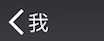
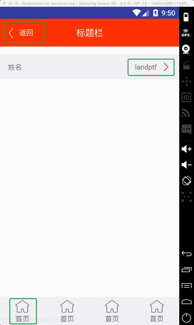
 1 <com.landptf.view.ButtonExtendM
 2     android:id="@+id/bem_back"
 3     android:layout_width="wrap_content"
 4     android:layout_height="wrap_content"
 5     android:layout_centerVertical="true"
 6     android:layout_marginLeft="8dp"
 7     landptf:iconDrawable="@drawable/title_back"
 8     landptf:iconDrawablePress="@drawable/title_back_selected"
 9     landptf:textColor="@android:color/white"
10     landptf:spacing="4dp"
11     landptf:text="返回"/>
这个是实现的菜单栏的返回按钮,左右结构,icon在左为默认样式,注意一下*Press的属性,主要是用来设置控件被按下后的效果的。
再来看一个上下结构的
1 <com.landptf.view.ButtonExtendM
2     android:layout_width="0dp"
3     android:layout_height="match_parent"
4     android:layout_weight="1"
5     landptf:iconDrawable="@drawable/icon_home_page"
6     landptf:text="首页"
7     landptf:style="iconUp" />
只需要设置landptf:style即可,同时也可以通过java代码实现
setIconStyle(ButtonExtendM.STYLE_ICON_UP)
全部代码已托管到开源中国的码云上,欢迎下载,地址:https://git.oschina.net/landptf/landptf.git
Android自定义控件系列(二)—icon+文字的多种效果实现
标签:lan state pre text 解决 记录 事件 接下来 oat
原文地址:http://www.cnblogs.com/landptf/p/6290810.html