标签:sel hose equal 技术 https 通过 uri mod art
Window.devicePixelRatio
This read-only property returns the ratio of the resolution in physical pixels to the resolution in CSS pixels for the current display device.
该值为分辨率之间的比,不是直接比较像素。分辨率是指单位英寸内像素数,类似于PPI。
pc端浏览器中dpr的值都为1,所以css中1px的元素在屏幕中占据1物理像素。
但在手机端,因为高分屏的出现,物理像素和css逻辑像素并不是1比1的关系。比如iPhone5中的dpr为2,就是2个物理像素对应1个逻辑像素。
另外缩放也会改变这种对应关系。
viewport
The width of the <html> element is restricted by the width of the viewport. The <html> element takes 100% of the width of that viewport.The viewport, in turn, is exactly equal to the browser window: it’s been defined as such.(html的宽度由viewport的宽度决定)
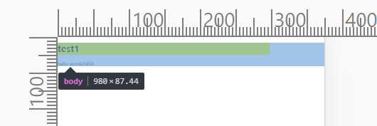
document.documentElement.clientWidth,gives the dimensions of the viewport, and not of the <html> element。 获取浏览器可视窗口的宽度(如果有滚动条时,不含滚动条的宽度)。
screen.width:屏幕的尺寸大小。You’re not interested in the physical size of the screen, but in how many CSS pixels currently fit on it.
Media queries:针对不同尺寸的元素使用不同的样式。
Web developers are not interested in the device width; it’s the width of the browser window that counts.So use width and forget device-width — on desktop.
手机端
Mobile browser vendors want to offer their
clients the best possible experience, which right now means “as much like
desktop as possible.” That,
however, requires viewport to be split into two: the visual viewport and the
layout viewport. (为了能在移动设备上正常显示pc浏览器上的网站内容,引进了虚拟的layout viewport的概念。)
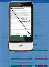
The visual viewport is the
part of the page that’s currently shown on-screen. The user may scroll to change
the part of the page he sees, or zoom to change the size of the visual
viewport.
How wide is the layout viewport? That differs
per browser. Safari iPhone uses 980px, Opera 850px, Android WebKit 800px, and
IE 974px. 所以pc页面的内容也能在手机上浏览,只是会缩的很小。
You can change the orientation of the frame(visual viewport), but the size and
shape of the large image (layout viewport) never changes.
Zooming
Many mobile browsers initially show any page in fully zoomed-out mode. Most browsers zoom out to show the entire layout viewport on the screen. browsers have chosen their dimensions of the layout viewport such that it completely covers the screen in fully zoomed-out mode (and is thus equal to the visual viewport). Thus the width and the height of the layout viewport are equal to whatever can be shown on the screen in the maximally zoomed-out mode. When the user zooms in these dimensions stay the same.
Measuring the visual viewport
visual viewport, it is measured by window.innerWidth/Height,it shows how many CSS pixels currently fit on the screen.
Obviously the measurements change when the user zooms out or in, since more or
fewer CSS pixels fit into the screen.
Event coordinates
pageX/Y is still relative to the page in CSS pixels.
screenX/Y is relative to the screen in device pixels,
this is the same reference that clientX/Y uses, and device pixels are useless.

Meta viewport
<meta
name="viewport" content="width=320">
It is meant to resize the layout viewport. 因为移动端默认的layout viewport比visual viewport大,所以通过meta标签控制layout viewport的属性达到更好的显示效果。
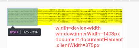
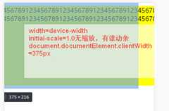
当设置width=device-width时,layout viewport就和visual viewport一样宽,但是屏幕会缩放到一定比率以显示所有内容。
缩放(zoom)和移动操作控制的是visual viewport;
layout viewport一旦初始化好后,就不会再变;可以通过meta标签的属性控制layout viewport。
苹果6的显示效果(通过chrome测试时自动刷新常有问题,最好点击Toggle device toolbar查看)
苹果6的dpr为2,物理分辨率为1334*750,所以visual viewport内宽可以显示375个css像素。
没有设置meta时,safari默认的layout viewport为980px,若页面的宽度小于layout viewport的宽度,则显示980px。否则safari会不断缩小(zoom out)页面直到全部layout viewport在visual point中显示为止。
如果设置width而设定initail-scale的话,会缩放到合适比例,没有滚动条。
如果再设置initial-scale=1.0,则不会进行缩放,会产生滚动条,通过移动来显示全部内容:如下
摘自A tale of two viewports,对相关概念介绍的非常清楚。
标签:sel hose equal 技术 https 通过 uri mod art
原文地址:http://www.cnblogs.com/kevin2chen/p/6833013.html