标签:logs abs list infinite top pos float border relative
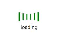
HTML:
<!DOCTYPE html>
<html lang="en">
<head>
    <meta charset="UTF-8">
    <title>loading</title>
</head>
<body>
    <div>
        <ul>
            <li></li>
            <li></li>
            <li></li>
            <li></li>
            <li></li>
            <li></li>
        </ul>
        <p>loading</p>
    </div>
</body>
</html>
CSS:
    <style>
        * { margin: 0; padding: 0; list-style: none; }
        div { width: 85px; height: 70px; margin: 50px auto; }
        ul { width: 85px; height: 50px; }
        li { width: 8px; height: 50px; background-color: green; float: left; margin-left: 5px; animation: loading 1.2s ease-in-out infinite; }
        p { text-align: center; vertical-align: middle; }

        li:nth-of-type(1) {
            animation-delay: -1.1s;
        }
        li:nth-of-type(2) {
            animation-delay: -1s;
        }
        li:nth-of-type(3) {
            animation-delay: -0.9s;
        }
        li:nth-of-type(4) {
            animation-delay: -0.8s;
        }
        li:nth-of-type(5) {
            animation-delay: -0.7s;
        }
        li:nth-of-type(6) {
            animation-delay: -0.6s;
        }
        @keyframes loading {
            0%,100% { transform: scaleY(1); }
            50% { transform: scale(.4); }
        }
    </style>

HTML:
<!DOCTYPE html>
<html>
    <head>
        <meta charset="UTF-8">
        <title></title>

    </head>
    <body>
        <div>
            <div></div>
            <img src="img/bg.jpg" alt="">
        </div>
    </body>
</html>
css:
        <style type="text/css">

            div { width: 200px; height: 200px; border-radius: 50%; position: relative; margin: 100px auto; background-color: black; }

            div > * { top: 0; right: 0; bottom: 0; left: 0; margin: auto; }

            div > div { width: 95%; height: 95%; border: 5px #333     solid; border-radius: 50%; border-top-color: #eee; background-size: 100%; transform: rotateZ(0deg); position: absolute; }

            img { width: 95%; height: 95%; border-radius: 50%; position: absolute; opacity: 1; }

            div:hover div { animation: rotate 1s linear infinite; }
            div:hover img { opacity: .6; }
            @keyframes rotate {
                0% { transform: rotateZ(0deg); }
                25% { transform: rotateZ(90deg); }
                50% { transform: rotateZ(180deg); }
                75% { transform: rotateZ(270deg); }
                100% { transform: rotateZ(360deg); }
            }
        </style>
标签:logs abs list infinite top pos float border relative
原文地址:http://www.cnblogs.com/Glunefish/p/6869726.html