标签:int images color img hidden 显示效果 parent alt 饼状图
1.利用边框制作正方形
如果将盒容器的width和height设置为0,并为每条边设置一个较粗的width值和彼此不同的颜色,最终会得到四个被拼接在一起三角形,它们分别指向不同的颜色。
html代码:<div id="square">11</div>
css3代码:
#square{
width:0;
height:0;
border-width:100px;
border-style:solid;
border-color: red blue green yellow;
line-height:99em;
overflow:hidden;
cursor:pointer;
margin: 30px auto;
}
显示效果:
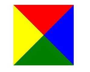
由图可见,四个三角形指向不同方向。
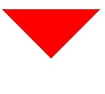
2.当我们对四个三角形的其中三个设置颜色为透明即transparent,即可得到一个三角形
html:
<div id="triangle">11</div>
css:
#triangle{
width:0;
height:0;
border-width:100px;
border-style:solid;
border-color:red transparent transparent transparent;
line-height:99em;
overflow:hidden;
cursor:pointer;
margin: 30px auto;
}
效果:
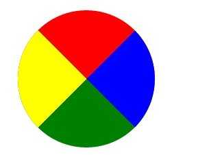
3.大家应该知道css3中引入了圆角属性(border-radius),一旦设置这个值,边框即会出现圆角。同样,我们对正方形设置圆角,即可得到饼状图
html:<div id="circle">11</div>
css:
#circle{
width:0;
height:0;
border-radius:100px;
border-width:100px;
border-style:solid;
border-color: red blue green yellow;
line-height:99em;
overflow:hidden;
cursor:pointer;
margin: 30px auto;
}
效果:
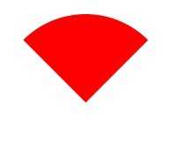
4.同样我们对其中三个边框设置透明色即可得到扇形
html:<div id="fan">11</div>
css:
#fan{
width:0;
height:0;
border-radius:100px;
border-width:100px;
border-style:solid;
border-color:red transparent transparent transparent;
line-height:99em;
overflow:hidden;
cursor:pointer;
margin: 30px auto;
}
效果:
标签:int images color img hidden 显示效果 parent alt 饼状图
原文地址:http://www.cnblogs.com/HanselHblog/p/6896833.html