标签:point art print axis asi color pen navigate using
1. Matplotlib
Backend Layer
Artist Layer
Scripting Layer
Matplotlib‘s pyplot is an example of a precedural method for building visualizations, we tell the underlying software which drawing acions we want it to take.
while SVG, HTML are declarative methods of creating and representing graphical interfaces.
visualizations
2. Basic plots
Using the scripting layer:
Pyplot is going to retrieve the current figure with the function gcf and then get the current axis with the function gca.
Pyplot is keeping track of the axis objects for you.
Pyplot is just morrors the API of the axis objects, you can use the pyplot to plot or calling the axis plot functions underneath.
import matplotlib.pyplot as plt
%matplotlib notebook
# create a new figure
plt.figure()

# plot the point (3,2) using the circle marker
plt.plot(3, 2, ‘o‘)

# get the current axes
ax = plt.gca()

# Set axis properties [xmin, xmax, ymin, ymax]
ax.axis([0,6,0,10])

# get all the child objects the axes contains
ax.get_children()
Output:

Directly using the backend:
 1 # First let‘s set the backend without using mpl.use() from the scripting layer
 2 from matplotlib.backends.backend_agg import FigureCanvasAgg
 3 from matplotlib.figure import Figure
 4
 5 # create a new figure
 6 fig = Figure()
 7
 8 # associate fig with the backend
 9 canvas = FigureCanvasAgg(fig)
10
11 # add a subplot to the fig
12 ax = fig.add_subplot(111)
13
14 # plot the point (3,2)
15 ax.plot(3, 2, ‘.‘)
16
17 # save the figure to test.png
18 # you can see this figure in your Jupyter workspace afterwards by going to
19 # https://hub.coursera-notebooks.org/
20 canvas.print_png(‘test.png‘)
3. Scatter plot
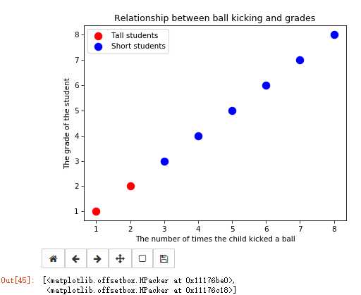
 1 import matplotlib.pyplot as plt
 2 %matplotlib notebook
 3
 4 plt.figure()
 5 # plot a data series ‘Tall students‘ in red using the first two elements of x and y
 6 plt.scatter(x[:2], y[:2], s=100, c=‘red‘, label=‘Tall students‘)
 7 # plot a second data series ‘Short students‘ in blue using the last three elements of x and y
 8 plt.scatter(x[2:], y[2:], s=100, c=‘blue‘, label=‘Short students‘)
 9
10 # add a label to the x axis
11 plt.xlabel(‘The number of times the child kicked a ball‘)
12 # add a label to the y axis
13 plt.ylabel(‘The grade of the student‘)
14 # add a title
15 plt.title(‘Relationship between ball kicking and grades‘)
16 # add the legend to loc=4 (the lower right hand corner), also gets rid of the frame and adds a title
17 plt.legend(loc=4, frameon=False, title=‘Legend‘)
18 # get children from current axes (the legend is the second to last item in this list)
19 plt.gca().get_children()
20 # get the legend from the current axes
21 legend = plt.gca().get_children()[-2]
22 # you can use get_children to navigate through the child artists
23 legend.get_children()[0].get_children()[1].get_children()[0].get_children()
Output:
Cycling throught all the children of the legend artist
 1 # import the artist class from matplotlib
 2 from matplotlib.artist import Artist
 3
 4 def rec_gc(art, depth=0):
 5     if isinstance(art, Artist):
 6         # increase the depth for pretty printing
 7         print("  " * depth + str(art))
 8         for child in art.get_children():
 9             rec_gc(child, depth+2)
10
11 # Call this function on the legend artist to see what the legend is made up of
12 rec_gc(plt.legend())
Output:

 1 Legend
 2     <matplotlib.offsetbox.VPacker object at 0x0000000011400208>
 3         <matplotlib.offsetbox.TextArea object at 0x00000000110BDF98>
 4             Text(0,0,u‘None‘)
 5         <matplotlib.offsetbox.HPacker object at 0x00000000110BD710>
 6             <matplotlib.offsetbox.VPacker object at 0x00000000110BDEB8>
 7                 <matplotlib.offsetbox.HPacker object at 0x00000000110BDF28>
 8                     <matplotlib.offsetbox.DrawingArea object at 0x00000000110BD908>
 9                         <matplotlib.collections.PathCollection object at 0x00000000110BDA58>
10                     <matplotlib.offsetbox.TextArea object at 0x00000000110BD748>
11                         Text(0,0,u‘Tall students‘)
12                 <matplotlib.offsetbox.HPacker object at 0x00000000110BDF60>
13                     <matplotlib.offsetbox.DrawingArea object at 0x00000000110BDCF8>
14                         <matplotlib.collections.PathCollection object at 0x00000000110BDE48>
15                     <matplotlib.offsetbox.TextArea object at 0x00000000110BDAC8>
16                         Text(0,0,u‘Short students‘)
17     FancyBboxPatch(0,0;1x1)
3. Line plots
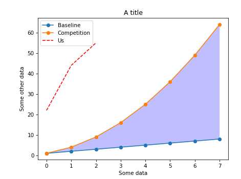
 1 import numpy as np
 2
 3 linear_data = np.array([1,2,3,4,5,6,7,8])
 4 exponential_data = linear_data**2
 5
 6 plt.figure()
 7 # plot the linear data and the exponential data
 8 plt.plot(linear_data, ‘-o‘, exponential_data, ‘-o‘)
 9 # plot another series with a dashed red line
10 plt.plot([22,44,55], ‘--r‘)
11 plt.xlabel(‘Some data‘)
12 plt.ylabel(‘Some other data‘)
13 plt.title(‘A title‘)
14 # add a legend with legend entries (because we didn‘t have labels when we plotted the data series)
15 plt.legend([‘Baseline‘, ‘Competition‘, ‘Us‘])
16 # fill the area between the linear data and exponential data
17 plt.gca().fill_between(range(len(linear_data)),
18                        linear_data, exponential_data,
19                        facecolor=‘blue‘,
20                        alpha=0.25)
Output:
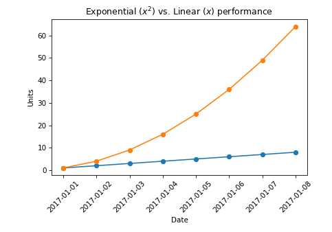
And the second example
 1 import pandas as pd
 2 import numpy as np
 3
 4 plt.figure()
 5 observation_dates = np.arange(‘2017-01-01‘, ‘2017-01-09‘, dtype=‘datetime64[D]‘)
 6 observation_dates = list(map(pd.to_datetime, observation_dates)) # convert the map to a list to get rid of the error
 7 plt.plot(observation_dates, linear_data, ‘-o‘,  observation_dates, exponential_data, ‘-o‘)
 8 x = plt.gca().xaxis
 9
10 # rotate the tick labels for the x axis
11 for item in x.get_ticklabels():
12     item.set_rotation(45)
13     # adjust the subplot so the text doesn‘t run off the image
14 plt.subplots_adjust(bottom=0.25)
15 ax = plt.gca()
16 ax.set_xlabel(‘Date‘)
17 ax.set_ylabel(‘Units‘)
18 # you can add mathematical expressions in any text element
19 ax.set_title("Exponential ($x^2$) vs. Linear ($x$) performance")
Output:
4. Bar plot
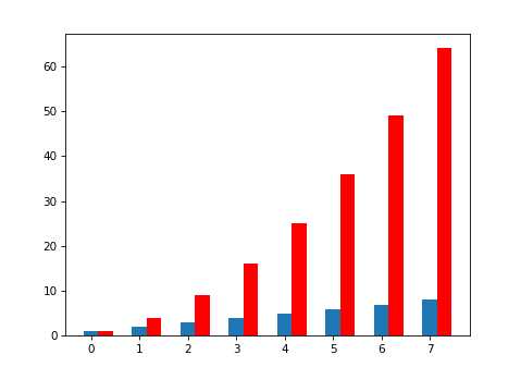
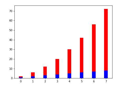
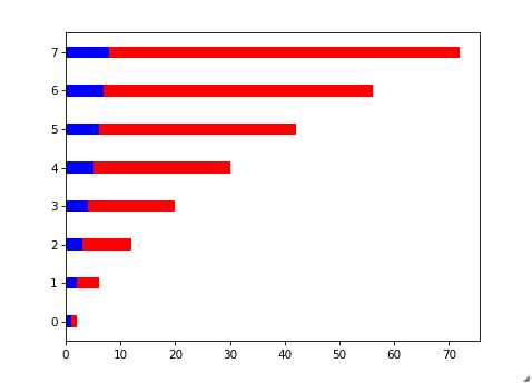
 1 import numpy as np
 2 import pandas as pd
 3
 4 linear_data = np.array([1,2,3,4,5,6,7,8])
 5 exponential_data = linear_data**2
 6
 7 plt.figure()
 8 xvals = range(len(linear_data))
 9 plt.bar(xvals, linear_data, width = 0.3)
10
11 new_xvals = []
12 # plot another set of bars, adjusting the new xvals to make up for the first set of bars plotted
13 for item in xvals:
14     new_xvals.append(item+0.3)
15
16 plt.bar(new_xvals, exponential_data, width = 0.3 ,color=‘red‘)
17
18 # This will plot a new set of bars with errorbars using the list of random error values
19 #plt.bar(xvals, linear_data, width = 0.3, yerr=linear_err)
20 # stacked bar charts are also possible
21 plt.figure()
22 xvals = range(len(linear_data))
23 plt.bar(xvals, linear_data, width = 0.3, color=‘b‘)
24 plt.bar(xvals, exponential_data, width = 0.3, bottom=linear_data, color=‘r‘)
25
26 # or use barh for horizontal bar charts
27 plt.figure()
28 xvals = range(len(linear_data))
29 plt.barh(xvals, linear_data, height = 0.3, color=‘b‘)
30 plt.barh(xvals, exponential_data, height = 0.3, left=linear_data, color=‘r‘)
Output:
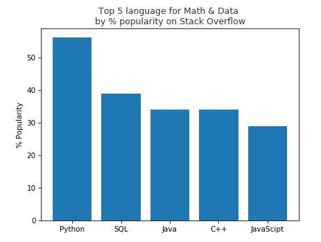
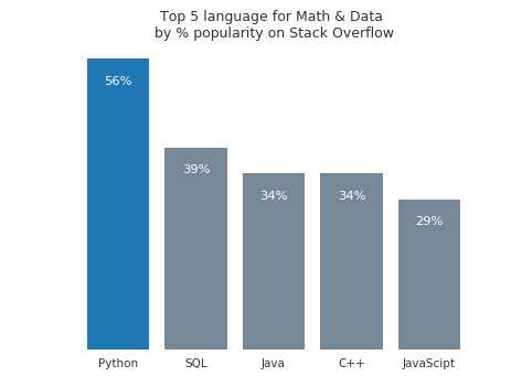
5. Example
 1 # import matplotlib.pyplot as plt
 2 # import numpy as np
 3
 4 # plt.figure()
 5
 6 # languages = [‘Python‘, ‘SQL‘, ‘Java‘, ‘C++‘, ‘JavaScipt‘]
 7 # pos = np.arange(len(languages))
 8 # popularity = [56, 39, 34, 34, 29]
 9
10 # plt.bar(pos, popularity, align=‘center‘)
11 # plt.xticks(pos, languages)
12 # plt.ylabel(‘% Popularity‘)
13 # plt.title(‘Top 5 language for Math & Data \nby % popularity on Stack Overflow‘, alpha=0.8)
14
15 # plt.show()
16 import matplotlib.pyplot as plt
17 import numpy as np
18
19 plt.figure()
20
21 languages = [‘Python‘, ‘SQL‘, ‘Java‘, ‘C++‘, ‘JavaScipt‘]
22 pos = np.arange(len(languages))
23 popularity = [56, 39, 34, 34, 29]
24
25 # change the bar color to be less bright blue
26 bars = plt.bar(pos, popularity, align=‘center‘, linewidth=0, color=‘lightslategrey‘)
27 # change one bar, the python bar, to a contrasting color
28 bars[0].set_color(‘#1F77B4‘)
29
30
31 # soften all labels by turning grey
32 plt.xticks(pos, languages, alpha=0.8)
33 #plt.ylabel(‘% Popularity‘,alpha=0.8)
34 plt.title(‘Top 5 language for Math & Data \nby % popularity on Stack Overflow‘, alpha=0.8)
35
36 # Remove all the ticks and tick labels on the Y axis
37 plt.tick_params(top=‘off‘, bottom=‘off‘, left=‘off‘, right=‘off‘, labelleft=‘off‘, labelbottom=‘on‘)
38
39 # Remove the frame of the chart
40 for spine in plt.gca().spines.values():
41     spine.set_visible(False)
42
43 # Direct label each bar with Y axis values
44 for bar in bars:
45     plt.gca().text(bar.get_x() + bar.get_width()/2, bar.get_height() -5, str(int(bar.get_height())) + ‘%‘, ha=‘center‘
46                    ,color=‘w‘,fontsize=11)
47
48 plt.show()
Output(See the difference between those two plots):
Data manipulation in python (module 4)
标签:point art print axis asi color pen navigate using
原文地址:http://www.cnblogs.com/climberclimb/p/6979618.html
