标签:val histogram height tick sub == numpy pass style
1. Subplots
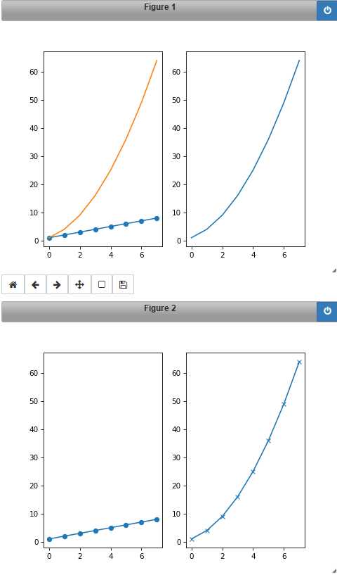
%matplotlib notebook
import matplotlib.pyplot as plt
import numpy as np

plt.figure()
# subplot with 1 row, 2 columns, and current axis is 1st subplot axes
plt.subplot(1, 2, 1)
linear_data = np.array([1,2,3,4,5,6,7,8])
# plot exponential data on 1st subplot axes
plt.plot(linear_data, ‘-o‘)

exponential_data = linear_data **2
# subplot with 1 row, 2 columns, and current axis is 2nd subplot axes
plt.subplot(1, 2, 2)
plt.plot(exponential_data)

plt.subplot(1, 2, 1)
plt.plot(exponential_data)

# Create a new figure
plt.figure()
ax1 = plt.subplot(1, 2, 1)
plt.plot(linear_data, ‘-o‘)
# pass sharey=ax1 to ensure the two subplots share the same y axis
ax2 = plt.subplot(1, 2, 2, sharey=ax1)
plt.plot(exponential_data, ‘-x‘)
Output:
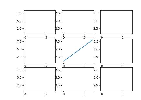
# create a 3x3 grid of subplots
fig, ((ax1,ax2,ax3), (ax4,ax5,ax6), (ax7,ax8,ax9)) = plt.subplots(3, 3, sharex=True, sharey=True)
# plot the linear_data on the 5th subplot axes
ax5.plot(linear_data, ‘-‘)
# set inside tick labels to visible
for ax in plt.gcf().get_axes():
    for label in ax.get_xticklabels() + ax.get_yticklabels():
        label.set_visible(True)
        # necessary on some systems to update the plot
plt.gcf().canvas.draw()
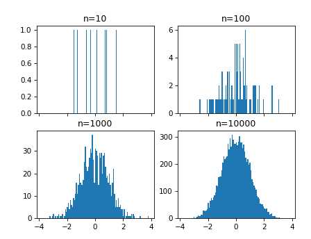
2 .Histogram
import numpy as np
import matplotlib.pyplot as plt
# create 2x2 grid of axis subplots
fig, ((ax1, ax2), (ax3, ax4)) = plt.subplots(2, 2, sharex=True)
axs = [ax1,ax2,ax3,ax4]
# draw n = 10, 100, 1000, and 10000 samples from the normal distribution and plot corresponding histograms
for i, ax in enumerate(axes):
    sample = np.random.normal(0, 1, 10**(i+1))
    ax.hist(sample, bins=100)
    ax.set_title(‘n={}‘.format(10**(i+1)))
Output:
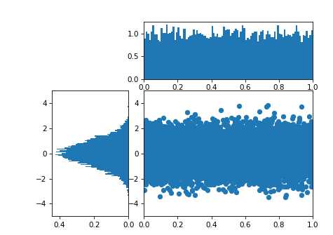
import matplotlib.gridspec as gridspec
plt.figure()

gspec = gridspec.GridSpec(3,3)

top_histogram = plt.subplot(gspec[0, 1:])
side_histogram = plt.subplot(gspec[1:, 0])
lower_right = plt.subplot(gspec[1:, 1:])

Y = np.random.normal(loc=0.0, scale=1.0, size=10000)
X = np.random.random(size=10000)
lower_right.scatter(X, Y)
top_histogram.hist(X, bins=100)
s = side_histogram.hist(Y, bins=100, orientation=‘horizontal‘)

# # clear the histograms and plot normed histograms
top_histogram.clear()
top_histogram.hist(X, bins=100, normed=True)

side_histogram.clear()
side_histogram.hist(Y, bins=100, orientation=‘horizontal‘, normed=True)
# flip the side histogram‘s x axis
side_histogram.invert_xaxis()

# change axes limits
for ax in [top_histogram, lower_right]:
    ax.set_xlim(0, 1)
for ax in [side_histogram, lower_right]:
    ax.set_ylim(-5, 5)
Output:
3. Box plots
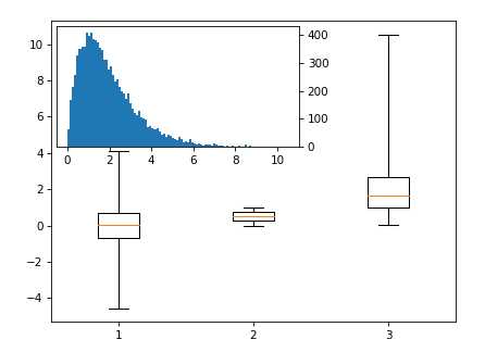
import matplotlib.pyplot as plt
import mpl_toolkits.axes_grid1.inset_locator as mpl_il
import pandas as pd
normal_sample =  np.random.normal(loc=0.0, scale=1.0, size=10000)
random_sample = np.random.random(size=10000)
gamma_sample = np.random.gamma(2, size=10000)
df = pd.DataFrame({"normal":normal_sample,
                   "random": random_sample,
                   "gamma":gamma_sample})

plt.figure()
# if `whis` argument isn‘t passed, boxplot defaults to showing 1.5*interquartile (IQR) whiskers with outliers
_ = plt.boxplot([ df[‘normal‘], df[‘random‘], df[‘gamma‘] ], whis=‘range‘)
# overlay axis on top of another
ax2 = mpl_il.inset_axes(plt.gca(), width=‘60%‘, height=‘40%‘, loc=2)
ax2.hist(df[‘gamma‘], bins=100)
# switch the y axis ticks for ax2 to the right side
ax2.yaxis.tick_right()
Output:
4. Heartmap
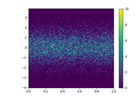
import matplotlib.pyplot as plt
import numpy as np
plt.figure()

Y = np.random.normal(loc=0.0, scale=1.0, size=10000)
X = np.random.random(size=10000)
plt.figure()
_ = plt.hist2d(X, Y, bins=100)
# add a colorbar legend
plt.colorbar()
Output:
5. Animation
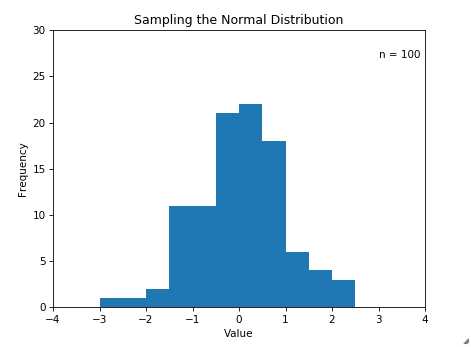
import matplotlib.animation as animation
import matplotlib.pyplot as plt
import numpy as np
plt.figure()
n = 100
x = np.random.randn(n)
plt.hist(x, bins=10)
# create the function that will do the plotting, where curr is the current frame
def update(curr):
    # check if animation is at the last frame, and if so, stop the animation a
    if curr == n:
        a.event_source.stop()
        # Clear the current axis
    plt.cla()
    bins = np.arange(-4, 4, 0.5)
    plt.hist(x[:curr], bins=bins)
    plt.axis([-4,4,0,30])
    plt.gca().set_title(‘Sampling the Normal Distribution‘)
    plt.gca().set_ylabel(‘Frequency‘)
    plt.gca().set_xlabel(‘Value‘)
    plt.annotate(‘n = {}‘.format(curr), [3,27])
fig = plt.figure()
a = animation.FuncAnimation(fig, update, interval=100)
Output:
6. Interactivity
Mousing clickigng
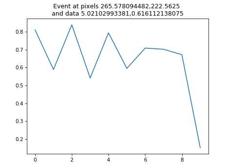
import matplotlib.pyplot as plt
import numpy as np
plt.figure()
data = np.random.rand(10)
plt.plot(data)

def onclick(event):
    plt.cla()
    plt.plot(data)
    plt.gca().set_title(‘Event at pixels {},{} \nand data {},{}‘.format(event.x, event.y, event.xdata, event.ydata))

# tell mpl_connect we want to pass a ‘button_press_event‘ into onclick when the event is detected
plt.gcf().canvas.mpl_connect(‘button_press_event‘, onclick)
Output:
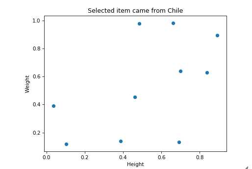
from random import shuffle
origins = [‘China‘, ‘Brazil‘, ‘India‘, ‘USA‘, ‘Canada‘, ‘UK‘, ‘Germany‘, ‘Iraq‘, ‘Chile‘, ‘Mexico‘]

shuffle(origins)

df = pd.DataFrame({‘height‘: np.random.rand(10),
                   ‘weight‘: np.random.rand(10),
                   ‘origin‘: origins})
plt.figure()
# picker=5 means the mouse doesn‘t have to click directly on an event, but can be up to 5 pixels away
plt.scatter(df[‘height‘], df[‘weight‘], picker=10)
plt.gca().set_ylabel(‘Weight‘)
plt.gca().set_xlabel(‘Height‘)

def onpick(event):
    origin = df.iloc[event.ind[0]][‘origin‘]
    plt.gca().set_title(‘Selected item came from {}‘.format(origin))

# tell mpl_connect we want to pass a ‘pick_event‘ into onpick when the event is detected
plt.gcf().canvas.mpl_connect(‘pick_event‘, onpick)
Output:
Data manipulation in python (module 5)
标签:val histogram height tick sub == numpy pass style
原文地址:http://www.cnblogs.com/climberclimb/p/6985255.html