标签:back html range 绝对定位 bsp pre ie浏览器 方式 alt
文档流、浮动、清除浮动、overflow、定位
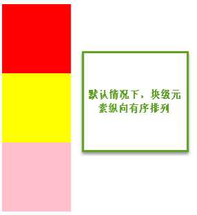
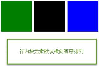
1.文档流
css文档流,标准流是什么?
元素自上而下,自左而右,块元素独占一行,行内元素在一行上显示,碰到父集元素的边框换行。
2.浮动布局
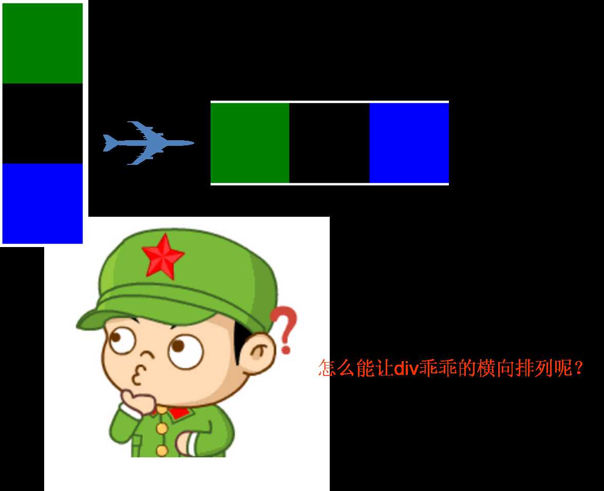
设置了浮动的元素,脱离标准流(脱标)
a)
float: left | right
元素浮动之后不占据原来的位置(脱标)
让块元素在一行上显示;浮动只影响后面的元素
行内元素浮动之后转换为行内块元素。(不推荐使用)
b)浮动的作用
文本绕图,制作导航,网页布局
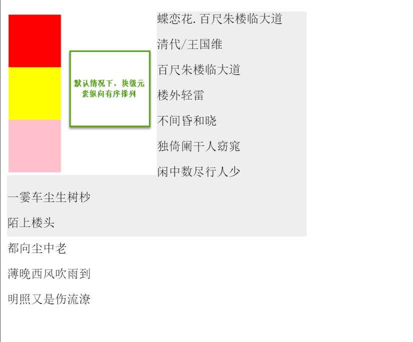
文本绕图案例
<!DOCTYPE html>
<html lang="en">
<head>
    <meta charset="UTF-8">
    <title>Document</title>
    <style type="text/css">
        .box{
            width: 400px;
            height: 300px;
            background: #eee;
        }
        .box img{
            float: left;
            /*在img标签里面只设置宽,不设置高,图片就会等比例缩放*/
        }
    </style>
</head>
<body>
    <div class="box">
    <img src="1.png" alt="" width="200px">
    <p>蝶恋花.百尺朱楼临大道</p>
    <p>清代/王国维</p>
    <p>百尺朱楼临大道</p>
    <p>楼外轻雷</p>
    <p>不间昏和晓</p>
    <p>独倚阑干人窈窕</p>
    <p>闲中数尽行人少</p>
    <p>一霎车尘生树杪</p>
    <p>陌上楼头</p>
    <p>都向尘中老</p>
    <p>薄晚西风吹雨到</p>
    <p>明照又是伤流潦</p>
    </div>
</body>
</html>
制作导航案例
<!DOCTYPE html>
<html>
<head>
    <title>浮动应用之制作导航</title>
    <meta charset="utf-8">
    <style type="text/css">
        body,ul,li{
            margin:0;
            padding: 0;
        }
        ul,li{
            list-style: none;
        }
        .nav{
            width: 800px;
            height: 40px;
            background: pink;
            margin: 10px auto;
            /*自动居中*/
        }
        .nav ul li{
            float: left;
        }
        .nav ul li a{
            display: inline-block;
            height: 40px;
            font: 14px/40px 微软雅黑;
            padding: 0 20px;
            text-decoration: none;
        }
        .nav ul li a:hover{
            background: #aaa;
        }


    </style>

</head>
<body>
    <div class="nav">
        <ul>
            <li><a href="#">深闺</a> </li>
            <li><a href="#">黛拂双蛾浅</a> </li>
            <li><a href="#">秋来愁更深</a> </li>
        </ul>

    </div>


</body>
</html>
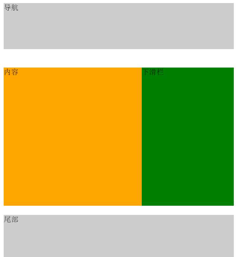
网页布局案例
<!DOCTYPE html>
<html>
<head>
    <title>浮动应用之页面布局</title>
    <meta charset="utf-8">
    <style type="text/css">
        .header,.main,.footer{
            width: 500px;
        }
        .header,.footer{
            height: 100px;
            background: #ccc;
            margin-bottom: 40px;
        }
        /*header的margin会与main的margin重合,取较大值40px*/
        /*footer只存在底部的margin,故与main之间margin为20px*/
        .main{
            height: 300px;
            background: #eee;
            margin: 20px 0;
        }
        .content{
            width: 300px;
            height: 300px;
            background: orange;
            float: left;
        }
        .sidebar{
            width: 200px;
            height: 300px;
            background: green;
            float: right;
        }

    </style>
</head>
<body>
    <div class="header">导航</div>
    <div class="main">
        <div class="content">内容</div>
        <div class="sidebar">下滑栏</div>
    </div>
    <div class="footer">尾部</div>

</body>
</html>
3.清除浮动 ***(尚不完全清除)
当父容器没有设置高度,里面的盒子没有设置浮动的情况下会将父容器的高度撑开。一旦父容器中的盒子设置浮动,脱离标准文档流,父容器立马没有高度,下面的盒子会跑到浮动的盒子下面。出现这种情况,我们需要清除浮动。
清除浮动不是不用浮动,清除浮动产生的不利影响。
方法:
1)给父容器设置高度
2)clear: left | right | both(工作里用的最多的是clear:both;)
3)给父集元素使用overflow:hidden;
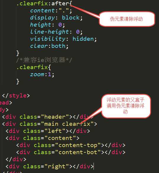
4)伪元素清除浮动 推荐使用
父容器未设置高度,子盒子设置浮动
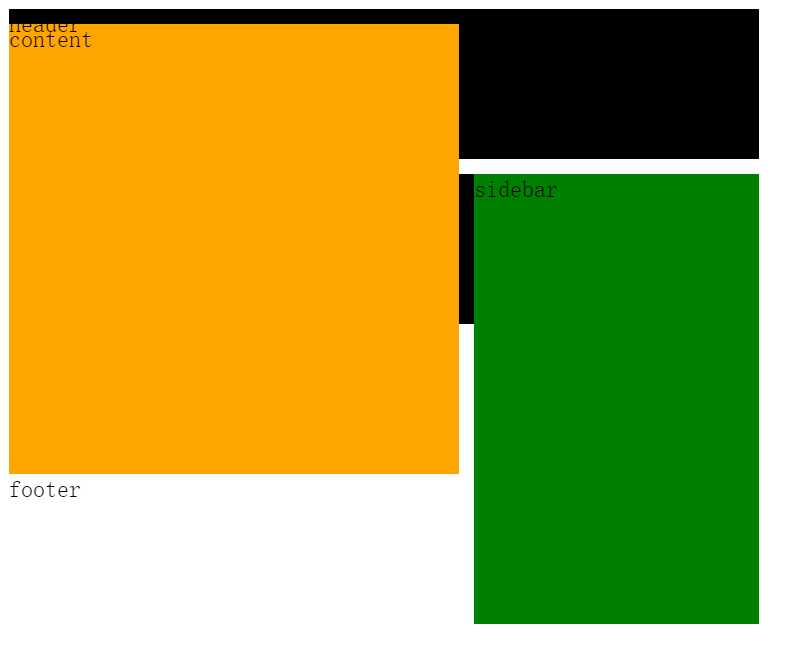
<!DOCTYPE html>
<html lang="en">
<head>
    <meta charset="UTF-8">
    <title>Document</title>
    <style type="text/css">
        .header,.main,.footer{
            width:500px;

        }
        .header,.footer{
            height: 100px;
            background: #000;
        }

        .content{
            width: 300px;
            height: 300px;
            background: orange;
            float: left;
            margin-top:-100px;

        }
        .sidebar{
            width: 190px;
            height: 300px;
            background: green;
            float: right;
        }
        .main{
            background: #eee;
            margin: 10px 0;
            /*overflow: hidden;*/

        }
        /*.clearfix:after{
            content: ".";
            display: block;
            height: 0;
            line-height: 0;
            visibility: hidden;
            clear:both;
        }
        /*兼容ie浏览器*/
        /*.clearfix{
            zoom:1;
        }*/
    </style>
</head>
<body>
    <div class="header">header</div>
    <div class="main">
        <div class="content">content</div>
        <div class="sidebar">sidebar</div>

        <!-- 额外标签法 -->
        <!-- <div style="clear:both;"></div> -->
    </div>
    <div class="footer">footer</div>
</body>
</html>
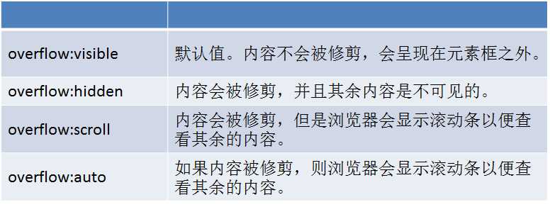
4.overflow属性,内容溢出元素框的时候如何显示
5.定位*****
a)
position:static; 静态定位。就是按照文档流(标准流)的方式展示。
b)
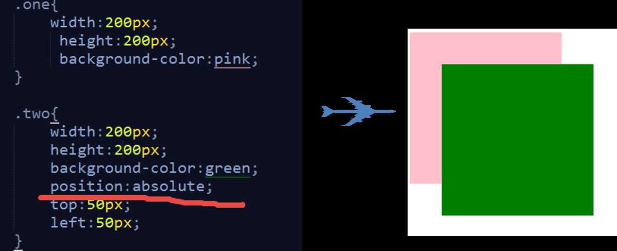
绝对定位
position:absolute;
特点:
★元素使用绝对定位之后不占据原来的位置(脱标)
★元素使用绝对定位,位置是从浏览器出发。
★嵌套的盒子,父盒子没有使用定位,子盒子绝对定位,子盒子位置是从浏览器出发。
★嵌套的盒子,父盒子使用定位,子盒子绝对定位,子盒子位置是从父元素位置出发。
★给行内元素使用绝对定位之后,转换为行内块。(不推荐使用,推荐使用display:inline-block;)
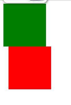
c)相对定位
position: relative;
特点:
★使用相对定位,位置从自身出发。
★还占据原来的位置。
★子绝父相(父元素相对定位,子元素绝对定位)
★行内元素使用相对定位不能转行内块
<!DOCTYPE html>
<html lang="en">
<head>
    <meta charset="UTF-8">
    <title>Document</title>
    <style type="text/css">
    .father{
        width: 500px;
        height: 500px;
        background: #eee;
        margin: 100px 0 0 300px;
        position: relative;
    }

        .red{
            width:100px;
            height: 100px;
        }
        .red{
            background: red;
            position: absolute;
            top: 20px;


        }
        span{
            position: relative;
            width:100px;
            height: 100px;
            background:pink;
        }
    </style>
</head>
<body>
    <div class="father">
        <div class="red"></div>
    </div>
    <span>二子乘舟,泛泛其景</span>
</body>
</html>
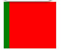
d)固定定位
position:fixed;
特点:
★固定定位之后,不占据原来的位置(脱标)
★元素使用固定定位之后,位置从浏览器出发。
★元素使用固定定位之后,会转化为行内块(不推荐,推荐使用display:inline-block;)
<!DOCTYPE html>
<html lang="en">
<head>
    <meta charset="UTF-8">
    <title>Document</title>
    <style type="text/css">
        .box,.box1{
            width: 100px;
            height: 100px;

        }
        .box{
            background: red;
            position: fixed;
            left:20px;

        }
        .box1{
            background: green;
        }


    </style>
</head>
<body>
    <div class="box"></div>
    <div class="box1"></div>
    <!-- <span class="box"></span> -->

</body>
</html>
<!-- <div class="box"></div> -->
    <div class="box1"></div>
    <span class="box"></span>
标签:back html range 绝对定位 bsp pre ie浏览器 方式 alt
原文地址:http://www.cnblogs.com/lovely7/p/7103727.html