标签:svg charset radius 大小 属性 box overflow order fda
各种demo:
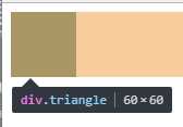
1、css实现正方形
思路:width为0;height为0;使用boder-width为正方形的边长的一半,不占任何字节;border-style为固体;border-color为正方形的填充色。
<!DOCTYPE html>
<html>
    <head>
        <meta charset="UTF-8">
        <title></title>
        <style type="text/css">
            .triangle{
                width: 0;
                height: 0;
                border-width: 30px;
                border-style: solid;
                border-color:#e66161;
            }
        </style>
    </head>
    <body>
        <div class="triangle"></div>
    </body>
</html>
图形
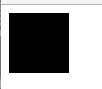
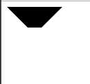
2、css实现三角形
思路:宽度width为0;height为0;border-width为直角三角形斜边的一半;border-color里有四个颜色属性,第一个为上--直角三角形内充填充色,第二个为右--直角三角形内填充色,第三个为下--直角三角形内填充色,第四个为左--直角三角形内填充色。
代码:
<!DOCTYPE html>
<html>
    <head>
        <meta charset="UTF-8">
        <title></title>
        <style type="text/css">
            .triangle{
                width: 0;
                height: 0;
                border-width: 30px;
                border-style: solid;
                border-color: #000000 transparent transparent transparent;
            }
        </style>
    </head>
    <body>
        <div class="triangle"></div>
    </body>
</html>
图形
代码:
.triangle{
                width: 0;
                height: 0;
                border-width: 30px;
                border-style: solid;
                border-color: #000000 #000000 transparent transparent;
            }
图形

代码:
.triangle{
                width: 0;
                height: 0;
                border-width: 30px;
                border-style: solid;
                border-color: #000000 #f50303 transparent transparent;
            }
图形
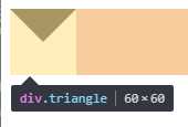
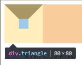
3、css实现正方形外梯形
思路:还是之前的思路,width为20;高度为20;梯形的短底边为div的width;梯形的长边=width+border-width*2;
代码:
<!DOCTYPE html>
<html>
    <head>
        <meta charset="UTF-8">
        <title></title>
        <style type="text/css">
            .triangle{
                width: 20px;
                height: 20px;
                border-width:30px;
                border-style: solid;
                border-color: #000000 transparent transparent transparent;
            }
        </style>
    </head>
    <body>
        <div class="triangle"></div>
    </body>
</html>
图形:
代码:
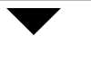
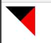
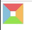
.triangle{
                width: 0;
                height: 0;
                border-width: 30px;
                border-style: solid;
                border-color:#e66161 #f3bb5b #94e24f #85bfda;
            }
图形:
4、css实现这个图形
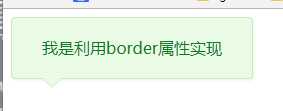
思路:利用两个三角形进行拼接,一个是背景色,一个是边框色,然后利用定位重叠在一起,定位要相差一个像素。
代码:
<!DOCTYPE html>
<html>
    <head>
        <meta charset="UTF-8">
        <title></title>
        <style type="text/css">
            .box{
                position: relative;
                width: 240px;
                height: 60px;
                line-height: 60px;
                background: #e9fbe4;
                box-shadow: 1px 2px 3px #e9fbe4;
                border: 1px solid #c9e9c0;
                border-radius: 4px;
                text-align: center;
                color: #0c7823;
            }
            .triangle-border{
                width: 0;
                height: 0;
                border-width: 10px;
                border-style: solid;
                position: absolute;
                left: 30px;
                overflow: hidden;

            }
            .border{
                bottom:-20px;
                border-color: #C9E9C0 transparent transparent transparent;
            }
            .background{
                bottom: -19px;
                border-color: #E9FBE4 transparent transparent transparent;
            }
        </style>
    </head>
    <body>
        <div class="box">
            <span>我是利用border属性实现</span>
            <div class="triangle-border border"></div>
            <div class="triangle-border background"></div>
        </div>
    </body>
</html>
5、css实现
标签:svg charset radius 大小 属性 box overflow order fda
原文地址:http://www.cnblogs.com/chengxs/p/7242647.html