标签:class form sso net bic 元素 ubi hover south
transition:all 1s ease 1s
ease:
1、ease:(逐渐变慢)默认值
2、linear:(匀速)
3、ease-in:(加速)
4、ease-out:(减速)
5、ease-in-out:(加速然后减速)
6、cubic-bezier
如:
<!DOCTYPE html>
<html lang="en">
<head>
    <meta charset="UTF-8">
    <title>Document</title>
    <style type="text/css">
        *{margin:0; padding: 0;}
        .icon_down{ width: 0; height: 0; border-left:20px solid transparent; border-right: 20px solid transparent; border-top:20px solid #B03939; transition: all .1s ease-in 0ms; margin:50px auto; cursor: pointer; }
        .icon_down:hover{ transform: rotate(180deg);}
    </style>
</head>
<body>
    <div class="icon_down"></div>
</body>
</html>
效果图:鼠标经过旋转180度,


例子2:
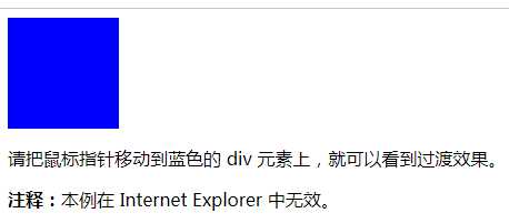
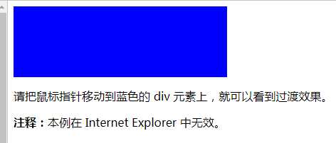
把鼠标指针放到 div 元素上,其宽度会从 100px 逐渐变为 300px:
div
{
width:100px;
transition: width 2s;
-moz-transition: width 2s; /* Firefox 4 */
-webkit-transition: width 2s; /* Safari 和 Chrome */
-o-transition: width 2s; /* Opera */
}
效果图:
鼠标经过后
CSS3 transition 属性——逐渐变慢/匀速/加速/减速/加速然后减速
标签:class form sso net bic 元素 ubi hover south
原文地址:http://www.cnblogs.com/huanghuali/p/7572885.html
