标签:加载速度 href sheet logs 属性 head 列表 指令 code
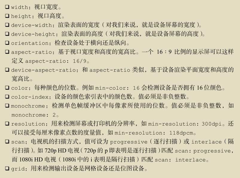
媒体查询由媒体类型和一个或多个检测媒体特性的条件表达式组成。媒体查询中可用于检测的媒体特性有:width、height和color(等)。使用媒体查询可以在不改变页面内容的情况下,为特性的一些输出设备定制显示效果。
CSS3中的媒体查询:根据浏览器窗口大小的改变,页面颜色就会改变。
<!DOCTYPE html>
<html\>
<head>
<title>无标题文档</title>
</head>
<style>
body{
    background-color:#0033FF;
}
@media screen and (max-width: 960px){
    body{
    background-color:#FF6699
    }
}

@media screen and (max-width: 768px){
    body{
    background-color:#00FF66;
    }
}

@media screen and (max-width: 550px){
    body{
    background-color:#6633FF;
    }
}

@media screen and (max-width: 320px){
    body{
    background-color:#FFFF00;
    }
}
</style>
<body>
<p>my  first @media</p>
</body>
</html>
<link rel="stylesheet" media="screen" href="portrait-screen.css"/>
<link rel+"stylesheet" media="screen and (orientation: portrait)" href="portrait-screen.css"/>
//设置了媒体类型和媒体特性(显示屏, 纵向放置)


<link rel="stylesheet" media="not screen and (orientation: portrait)" href="portrait-
screen.css" />
//非纵向放置的显示屏

<link rel="stylesheet" media="screen and (orientation: portrait) and (min-width:800px)" href="800wide-portrait-screen.css" />
//限制只有视口宽度大于800px像素的显示屏设备才能加载此文件
<link rel="stylesheet" media="screen and (orientation: portrait) and (min-width:800px), projection" href="800wide-portrait-screen.css" />
除了以上方法还可以使用CSS中的@import指令在当前样式表中按条件引入其他样式表。(使用@import方法会增加HTTP请求影响加载速度)
@import url("phone.css") screen and (max-width:360px);
标签:加载速度 href sheet logs 属性 head 列表 指令 code
原文地址:http://www.cnblogs.com/clean/p/7595776.html