标签:ng2 es2017 transform abs bezier lan inf bic ott
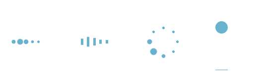
四种loading加载效果:
<!DOCTYPE html>
<html lang="en">
<head>
    <meta charset="utf-8">
    <title>四种加载效果</title>
<style>
/*第一种*/
.demo1 {
    width: 4px;
    height: 4px;
    border-radius: 2px;
    background: #68b2ce;
    float: left;
    margin: 0 3px;
    animation: demo1 linear 1s infinite;
    -webkit-animation: demo1 linear 1s infinite;
}
.demo1:nth-child(1){
    animation-delay:0s;
}
.demo1:nth-child(2){
    animation-delay:0.15s;
}
.demo1:nth-child(3){
    animation-delay:0.3s;
}
.demo1:nth-child(4){
    animation-delay:0.45s;
}
.demo1:nth-child(5){
    animation-delay:0.6s;
}
@keyframes demo1{
    0%,60%,100% {transform: scale(1);}
    30% {transform: scale(2.5);}
}
@-webkit-keyframes demo1{
    0%,60%,100% {transform: scale(1);}
    30% {transform: scale(2.5);}
}
/*第二种*/
.demo2 {
    width: 4px;
    height: 6px;
    background: #68b2ce;
    float: left;
    margin: 0 3px;
    animation: demo2 linear 1s infinite;
    -webkit-animation: demo2 linear 1s infinite;
}
.demo2:nth-child(1){
    animation-delay:0s;
}
.demo2:nth-child(2){
    animation-delay:0.15s;
}
.demo2:nth-child(3){
    animation-delay:0.3s;
}
.demo2:nth-child(4){
    animation-delay:0.45s;
}
.demo2:nth-child(5){
    animation-delay:0.6s;
}
@keyframes demo2{
    0%,60%,100% {transform: scale(1);}
    30% {transform: scaleY(3);}
}
@-webkit-keyframes demo2{
    0%,60%,100% {transform: scale(1);}
    30% {transform: scaleY(3);}
}
/*第三种*/
#loading3 {
    position: relative;
    width: 50px;
    height: 50px;
}
.demo3 {
    width: 4px;
    height: 4px;
    border-radius: 2px;
    background: #68b2ce;
    position: absolute;
    animation: demo3 linear 0.8s infinite;
    -webkit-animation: demo3 linear 0.8s infinite;
}
.demo3:nth-child(1){
    left: 24px;
    top: 2px;
    animation-delay:0s;
}
.demo3:nth-child(2){
    left: 40px;
    top: 8px;
    animation-delay:0.1s;
}
.demo3:nth-child(3){
    left: 47px;
    top: 24px;
    animation-delay:0.1s;
}
.demo3:nth-child(4){
    left: 40px;
    top: 40px;
    animation-delay:0.2s;
}
.demo3:nth-child(5){
    left: 24px;
    top: 47px;
    animation-delay:0.4s;
}
.demo3:nth-child(6){
    left: 8px;
    top: 40px;
    animation-delay:0.5s;
}
.demo3:nth-child(7){
    left: 2px;
    top: 24px;
    animation-delay:0.6s;
}
.demo3:nth-child(8){
    left: 8px;
    top: 8px;
    animation-delay:0.7s;
}
@keyframes demo3{
    0%,40%,100% {transform: scale(1);}
    20% {transform: scale(3);}
}
@-webkit-keyframes demo3{
    0%,40%,100% {transform: scale(1);}
    20% {transform: scale(3);}
}
/*第四种*/
#loading5 {
    width: 20px;
    height: 100px;
    border-bottom: 1px solid #68b2ce;
}
.demo5 {
    width: 20px;
    height: 20px;
    border-radius: 10px;
    background: #68b2ce;
    animation: demo5 cubic-bezier(0.5,0.01,0.9,1) 0.6s infinite alternate;
    -webkit-animation: demo5 cubic-bezier(0.5,0.01,0.9,1) 0.6s infinite alternate;
}
@keyframes demo5{
    0%{
        transform:translateY(0px);
        -webkit-transform:translateY(0px);
    }
    100%{
        transform:translateY(80px);
        -webkit-transform:translateY(80px);
    }
}
@-webkit-keyframes demo5{
    0%{
        transform:translateY(0px);
        -webkit-transform:translateY(0px);
    }
    100% {
        transform:translateY(80px);
        -webkit-transform:translateY(80px);
    }
}
</style>
<body>
    <div id="loading1">
        <div class="demo1"></div>
        <div class="demo1"></div>
        <div class="demo1"></div>
        <div class="demo1"></div>
        <div class="demo1"></div>
    </div>
    <div id="loading2">
        <div class="demo2"></div>
        <div class="demo2"></div>
        <div class="demo2"></div>
        <div class="demo2"></div>
        <div class="demo2"></div>
    </div>
    <div id="loading3">
        <div class="demo3"></div>
        <div class="demo3"></div>
        <div class="demo3"></div>
        <div class="demo3"></div>
        <div class="demo3"></div>
        <div class="demo3"></div>
        <div class="demo3"></div>
        <div class="demo3"></div>
    </div>
    <div id="loading5">
        <div class="demo5"></div>
    </div>
</body>
</html>
标签:ng2 es2017 transform abs bezier lan inf bic ott
原文地址:http://www.cnblogs.com/goloving/p/7684564.html