标签:app 简易 宽度 条件 div log 需要 结果 es2017
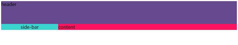
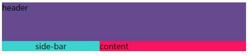
如图, header的height: 80px , side-bar的width: 200px, 别的均为不知, 该如何做出该布局呢??
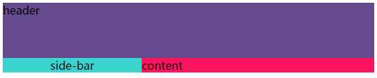
在响应式布局的大前提下, 首先想到的就是flex布局吧:
  .header{
    height: 80px;
    width: 100%;
    background-color: #654a8e;
  }
  .wrapper{
    display: flex;
    width: 100%;
    height: 100%;
  }
  .side-bar{
    flex: none;
    width: 200px;
    height: 100%;
    background-color:#3ad3cd;
    text-align: center;
  }
  .content{
    flex: 1;
    height: 100%;
    width: 100%;
    background-color:#fd145e;
  }
就是使用一个wrapper来包着除了header以外的内容, 定义样式 display: flex, 具体的就不赘述了。
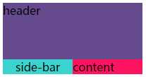
当然, 也可以活用 max/min - width/height, 例如:
  .header{
    height: 80px;
    width: 100%;
    background-color: #654a8e;
  }
  .wrapper{
    display: flex;
    width: 100%;
    height: 100%;
  }
  .side-bar{
    flex: 1;
    max-width: 200px;
    height: 100%;
    background-color:#3ad3cd;
    text-align: center;
  }
  .content{
    flex: 1;
    height: 100%;
    width: 100%;
    background-color:#fd145e;
  }
这样就可以得到一个弹性的 side-bar, 但最宽也只能是200px。
但为了照顾兼容性(flex低版本浏览器理所当然不兼容), 当然首选多年依赖CSS布局都离不开的浮动, float: left 啦!!
但是, 在给出的条件下, 应该哪个浮动, 还是都浮动呢??
下面都来试试:
首先让 side-bar 和 content 都左浮动
.header{
    height: 80px;
    width: 100%;
    background-color: #654a8e;
  }
  .side-bar{
    width: 200px;
    height: 100%;
    background-color:#3ad3cd;
    float: left;
    text-align: center;
  }
  .content{
    height: 100%;
    width: 100%;
    background-color:#fd145e;
    float: left;
  }
结果如下:
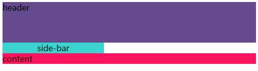
因为 content 的 width设置为100% 所以左浮后本该和 side-bar 同一行, 结果超过屏幕宽度后, 自动移到下一行了, 这也符合浮动的效果之一: 浮动的元素还会互相贴靠, 如果没有足够的空间贴靠, 则往浏览器边上靠。
接着试试只让 side-bar 浮动, 看有什么效果:
  .header{
    height: 80px;
    width: 100%;
    background-color: #654a8e;
  }
  .side-bar{
    width: 200px;
    height: 100%;
    background-color:#3ad3cd;
    float: left;
    text-align: center;
  }
  .content{
    height: 100%;
    width: 100%;
    background-color:#fd145e;
  }
结果正是我们需要的布局样式, 再看看浮动的定义: 使元素脱离标准流文档。
而这就是: 当排第一的块级因float脱离标准文档流后, 后一个块级会自以为是标准文档流中的第一个元素而顶上。
给content单独添加左浮, 效果和两个都左浮一样, 就算得到了正确布局还是要去试一试的, 万一手痒了呢。
标签:app 简易 宽度 条件 div log 需要 结果 es2017
原文地址:http://www.cnblogs.com/olivier17/p/7811357.html