下面采用HTML+CSS+JavaScript实现模态框,并采用Flex布局和多媒体查询实现响应式。
一、模态框HTML代码
 1 <!DOCTYPE html>
 2 <html lang="en">
 3 <head>
 4     <meta charset="UTF-8">
 5     <title>模态框实现</title>
 6     <link rel="stylesheet" href="css\modal.css" type="text/css">
 7 </head>
 8 <body>
 9 <button class="btn" id="showModel">模态框展示</button>
10 <div id="modal" class="modal">
11     <div class="modal-content">
12         <header class="modal-header">
13             <h4>模态框标题</h4>
14             <span class="close">×</span>
15         </header>
16         <div class="modal-body">
17             <p>HTML+CSS+JS原生实现响应式模态框演示!</p>
18         </div>
19         <footer class="modal-footer">
20             <button id="cancel">取消</button>
21             <button id="sure">确定</button>
22         </footer>
23     </div>
24 </div>
25 </body>
26 </html>
首先定义模态框的overlayer,然后定义模态框的内容包括header(带关闭按钮)、body和footer。
二、模态框CSS代码
  1 h4{
  2     margin-left: 20px;
  3 }
  4 p{
  5     text-align: center;
  6 }
  7 .btn{
  8     width: 100px;
  9     height: 35px;
 10     border-radius: 5px;
 11     font-size: 16px;
 12     color: white;
 13     background-color: cornflowerblue;
 14 }
 15 .btn:hover, .btn:focus{
 16     background-color: #95b4ed;
 17 }
 18 .modal{
 19     display: none;
 20     width: 100%;
 21     height: 100%;
 22     position: fixed;
 23     left: 0;
 24     top: 0;
 25     z-index: 1000;
 26     background-color: rgba(0,0,0,0.5);
 27 }
 28 .modal-content{
 29     display: flex;
 30     flex-flow: column nowrap;
 31     justify-content: space-between;
 32     width: 50%;
 33     max-width: 700px;
 34     height: 40%;
 35     max-height: 500px;
 36     margin: 100px auto;
 37     border-radius:10px;
 38     background-color:#fff;
 39     -webkit-animation: zoom 0.6s;
 40     animation: zoom 0.6s;
 41     resize: both;
 42     overflow: auto;
 43 }
 44 @-webkit-keyframes zoom{
 45     from {-webkit-transform: scale(0)}
 46     to {-webkit-transform: scale(1)}
 47 }
 48 @keyframes zoom{
 49     from {transform: scale(0)}
 50     to {transform: scale(1)}
 51 }
 52 .modal-header{
 53     box-sizing:border-box;
 54     border-bottom:1px solid #ccc;
 55     display: flex;
 56     justify-content: space-between;
 57     align-items: center;
 58 }
 59 .close{
 60     color: #b7b7b7;
 61     font-size: 30px;
 62     font-weight: bold;
 63     margin-right: 20px;
 64     transition: all 0.3s;
 65 }
 66 .close:hover, .close:focus{
 67     color: #95b4ed;
 68     text-decoration: none;
 69     cursor: pointer;
 70 }
 71 .modal-body{
 72     padding: 10px;
 73     font-size: 16px;
 74     box-sizing:border-box;
 75 }
 76 .modal-footer{
 77     box-sizing:border-box;
 78     border-top:1px solid #ccc;
 79     display: flex;
 80     padding: 15px;
 81     justify-content: flex-end;
 82     align-items: center;
 83 }
 84 .modal-footer button{
 85     width: 60px;
 86     height: 35px;
 87     padding: 5px;
 88     box-sizing: border-box;
 89     margin-right: 10px;
 90     font-size: 16px;
 91     color: white;
 92     border-radius: 5px;
 93     background-color: cornflowerblue;
 94 }
 95 .modal-footer button:hover, .modal-footer button:focus{
 96     background-color: #95b4ed;
 97     cursor: pointer;
 98 }
 99 @media only screen and (max-width: 700px){
100     .modal-content {
101         width: 80%;
102     }
103 }
模态框model默认不显示(display:none),且固定占满整个屏幕,覆盖其它内容(z-index),蒙层背景颜色为黑色半透明;
模态框的显示通过animateion动画逐渐放大显示出来;
模态框响应式布局,首先设置整个模态框为flex容器,flex项目为header、body和footer,且主轴为纵向。header和footer模块又可用flex布局,flex容器为header和footer,flex项目为内部元素,主轴为水平方向。
多媒体media查询实现当屏幕小到一定程度时,模态框大小比例可适当放大。
三、模态框JavaScript代码
 1 <script>
 2     var btn = document.getElementById(‘showModel‘);
 3     var close = document.getElementsByClassName(‘close‘)[0];
 4     var cancel = document.getElementById(‘cancel‘);
 5     var modal = document.getElementById(‘modal‘);
 6     btn.addEventListener(‘click‘, function(){
 7         modal.style.display = "block";
 8     });
 9     close.addEventListener(‘click‘, function(){
10         modal.style.display = "none";
11     });
12     cancel.addEventListener(‘click‘, function(){
13         modal.style.display = "none";
14     });
15 </script>
给按钮添加事件监听,当点击显示模态框按钮时,设置modal的display属性为block,当点击取消或关闭模态框按钮时,设置modal的display属性为none。
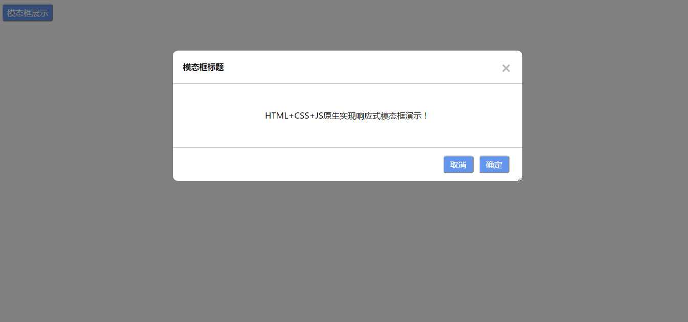
四、效果展示
首先点击显示模态框,全屏最大显示:
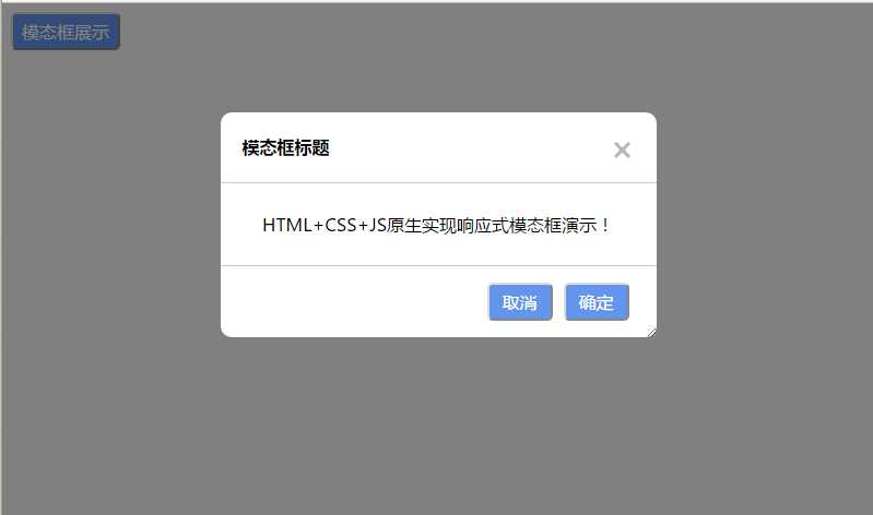
横向缩小浏览器窗口宽度时,模态框横向实现响应式显示。
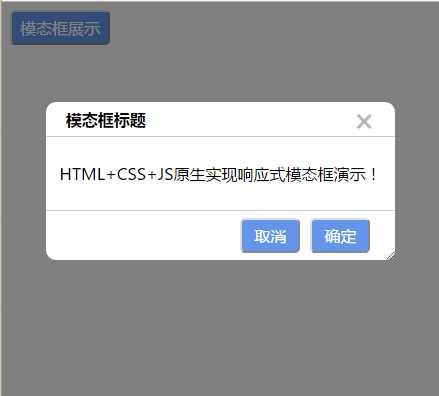
纵向缩小浏览器窗口高度时,模态框纵向实现响应式显示。