Dropdown
下拉菜单
The Dropdown can be used to let the user choose a single option from a list of options.
Dropdown可以让用户从一个列表的选项中选出一个选项。
The control shows the currently chosen option. Once clicked, it opens up the list of options so a new option can be chosen. Upon choosing a new option, the list of closed again, and the control shows the new selected option. The list is also closed if the user clicks on the control itself, or anywhere else inside the Canvas.
这个控件显示当前选中的选项。每当点击的时候,它会展开选项列表让你可以选择一个新的选项。当你选择了一个新的选项时,这个列表会收起来,然后空间上显示的成了新被选中的选项。如果用户点击了控件本身(而不是列表)或者Canvas的别的地方,展开的列表也会收起来。
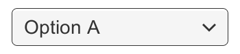
A Dropdown.
一个下拉菜单
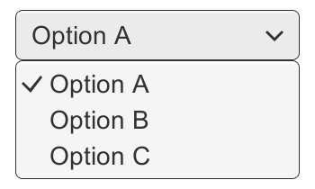
A Dropdown with its list of options open.
一个展开了选项列表的下拉菜单
Properties
属性
| Property: | Function: |
|---|---|
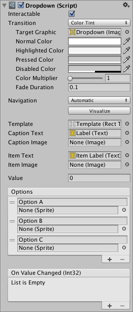
| Interactable | Will this component will accept input? See Interactable. |
| Transition |
Properties that determine the way the control responds visually to user actions. See Transition Options. |
| Navigation | Properties that determine the sequence of controls. See Navigation Options. |
| Template | The Rect Transform of the template for the dropdown list. See instructions below. |
| Caption Text | The Text component to hold the text of the currently selected option. (Optional) |
| Caption Image | The Image component to hold the image of the currently selected option. (Optional) |
| Item Text | The Text component to hold the text of the item. (Optional) |
| Item Image | The Image component to hold the image of the item. (Optional) |
| Value | The index of the currently selected option. 0 is the first option, 1 is the second, and so on. |
| Options | The list of possible options. A text string and an image can be specified for each option. |
| 属性 | 功能 |
|---|---|
| Interactable | 这个组件是否会接受输入? 请参阅 Interactable. |
| Transition |
确定控件如何对用户操作进行可视化响应的属性。 |
| Navigation | 确定控件导航时对不同方向的响应。请参阅 Navigation Options. |
| Template |
下拉列表模板的RectTransform。请参阅下面的说明。 |
| Caption Text |
已选中的选项的展示文本(可选) |
| Caption Image | 已选中的选项的展示图片(可选) |
| Item Text |
下拉框选项模板里的文字(可选)这里不填会导致选项列表中的每个选项不会修改模板里的文字 |
| Item Image | 下拉框选项模板里的图片(可选)这里不填会导致选项列表中的每个选项不会修改模板里的图片 |
| Value |
当前选中的选项的下标。0代表第一个选项,1表示第二个,以此类推 |
| Options |
可选的选项的列表。每个选项可以指定text和image |
Events
事件
| Property: | Function: |
|---|---|
| On Value Changed | A UnityEvent that is invoked when a user has clicked one of the options in the dropdown list. |
| 属性 | 功能 |
|---|---|
| On Value Changed | 当用户点击下拉列表中的一个选项时,一个UnityEvent会被调用 |
Details
详细
The list of options is specified in the Inspector or can be assigned from code. For each option a text string can be specified, and optionally an image as well, if the Dropdown is setup to support it.
选项列表可以在Inspector中或者代码中指定。如果Dropdown初始化的时候支持(设置了Item Text或Item Image),对于每个选项,可以指定text也可以指定image。
The button has a single event called On Value Changed that responds when the user completes a click on one of the options in the list. It supports sending an integer number value that is the index of the selected option. 0 is the first option, 1 is the second, and so on.
这个按钮有一个事件叫做On Value Changed,它会在用户点击了选项列表中的一项时被响应。它支持发送一个整形数值表示当前选中选项的下标。0代表第一个,1代表第二个,以此类推。
The template system
模板系统
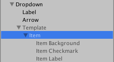
The Dropdown control is designed to have a child GameObject which serves as a template for the dropdown list that is shown when clicking the dropdown control. The template GameObject is inactive by default, but can be made active while editing the template to better see what’s going on. A reference to the template object must be specified in the Template property of the Dropdown component.
Dropdown控件设计的时候有一个子GameObject作为下拉列表的模板。这个模板GameObject默认情况下是inactive的,不过在编辑它的时候可以先active它来看清楚修改。在DropDown控件的Template属性中必须指定这个模板的引用。
The template must have a single item in it with a Toggle component on. When the actual dropdown list is created upon clicking the dropdown control, this item is duplicated multiple times, with one copy used for each option in the list. The parent of the item is automatically resized so it can fit all the items inside.
模板必须有一个单独的条目,这个条目(item)必须有一个打开状态的Toggle组件。当你点击dropdown控件并真正创建一个下拉列表的时候,这个条目(item)会被复制多份,选项列表中的每个选项对应一份拷贝。条目(item)的父节点会自动调整尺寸,因此它可以装下所有的条目(item)。
A simple dropdown setup where the item is an immediate child of the template.
一个简单的下拉菜单。条目(item)是模板的直接孩子。
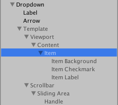
A more advanced dropdown setup that includes a scrollview that enables scrolling when there are many options in the list.
更高级的下拉列表设置,包含scrollview,当有很多选项的时候可以支持滚动。
The template can be setup in many different ways. The setup used by the GameObject > UI > Dropdown menu item includes a scroll view, such that if there are too many options to show at once, a scrollbar will appear and the user can scroll through the options. This is however not a mandatory part of the template setup.
该模板可以以各种不同的方式设置,用GameObject > UI > Dropdown菜单使用的设置包含Scroll View,因此,如果这里要一次显示太多选项,一个滚动滑块会出现,用户可以滑动选项。然而这不是模板设置的强制部分。
(See the ScrollRect page for more information about setup of Scroll Views.)
有关设置Scroll Views的更多信息,请参阅ScrollRect页面。
Setup of text and image support
text和image支持的设置
The dropdown supports one text content and one image content for each option. Both text and image is optional. They can only be used if the Dropdown is setup to support it.
下拉菜单支持每个选项一个文本内容和一个图像内容。 文本和图像都是可选的。 只有在设置下拉菜单来支持它们的情况下才能使用它们。
The dropdown supports text for each option when the Caption Text and Item Text properties are both setup. These are setup by default when using the GameObject > UI > Dropdown menu item.
Caption Text和Item Text属性都设置时,下拉菜单支持每个选项的文本。 当使用GameObject> UI> Dropdown菜单项时,这些都会被默认设置。
- The Caption Text is the Text component to hold the text for the currently selected option. It is typically a child to the Dropdown GameObject.
- Caption Text是用来显示当前选中的选项的文字描述的。它一般是Dropdown GameObject的子节点
- The Item Text is the Text component to hold the text for each option. It is typically a child to the Item GameObject.
- Item Text是用来显示每个选项的模板的文字描述。它一般是item GameObject的子节点(这块文字很绕,建议创建一个DropDown对照着看)
The dropdown supports an image for each option when the Caption Image and Item Image properties are both setup. These are not setup by default.
当Caption Image和Item Image属性都设置时,下拉菜单支持每个选项的图像。 这两个属性默认是不会设置的。
- The Caption Image is the Image component to hold the image for the currently selected option. It is typically a child to the Dropdown GameObject.
- Caption Image是用来显示当前选中的选项的图片的。它一般是Dropdown GameObject的子节点
- The Item Image is the Image component to hold the image for each option. It is typically a child to the Item GameObject.
- Item Image是用来显示每个选项的模板的图片。它一般是item GameObject的子节点
The actual text and images used for the dropdowns are specified in the Options property of the Dropdown component, or can be set from code.
下拉列表中实际的文字和图片是在Dropdown组件的Options属性中指定的,或者也可以在代码中指定。
Placement of the dropdown list
放置下拉列表
The placement of the dropdown list in relation to the dropdown control is determined by the anchoring and pivot of the Rect Transform of the Template.
下拉列表的放置位置和Dropdown控件的关联取决于Template(模板的)的Rect Transform的锚点和枢轴点
By default, the list will appear below the control. This is achieved by anchoring the template to the bottom of the control. The pivot of the template also needs to be at the top, so that as the template is exapanded to accommodate a variable number of option items, it only expands downwards.
默认情况下,列表会出现在Dropdown控件的下面。这是通过把template的锚点设置在Dropdown控件的底部来实现的。template的枢轴点也需要在顶端,因此当模板扩展到容纳可变数量的选项时,它只会向下扩展。
The Dropdown control has simple logic to prevent that the dropdown is displayed outside the bounds of the Canvas, since this would make it impossible to select certain options. If the dropdown at its default position is not fully within the Canvas rectangle, its position in relation to the control is reversed. For example, a list that is shown below the control by default will be shown above it instead.
Dropdown 控件有一个简单的逻辑防止下拉列表显示在Canvas的边界外,导致不能选到某些选项。如果dropdown在默认位置不能完全显示在Canvas的矩形区域内,列表和控件的相对位置可能会反转。例如,一个显示在dropdown控件下面的列表,会显示在dropdown控件的上面
This logic is quite simple and has certain limitations. The dropdown template needs to be no larger than half the Canvas size minus the size of the dropdown control, otherwise there may not be room for the list at either position if the dropdown control is placed in the middle of the Canvas.
这个逻辑很简单而且有一定的局限性。template的大小不能大于Canvas大小的一半减去下拉控件的大小,否则如果下拉控件放置在Canvas中间,那么在任一位置都可能没有空间。