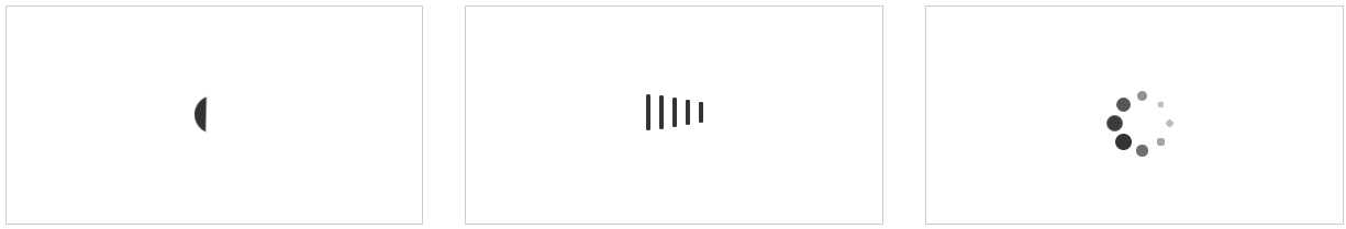
<!DOCTYPE html>
<html lang="en">
<head>
    <meta charset="UTF-8">
    <title>CSS3实现加载数据动画</title>
    <style type="text/css">
        .box{
            width: 100%;
            padding: 3%;
            /*设置margin与padding的值包含在所设置的宽高之中*/
            -webkit-box-sizing: border-box;
            -moz-box-sizing: border-box;
            box-sizing: border-box;
            /*设置隐藏移除部分*/
            overflow: hidden;
        }

        .box .loader{
            width: 30%;
            float: left;
            height: 200px;
            margin-right: 3%;
            border: 1px #cccccc solid;
            -webkit-box-sizing: border-box;
            -moz-box-sizing: border-box;
            box-sizing: border-box;

            /*设置对象显示为伸缩盒(弹性盒)模型*/
            display: flex;
            /*设置弹性盒子元素在侧轴(纵轴)方向上的对齐方式*/
            align-items: center;
            /*设置弹性盒子元素在主轴(横轴)方向上的对齐方式*/
            justify-content: center;
        }
        .loading-1{
            width: 35px;
            height: 35px;
            position: relative;
        }
        .loading-1 i{
            display: block;
            width: 100%;
            height: 100%;
            border-radius: 50%;
            background: linear-gradient(transparent 0%, transparent 70%, #333333 30%, #333333 100%);
            background: -webkit-linear-gradient(transparent 0%, transparent 70%, #333333 30%, #333333 100%);
            background: -moz-linear-gradient(transparent 0%, transparent 70%, #333333 30%, #333333 100%);
            background: -ms-linear-gradient(transparent 0%, transparent 70%, #333333 30%, #333333 100%);
            background: -o-linear-gradient(transparent 0%, transparent 70%, #333333 30%, #333333 100%);
            -webkit-animation: loading-1 .5s linear infinite;
            -moz-animation: loading-1 .5s linear infinite;
            -o-animation: loading-1 .5s linear infinite;
            animation: loading-1 .5s linear infinite;
        }
        @-webkit-keyframes loading-1{
            0%{ transform: rotate(0deg); }
            50%{ transform: rotate(180deg); }
            100%{ transform: rotate(360deg); }
        }
        @-moz-keyframes loading-1{
            0%{ transform: rotate(0deg); }
            50%{ transform: rotate(180deg); }
            100%{ transform: rotate(360deg); }
        }
        @-o-keyframes loading-1{
            0%{ transform: rotate(0deg); }
            50%{ transform: rotate(180deg); }
            100%{ transform: rotate(360deg); }
        }
        @keyframes loading-1{
            0%{ transform: rotate(0deg); }
            50%{ transform: rotate(180deg); }
            100%{ transform: rotate(360deg); }
        }
        .loading-2 i{
            /*设置为内联元素,可以使元素在同一行显示*/
            display: inline-block;
            width: 4px;
            height: 35px;
            border-radius: 2px;
            margin: 0 2px;
            background-color: #333333;
        }
        .loading-2 i:nth-child(1){
            -webkit-animation: loading-2 1s linear .1s infinite;
            -moz-animation: loading-2 1s linear .1s infinite;
            -o-animation: loading-2 1s linear .1s infinite;
            animation: loading-2 1s linear .1s infinite;
        }
        .loading-2 i:nth-child(2){
            -webkit-animation: loading-2 1s linear .2s infinite;
            -moz-animation: loading-2 1s linear .2s infinite;
            -o-animation: loading-2 1s linear .2s infinite;
            animation: loading-2 1s linear .2s infinite;
        }
        .loading-2 i:nth-child(3){
            -webkit-animation: loading-2 1s linear .3s infinite;
            -moz-animation: loading-2 1s linear .3s infinite;
            -o-animation: loading-2 1s linear .3s infinite;
            animation: loading-2 1s linear .3s infinite;
        }
        .loading-2 i:nth-child(4){
            -webkit-animation: loading-2 1s linear .4s infinite;
            -moz-animation: loading-2 1s linear .4s infinite;
            -o-animation: loading-2 1s linear .4s infinite;
            animation: loading-2 1s linear .4s infinite;
        }
        .loading-2 i:nth-child(5){
            -webkit-animation: loading-2 1s linear .5s infinite;
            -moz-animation: loading-2 1s linear .5s infinite;
            -o-animation: loading-2 1s linear .5s infinite;
            animation: loading-2 1s linear .5s infinite;
        }
        @-webkit-keyframes loading-2 {
            0%{ transform: scaleY(1); }
            50%{ transform: scaleY(.4); }
            100%{ transform: scaleY(1); }
        }
        @-moz-keyframes loading-2 {
            0%{ transform: scaleY(1); }
            50%{ transform: scaleY(.4); }
            100%{ transform: scaleY(1); }
        }
        @-o-keyframes loading-2 {
            0%{ transform: scaleY(1); }
            50%{ transform: scaleY(.4); }
            100%{ transform: scaleY(1); }
        }
        @keyframes loading-2 {
            0%{ transform: scaleY(1); }
            50%{ transform: scaleY(.4); }
            100%{ transform: scaleY(1); }
        }

        .loading-3{
            position: relative;
        }
        .loading-3 i{
            display: block;
            width: 15px;
            height: 15px;
            -webkit-border-radius: 50%;
            -moz-border-radius: 50%;
            border-radius: 50%;
            background-color: #333333;
            position: absolute;
        }
        .loading-3 i:nth-child(1){
            top: 25px;
            left: 0;
            -webkit-animation: loading-3 1s ease 0s infinite;
            -o-animation: loading-3 1s ease 0s infinite;
            -moz-animation: loading-3 1s ease 0s infinite;
            animation: loading-3 1s ease 0s infinite;
        }
        .loading-3 i:nth-child(2){
            top: 17px;
            left: 17px;
            /*这里延迟-0.12s是因为在布局时,位置是逆时针,要使动画顺时针变换,则这里需要设置负的延迟时间*/
            -webkit-animation: loading-3 1s ease -0.12s infinite;
            -o-animation: loading-3 1s ease -0.12s infinite;
            -moz-animation: loading-3 1s ease -0.12s infinite;
            animation: loading-3 1s ease -0.12s infinite;
        }
        .loading-3 i:nth-child(3){
            top: 0;
            left: 25px;
            -webkit-animation: loading-3 1s ease -0.24s infinite;
            -o-animation: loading-3 1s ease -0.24s infinite;
            -moz-animation: loading-3 1s ease -0.24s infinite;
            animation: loading-3 1s ease -0.24s infinite;
        }
        .loading-3 i:nth-child(4){
            top: -17px;
            left: 17px;
            -webkit-animation: loading-3 1s ease -0.36s infinite;
            -o-animation: loading-3 1s ease -0.36s infinite;
            -moz-animation: loading-3 1s ease -0.36s infinite;
            animation: loading-3 1s ease -0.36s infinite;
        }
        .loading-3 i:nth-child(5){
            top: -25px;
            left: 0;
            -webkit-animation: loading-3 1s ease -0.48s infinite;
            -o-animation: loading-3 1s ease -0.48s infinite;
            -moz-animation: loading-3 1s ease -0.48s infinite;
            animation: loading-3 1s ease -0.48s infinite;
        }
        .loading-3 i:nth-child(6){
            top: -17px;
            left: -17px;
            -webkit-animation: loading-3 1s ease -0.6s infinite;
            -o-animation: loading-3 1s ease -0.6s infinite;
            -moz-animation: loading-3 1s ease -0.6s infinite;
            animation: loading-3 1s ease -0.6s infinite;
        }
        .loading-3 i:nth-child(7){
            top: 0;
            left: -25px;
            -webkit-animation: loading-3 1s ease -0.72s infinite;
            -o-animation: loading-3 1s ease -0.72s infinite;
            -moz-animation: loading-3 1s ease -0.72s infinite;
            animation: loading-3 1s ease -0.72s infinite;
        }
        .loading-3 i:nth-child(8){
            top: 17px;
            left: -17px;
            -webkit-animation: loading-3 1s ease -0.84s infinite;
            -o-animation: loading-3 1s ease -0.84s infinite;
            -moz-animation: loading-3 1s ease -0.84s infinite;
            animation: loading-3 1s ease -0.84s infinite;
        }
        @-webkit-keyframes loading-3 {
            50%{
                transform: scale(.4);
                /*设置透明度为*/
                opacity: .3;
            }
            100%{
                transform: scale(1);
                /*设置透明度为*/
                opacity: 1;
            }
        }
        @-o-keyframes loading-3 {
            50%{
                transform: scale(.4);
                /*设置透明度为*/
                opacity: .3;
            }
            100%{
                transform: scale(1);
                /*设置透明度为*/
                opacity: 1;
            }
        }
        @-moz-keyframes loading-3 {
            50%{
                transform: scale(.4);
                /*设置透明度为*/
                opacity: .3;
            }
            100%{
                transform: scale(1);
                /*设置透明度为*/
                opacity: 1;
            }
        }
        @keyframes loading-3 {
            50%{
                transform: scale(.4);
                /*设置透明度为*/
                opacity: .3;
            }
            100%{
                transform: scale(1);
                /*设置透明度为*/
                opacity: 1;
            }
        }
    </style>
</head>
<body>
    <div class="box">
        <div class="loader">
            <div class="loading-1"><i></i></div>
        </div>
        <div class="loader">
            <div class="loading-2">
                <i></i>
                <i></i>
                <i></i>
                <i></i>
                <i></i>
            </div>
        </div>
        <div class="loader">
            <div class="loading-3">
                <i></i>
                <i></i>
                <i></i>
                <i></i>
                <i></i>
                <i></i>
                <i></i>
                <i></i>
            </div>
        </div>
    </div>
</body>
</html>