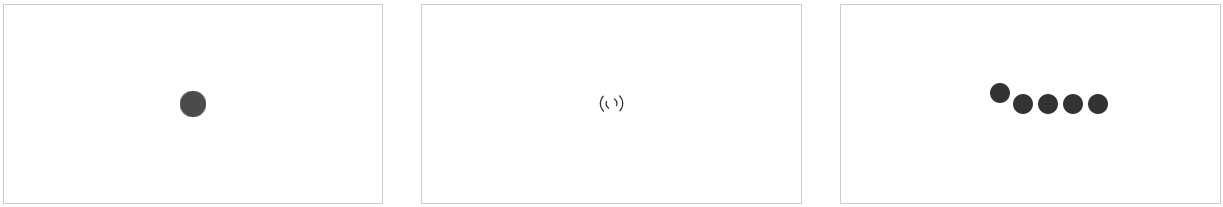
<!DOCTYPE html> <html lang="en"> <head> <meta charset="UTF-8"> <title>CSS3实现加载数据动画</title> <style type="text/css"> .box{ width: 100%; padding: 3%; -webkit-box-sizing: border-box; -moz-box-sizing: border-box; box-sizing: border-box; overflow: hidden; } .box .loader{ width: 30%; height: 200px; float: left; margin-right: 3%; border: 1px #cccccc solid; -webkit-box-sizing: border-box; -moz-box-sizing: border-box; box-sizing: border-box; display: flex; align-items: center; justify-content: center; } .loading-1{ width: 60px; height: 60px; position: relative; } .loading-1 i{ display: block; width: 60px; height: 60px; border-radius: 50%; background-color: #333333; position: absolute; left: 0; top: 0; opacity: 0; } .loading-1 i:nth-child(1){ -webkit-animation: loading-1 1s linear 0s infinite; -moz-animation: loading-1 1s linear 0s infinite; -o-animation: loading-1 1s linear 0s infinite; animation: loading-1 1s linear 0s infinite; } .loading-1 i:nth-child(2){ -webkit-animation: loading-1 1s linear 0.2s infinite; -moz-animation: loading-1 1s linear 0.2s infinite; -o-animation: loading-1 1s linear 0.2s infinite; animation: loading-1 1s linear 0.2s infinite; } .loading-1 i:nth-child(2){ -webkit-animation: loading-1 1s linear 0.4s infinite; -moz-animation: loading-1 1s linear 0.4s infinite; -o-animation: loading-1 1s linear 0.4s infinite; animation: loading-1 1s linear 0.4s infinite; } @-webkit-keyframes loading-1 { 0%{ -webkit-transform: scale(0); -moz-transform: scale(0); -ms-transform: scale(0); -o-transform: scale(0); transform: scale(0); opacity: 0; } 50%{ opacity: 1; } 100%{ -webkit-transform: scale(1); -moz-transform: scale(1); -ms-transform: scale(1); -o-transform: scale(1); transform: scale(1); opacity: 0; } } @-moz-keyframes loading-1 { 0%{ -webkit-transform: scale(0); -moz-transform: scale(0); -ms-transform: scale(0); -o-transform: scale(0); transform: scale(0); opacity: 0; } 50%{ opacity: 1; } 100%{ -webkit-transform: scale(1); -moz-transform: scale(1); -ms-transform: scale(1); -o-transform: scale(1); transform: scale(1); opacity: 0; } } @-o-keyframes loading-1 { 0%{ -webkit-transform: scale(0); -moz-transform: scale(0); -ms-transform: scale(0); -o-transform: scale(0); transform: scale(0); opacity: 0; } 50%{ opacity: 1; } 100%{ -webkit-transform: scale(1); -moz-transform: scale(1); -ms-transform: scale(1); -o-transform: scale(1); transform: scale(1); opacity: 0; } } @keyframes loading-1 { 0%{ -webkit-transform: scale(0); -moz-transform: scale(0); -ms-transform: scale(0); -o-transform: scale(0); transform: scale(0); opacity: 0; } 50%{ opacity: 1; } 100%{ -webkit-transform: scale(1); -moz-transform: scale(1); -ms-transform: scale(1); -o-transform: scale(1); transform: scale(1); opacity: 0; } } .loading-2{ width: 40px; height: 40px; position: relative; } .loading-2 i{ display: block; border: 2px solid; border-color: transparent #333333; -webkit-border-radius: 50%; -moz-border-radius: 50%; border-radius: 50%; position: absolute; } .loading-2 i:first-child{ width: 35px; height: 35px; top: 0; left: 0; -webkit-animation: loading-2 1s ease 0s infinite; -moz-animation: loading-2 1s ease 0s infinite; -o-animation: loading-2 1s ease 0s infinite; animation: loading-2 1s ease 0s infinite; } .loading-2 i:last-child{ width: 15px; height: 15px; top: 10px; left: 10px; -webkit-animation: loading-2 1s ease -0.25s infinite reverse; -moz-animation: loading-2 1s ease -0.25s infinite reverse; -o-animation: loading-2 1s ease -0.25s infinite reverse; animation: loading-2 1s ease -0.25s infinite reverse; } @-webkit-keyframes loading-2 { 0%{ -webkit-transform: rotate(0deg) scale(1); -moz-transform: rotate(0deg) scale(1); -ms-transform: rotate(0deg) scale(1); -o-transform: rotate(0deg) scale(1); transform: rotate(0deg) scale(1); } 50%{ -webkit-transform: rotate(180deg) scale(.6); -moz-transform: rotate(180deg) scale(.6); -ms-transform: rotate(180deg) scale(.6); -o-transform: rotate(180deg) scale(.6); transform: rotate(180deg) scale(.6); } 100%{ -webkit-transform: rotate(360deg) scale(1); -moz-transform: rotate(360deg) scale(1); -ms-transform: rotate(360deg) scale(1); -o-transform: rotate(360deg) scale(1); transform: rotate(360deg) scale(1); } } @-moz-keyframes loading-2 { 0%{ -webkit-transform: rotate(0deg) scale(1); -moz-transform: rotate(0deg) scale(1); -ms-transform: rotate(0deg) scale(1); -o-transform: rotate(0deg) scale(1); transform: rotate(0deg) scale(1); } 50%{ -webkit-transform: rotate(180deg) scale(.6); -moz-transform: rotate(180deg) scale(.6); -ms-transform: rotate(180deg) scale(.6); -o-transform: rotate(180deg) scale(.6); transform: rotate(180deg) scale(.6); } 100%{ -webkit-transform: rotate(360deg) scale(1); -moz-transform: rotate(360deg) scale(1); -ms-transform: rotate(360deg) scale(1); -o-transform: rotate(360deg) scale(1); transform: rotate(360deg) scale(1); } } @-o-keyframes loading-2 { 0%{ -webkit-transform: rotate(0deg) scale(1); -moz-transform: rotate(0deg) scale(1); -ms-transform: rotate(0deg) scale(1); -o-transform: rotate(0deg) scale(1); transform: rotate(0deg) scale(1); } 50%{ -webkit-transform: rotate(180deg) scale(.6); -moz-transform: rotate(180deg) scale(.6); -ms-transform: rotate(180deg) scale(.6); -o-transform: rotate(180deg) scale(.6); transform: rotate(180deg) scale(.6); } 100%{ -webkit-transform: rotate(360deg) scale(1); -moz-transform: rotate(360deg) scale(1); -ms-transform: rotate(360deg) scale(1); -o-transform: rotate(360deg) scale(1); transform: rotate(360deg) scale(1); } } @keyframes loading-2 { 0%{ -webkit-transform: rotate(0deg) scale(1); -moz-transform: rotate(0deg) scale(1); -ms-transform: rotate(0deg) scale(1); -o-transform: rotate(0deg) scale(1); transform: rotate(0deg) scale(1); } 50%{ -webkit-transform: rotate(180deg) scale(.6); -moz-transform: rotate(180deg) scale(.6); -ms-transform: rotate(180deg) scale(.6); -o-transform: rotate(180deg) scale(.6); transform: rotate(180deg) scale(.6); } 100%{ -webkit-transform: rotate(360deg) scale(1); -moz-transform: rotate(360deg) scale(1); -ms-transform: rotate(360deg) scale(1); -o-transform: rotate(360deg) scale(1); transform: rotate(360deg) scale(1); } } .loading-3{ width: 80px; height: 20px; position: relative; } .loading-3 i{ display: block; width: 20px; height: 20px; -webkit-border-radius: 50%; -moz-border-radius: 50%; border-radius: 50%; background: #333333; margin-right: 10px; position: absolute; } .loading-3 i:nth-child(1){ -webkit-animation: loading-3 2s linear 0s infinite; -moz-animation: loading-3 2s linear 0s infinite; -o-animation: loading-3 2s linear 0s infinite; animation: loading-3 2s linear 0s infinite; } .loading-3 i:nth-child(2){ -webkit-animation: loading-3 2s linear -0.4s infinite; -moz-animation: loading-3 2s linear -0.4s infinite; -o-animation: loading-3 2s linear -0.4s infinite; animation: loading-3 2s linear -0.4s infinite; } .loading-3 i:nth-child(3){ -webkit-animation: loading-3 2s linear -0.8s infinite; -moz-animation: loading-3 2s linear -0.8s infinite; -o-animation: loading-3 2s linear -0.8s infinite; animation: loading-3 2s linear -0.8s infinite; } .loading-3 i:nth-child(4){ -webkit-animation: loading-3 2s linear -1.2s infinite; -moz-animation: loading-3 2s linear -1.2s infinite; -o-animation: loading-3 2s linear -1.2s infinite; animation: loading-3 2s linear -1.2s infinite; } .loading-3 i:nth-child(5){ -webkit-animation: loading-3 2s linear -1.6s infinite; -moz-animation: loading-3 2s linear -1.6s infinite; -o-animation: loading-3 2s linear -1.6s infinite; animation: loading-3 2s linear -1.6s infinite; } @-moz-keyframes loading-3 { 0%{ left: 100px; top: 0; } 80%{ left: 0; top: 0; } 85%{ width: 20px; height: 20px; left: 0; top: -25px; } 90%{ width: 40px; height: 20px; } 95%{ left: 100px; top: -20px; width: 20px; height: 20px; } 100%{ left: 100px; top: 0; } } @-webkit-keyframes loading-3 { 0%{ left: 100px; top: 0; } 80%{ left: 0; top: 0; } 85%{ width: 20px; height: 20px; left: 0; top: -25px; } 90%{ width: 40px; height: 20px; } 95%{ left: 100px; top: -20px; width: 20px; height: 20px; } 100%{ left: 100px; top: 0; } } @-o-keyframes loading-3 { 0%{ left: 100px; top: 0; } 80%{ left: 0; top: 0; } 85%{ width: 20px; height: 20px; left: 0; top: -25px; } 90%{ width: 40px; height: 20px; } 95%{ left: 100px; top: -20px; width: 20px; height: 20px; } 100%{ left: 100px; top: 0; } } @keyframes loading-3 { 0%{ left: 100px; top: 0; } 80%{ left: 0; top: 0; } 85%{ width: 20px; height: 20px; left: 0; top: -25px; } 90%{ width: 40px; height: 20px; } 95%{ left: 100px; top: -20px; width: 20px; height: 20px; } 100%{ left: 100px; top: 0; } } </style> </head> <body> <div class="box"> <div class="loader"> <div class="loading-1"> <i></i> <i></i> <i></i> </div> </div> <div class="loader"> <div class="loading-2"> <i></i> <i></i> </div> </div> <div class="loader"> <div class="loading-3"> <i></i> <i></i> <i></i> <i></i> <i></i> </div> </div> </div> </body> </html>