一、文本属性
1.text-align:cnter 文本居中
2.line heigth 垂直居中 :行高,和高度对应
3.设置图片与文本的距离:vertical-align
4.text-decoration:none 去掉超链接下划线
5.要是给a标签修改颜色的时候,就定到a标签上,用继承有时候是搞不定的
因为继承的级别是很低的,如果a标签设置了样式,是不会继承父亲的
6.首行缩进:text-indent:30px
7.font-style:oblique 或者italic....(设置字体的样式为斜体)
二、背景属性
">background-image:url(‘11.jpg‘); 背景图片链接
background-repeat:repeat-x; x轴平铺
background-repeat:no-repeat; 不重复
background-position:400px 200px 调整背景的位置(距左。距右)
background-position: center:center; 背景居中
简写:
background: url(‘11.jpg‘) no-repeat center;
//背景调试小黄人的眼睛
<!DOCTYPE html>
<html lang="en">
<head>
<meta charset="UTF-8">
<title>背景处理</title>
<style>
.c1{
width: 100px;
height: 100px;
border: 1px solid red;
background: url("xhr.jpg") -206px -29px;
/*可在那个网页上右击点击检查,调试*/
/*background-position: center; */
/*定位*/
}
</style>
</head>
<body>
<div class="c1">
</div>
</body>
</html>

 1 <!DOCTYPE html>
 2 <html lang="en">
 3 <head>
 4     <meta charset="UTF-8">
 5     <title>背景处理</title>
 6     <style>
 7         .c1{
 8             width: 100px;
 9             height: 100px;
10             border: 1px solid red;
11             background: url("xhr.jpg")  -206px -29px;
12             /*可在那个网页上右击点击检查,调试*/
13             /*background-position: center; */
14             /*定位*/
15         }
16     </style>
17 </head>
18 <body>
19 <div class="c1">
20 </div>
21 </body>
22 </html>
三、边框属性
常用属性
简写:border :1px soild red;
deshed:虚线
只加有一个方向的:border-right :1px soild red;
四、列表属性
去掉列表前面的标志:ul li{list-style:none;}
去掉列表前面的空格:ul{padding:0}
上面两行也可写成下面一行
去掉盒子上面的间隙:*{margin:0; padding :0;}
<!DOCTYPE html>
<html lang="en">
<head>
    <meta charset="UTF-8">
    <title>Title</title>
    <style>
        ul li{
            font-family: 华文中宋;
            list-style: none; //去掉点
            /*list-style: circle;//空心圆*/
            /*list-style: disc;//实心圆(默认也是实心圆)*/
        }
        ul{
            padding: 0; //把字体移到前面

        }
    </style>
</head>
<body>
<div>
    <ul>
        <li>第一章</li>
        <li>第二章</li>
        <li>第三章</li>
        <li>第四章</li>
    </ul>
</div>
</body>
</html>
五、display属性
display属性
1.将块级标签设置成内联标签:disply:inline;
2.将内联标签设置成块级标签:disply:block;
3.内联块级标签:像块级一样可设长宽,也可像内联一样在一行显示:display:inline-block;
4.display:none; 吧不想让用户看到的给隐藏了(很重要的一个属性)
5.visibility :hiddon; 也是隐藏
注意与visibility:hidden的区别:
visibility:hidden:可以隐藏某个元素,但隐藏的元素仍需占用与未隐藏之前一样的空间。也就是说,该元素虽然被 隐藏了,但仍然会影响布局。
display:none:可以隐藏某个元素,且隐藏的元素不会占用任何空间。也就是说,该元素不但被隐藏了,而且该元 素原本占用的空间也会从页面布局中消失
<!DOCTYPE html>
<html lang="en">
<head>
    <meta charset="UTF-8">
    <title>Title</title>
    <style>
        .c1{
            width: 100px;
            height:100px;
            background-color: rebeccapurple;
        }
        .c2{
            width: 100px;
            height:100px;
            background-color: burlywood;
        }
        .c3{
            width: 100px;
            height:100px;
            background-color: crimson;
            display: inline;
        }
        .c4{
            width: 100px;
            height:100px;
            background-color: gray;
        }
        .s1{
             display: block;
            width: 200px;
            height: 200px;
            background-color: royalblue;
            /*visibility: hidden;*/  //隐藏了其他的不会顶上去
            display:none; //隐藏了其他的会顶上去

        }
    </style>
</head>
<body>
<div class="c4">div</div>
<span class="s1">span</span>
<div class="c1">年后</div>
<div class="c2">年后</div>
<div class="c3">年后</div>
</body>
</html>
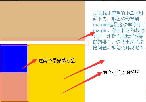
六、边距的塌陷问题
1、兄弟div:
上面div的margin-bottom和下面div的margin-top会塌陷,也就是会取上下两者margin里最大值作为显示值
2、父子div:
if 父级div中没有border,padding,inlinecontent,子级div的margin会一直向上找,直到找到某个标签包括border,padding,inline content中的其中一个,然后按此div 进行margin;
解决方法
解决方法
        这两种会改变结构
            1.加上padding
            2.加上border
        不改变结构
            3.overflow:hidden
<!DOCTYPE html>
<html lang="en">
<head>
<meta charset="UTF-8">
<title>Title</title>
<style>
body{
margin: 0;
}
.outer{
background-color: gold;
width: 300px;
height: 300px;
/*第一种解决方法:但是改变了结构padding: 10px;*/
/*第二种方法:加个border*/ /*border: 1px solid;*/
/*第三种方法*/
overflow: hidden;
}
.box1{
width: 100px;
height: 100px;
background-color: blue;
/*如果父级标签什么都没有,那么就会找叔叔的*/
margin-top:10px;
}
.box2{
width: 100px;
height: 100px;
background-color: darksalmon;
/*如果这样的话就合适呢,对着就下去了*/
margin-top: 10px;
}
</style>
</head>
<body>
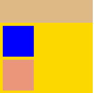
<div style="background-color: burlywood; width:300px; height
:300px"></div>
<div class="outer">
<div class="box1"></div>
<div class="box2"></div>
</div>
</body>
</html>
处理后的结果如图:
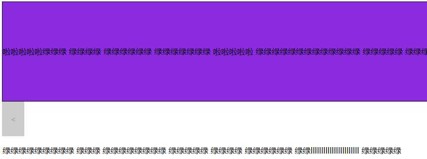
溢出问题
//溢出例子
<!DOCTYPE html>
<html lang="en">
<head>
<meta charset="UTF-8">
<title>css属性操作</title>
<style>
.c1{
border: 1px solid;
background-color: blueviolet;
width: 100%;
height:200px;
/*text-align: center;*/
/*设置两端对齐*/
text-align: justify;
line-height: 200px;
/*如果你写的多了,会溢出来*/
/*第一种方法:overflow: hidden;*/
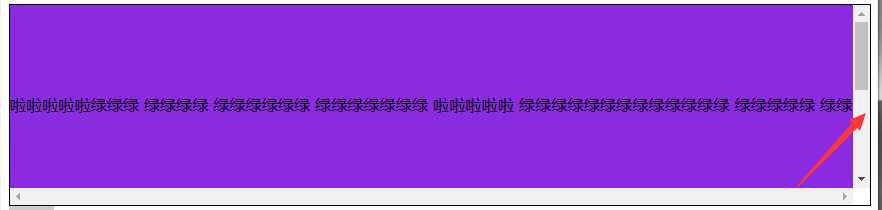
overflow: scroll;
}
.btn{
width: 45px;
height: 70px;
background-color: gray;
/*设置透明度*/
opacity: 0.4;
text-align: center;
line-height: 70px;
/*行高和高度对应*/
}
</style>
</head>
<body>
<div class="c1">啦啦啦啦啦绿绿绿
绿绿绿绿 绿绿绿绿绿绿 绿绿绿绿绿绿绿
啦啦啦啦啦 绿绿绿绿绿绿绿绿绿绿绿绿绿
绿绿绿绿绿 绿绿绿绿绿绿绿绿绿绿绿绿
绿绿绿 绿绿绿绿绿绿绿绿 绿绿绿绿绿
绿绿绿绿 绿绿绿绿绿绿 绿绿lllllllllllllllllllllll
绿绿绿绿绿</div>
<div class="btn"> < </div>
</body>
</html>
解决溢出的方法
解决溢出的方法
        overflow:auto;

     overflow: hidden;

        overflow:scoll; #加上滚动条
七、清除浮动
clear语法:
clear:none | left | right | both
1.clear:left 清除的是左边的浮动
2.clear:both :保证左右两边都没有浮动
注意:
排序的时候是一个标签一个标签的排
如果上一个是浮动的,就紧贴个上一个
如果上一个不是浮动的,就和上一个保持垂直不变
八、float父级的塌陷问题
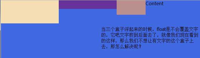
float它不是完全脱离,它是半脱离的。像是文字环绕的就是用float实现的。float是不覆盖文字的
半脱离的,吧文字给挤过去了。
//float塌陷
<!DOCTYPE html>
<html lang="en">
<head>
    <meta charset="UTF-8">
    <title>Title</title>
    <style>
        .c1{
            width: 100px;
            height: 60px;
            background-color: blue;
            float: left;
        }
        .c2{
            width: 200px;
            height: 30px;
            background-color: aqua;
            float: left;
        }
         .c3{
            width: 200px;
            height: 100px;
            background-color: crimson;
             float: left;
        }

    </style>
</head>
<body>
<div class="c1"></div>
<div class="c2"></div>
<div class="c3"></div>

<div class="content">
    content
</div>
</body>
</html>
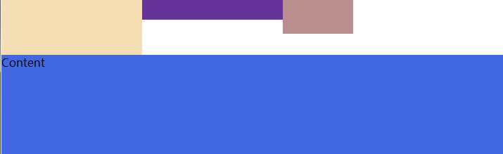
解决方案
解决方案
    1.<div style=‘clear:both‘></div>
    也可以不加div
    2.用after
    .header:after{
        content:""; #内容为空
        display:block; #块级标签
        clear:both; #清楚浮动的功能
    }

    约定的名字:clearfix
    .clearfix:after{
        content:""; #内容为空
        display:block; #块级标签
        clear:both; #清楚浮动的功能(可以做到一个自动切换的功能)
    }
解决问题以后的
<!DOCTYPE html>
<html lang="en">
<head>
    <meta charset="UTF-8">
    <title>Title</title>
    <style>
        *{
            margin: 0;
            padding: 0;
        }
        .header{
            /*height: 30px;*/
        }
        .box1{
            width: 200px;
            height: 80px;
            background-color: wheat;
            float: left;
        }
         .box2{
            width: 200px;
            height: 30px;
            background-color: rebeccapurple;
             float: left;
        }
          .box3{
            width: 100px;
            height: 50px;
            background-color: rosybrown;
              float: left;
        }

        .content{
            width: 100%;
            height: 200px;
            background-color: royalblue;
        }


        .clearfix:after{
            content: "";
            display: block;
            clear: both;
        }
    </style>
</head>
<body>

<div class="header clearfix">
    <div class="box1"></div>
    <div class="box2"></div>
    <div class="box3"></div>

</div>
<div class="content">
    Content
</div>
</body>
</html>
九、position(定位)属性
position的四种属性
1.static:默认位置
2.fixed:完全脱离文档流,固定定位(以可视窗口为参照物)
3.relative:相对定位(参照的是自己本身的位置),没有脱离文档流,没有顶上去,会保持自己的位置不动。可以使用top left 进行定位
4.absolute:绝对定位:脱离了文档流(参照的是按已定位的父级标签定位,如果找不到会按body的去找)
注意:将定位标签设置为absolute,将他的父级标签设置为定位标签 (relative)
field举例(做一个返回顶部的样式。不管你拉不拉滚动条,他都会固定位置不变给它加一个)
//固定位置
<!DOCTYPE html>
<html lang="en">
<head>
    <meta charset="UTF-8">
    <title>固定位置</title>

    <style>
        .c1{
            background-color: limegreen;
            width:100%;
            height: 1000px;
        }
        .returntop{
            width: 100px;
            height: 40px;
            background-color: gray;
            /*透明度*/
            /*opacity: 0.4;*/
            color: white;
            text-align: center;
            line-height: 40px;
            position: fixed;
            bottom:50px;
            right: 20px;
        }
    </style>
</head>
<body>
<div class="c1"></div>
<div class="returntop">返回顶部>></div>


</body>
</html>
相对位置,绝对位置例子
===============
一开始父级没有定位、
<!DOCTYPE html>
<html lang="en">
<head>
    <meta charset="UTF-8">
    <title>绝对定位</title>
    <style>
        *{
            margin: 0;
        }
        .box1 ,.box2,.box3{
            width: 200px;
            height: 200px;
        }
        .box1{
            background-color: blueviolet;  position: relative;

        }
        .box2{
            background-color: darksalmon;
            position: relative;
            /*position: absolute;*/
            left: 200px;
            /*right: 200px;*/
            top: 200px;
        }
        .box3{
            background-color: lime;
        }
    </style>
</head>
<body>
<div class="box1"></div>
<div class="box2"></div>
<div class="box3"></div>
</body>
</html>
<!--父级有了定位-->
<!--================-->
<!DOCTYPE html>
<html lang="en">
<head>
    <meta charset="UTF-8">
    <title>绝对定位</title>
    <style>
        .father{
            position: relative;
        }
        *{
            margin: 0;
        }
        .box1 ,.box2,.box3{
            width: 200px;
            height: 200px;
        }
        .box1{
            background-color: blueviolet;  position: relative;

        }
        .box2{
            background-color: darksalmon;
            /*position: relative;*/
            position: absolute;
            left: 200px;
            /*right: 200px;*/
            top: 200px;
        }
        .box3{
            background-color: lime;
            position: absolute;
        }
    </style>
</head>
<body>
<div class="box1"></div>
<div class="father">
    <div class="box2"></div>
</div>
<div class="box3"></div>


</body>
</html>

父级标签有了定位
十、float和position的区别
float:半脱离文档流
position:全脱离文档流