虽说css3 都已经使用多年了,但是关于css3的渐变用的很少。今天遇见了,就学习了一下。
首先我们打开ps,新建一个画布,选择渐变工具,这个时候我们能够看到顶栏上面的渐变类型如下
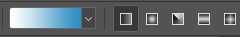
第一个我们选中的是线性渐变,第二个是径向渐变,第三个是角度渐变,第四个是对称渐变,第五个是菱形渐变。对于css3 并没有提供这么多的渐变类型,只提供了两种基本的渐变类型:线性渐变和径向渐变,还有一种组合渐变就是重复渐变。
线性渐变
css3 中的线性渐变用的是 linear-gradient 这个函数。
基本语法:
<linear-gradient> = linear-gradient([ [ <angle> | to <side-or-corner] ,]? <color-start>[, <color-end>]+)
<side-or-corner> = [left | right] || [top | bottom]
<color-start|end> = <color>[ <length>|<percentage>]?
语法说明:
<angle>:用角度值指定渐变的方向(或角度)。
to left:设置渐变为从右到左。相当于: 270deg
to right:设置渐变从左到右。相当于: 90deg
to top:设置渐变从下到上。相当于: 0deg
to bottom:设置渐变从上到下。相当于: 180deg。这是默认值,等同于留空不写。
<color-start|end> 用于指定渐变的起止颜色:
<color>:指定颜色。
<length>:用长度值指定起止色位置。不允许负值
<percentage>:用百分比指定起止色位置。
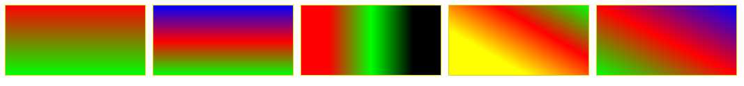
实例如下:
div {
    width: 200px;
    height: 100px;
    margin: 10px 5px;
    border: 1px solid #ddd000;
}
#LinearStartToEnd {
  float:left;
  background: linear-gradient(#ff0000, #00ff00);
}
#LinearPercentage {
  float:left;
  background: linear-gradient(#0000ff, #ff0000 52%, #00ff00);
}
#LinearAnglePercentage {
  float:left;
  background: linear-gradient(90deg, #ff0000 20%, #00ff00 50%, #000000 80%);
}
#LinearAngle {
  float:left;
  background: linear-gradient(30deg, #ffff00 30%, #ff0000, #00ff00);
}
#LinearTopRight {
  float:left;
  background: linear-gradient(to right top, #00ff00, #ff0000 50%, #0000ff);
}
径向渐变
使用函数:raidal-gradient
基本语法
 <position> = [ <length>① | <percentage>① | left | center① | right ]? [ <length>② | <percentage>② | top | center② | bottom ]?
     <shape> = circle | ellipse
     <size> = <extent-keyword>|[<circle-size>||<ellipse-size>]
     <extent-keyword> = closest-side | closest-corner | farthest-side | farthest-corner
     <circle-size> = <length>
     <ellipse-size> = [ <length>| <percentage> ]{2}
     <shape-size> = <length>| <percentage>
     <radial-gradient> = radial-gradient([ [ <shape>|| <size> ] [ at <position> ]? , | at <position> , ]?<color-start>[[ , <color-end>]]+)
语法的简单描述
<position> 确定圆心的位置。如果提供2个参数,第一个表示横坐标,第二个表示纵坐标;如果只提供一个,第二值默认为50%,即center
<length>①:用长度值指定径向渐变圆心的横坐标值。可以为负值。
<percentage>①:用百分比指定径向渐变圆心的横坐标值。可以为负值。
<length>②:用长度值指定径向渐变圆心的纵坐标值。可以为负值。
<percentage>②:用百分比指定径向渐变圆心的纵坐标值。可以为负值。
center①:设置中间为径向渐变圆心的横坐标值。
center②:设置中间为径向渐变圆心的纵坐标值。
left:设置左边为径向渐变圆心的横坐标值。
right:设置右边为径向渐变圆心的横坐标值。
top:设置顶部为径向渐变圆心的纵坐标值。
bottom:设置底部为径向渐变圆心的纵坐标值。
<shape> 确定圆的类型
circle:指定圆形的径向渐变
ellipse:指定椭圆形的径向渐变。
<extent-keyword> circle | ellipse 都接受该值作为 size。
closest-side:指定径向渐变的半径长度为从圆心到离圆心最近的边。
closest-corner:指定径向渐变的半径长度为从圆心到离圆心最近的角。
farthest-side:指定径向渐变的半径长度为从圆心到离圆心最远的边。
farthest-corner:指定径向渐变的半径长度为从圆心到离圆心最远的角。
<circle-size> circle 接受该值作为 size。
<length>:用长度值指定正圆径向渐变的半径长度。不允许负值。
<ellipse-size> ellipse 接受该值作为 size。
<length>:用长度值指定椭圆径向渐变的横向或纵向半径长度。不允许负值。
<percentage>:用百分比指定椭圆径向渐变的横向或纵向半径长度。不允许负值。
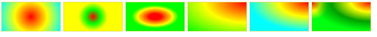
实例如下:
#RadialCenterCircle {
  float:left;
    background: radial-gradient(circle at center, #ff0000, #ffff00, #00ffff);
}
#RadialClosestSide {
  float:left;
    background: radial-gradient(circle closest-side, #ff0000, #00ff00, #ffff00);
}
#RadialFarthestSide {
  float:left;
    background: radial-gradient(farthest-side, #ff0000 20%, #ffff00 60%, #00ff00 80%);
}
#RadialRightTop {
  float:left;
    background: radial-gradient(at right top, #ff0000, #ffff00, #00ff00);
}
#RadialRadiusCenter {
  float:left;
    background: radial-gradient(farthest-side at top right, #ff0000, #ffff00, #01fefe);
}
#RadialGroup {
  float:left;
    background:
        radial-gradient(farthest-side at top right, #ff0000, #ffff00, #009f00, transparent),
        radial-gradient(60px at top left, #ff0000, #ffff00, #00ff0e);
}
重复渐变
重复渐变分为重复线性渐变和重复径向渐变,重复渐变的语法其实和相对应的基础渐变的语法是相类似的。
下面给出一些基本的实例:
#RepeatingLinearPercentage{
  float:left;
    background: repeating-linear-gradient(#ff0000, #00ff00 10%, #000000 15%);
}
#RepeatingLinearRight {
  float:left;
    background: repeating-linear-gradient(to right, #ff0000, #00ff00 10%, #000000 15%);
}
#RepeatingLinearAngle {
  float:left;
    background: repeating-linear-gradient(45deg, #ff0000, #00ff00 10%, #0000ff 15%);
}
#RepeatingLinearBottomLeft {
  float:left;
    background: repeating-linear-gradient(to bottom left, #00ffff, #ff0000 10%, #00ff00 15%);
}
#RepeatingRadialCircle {
  float:left;
    background: repeating-radial-gradient(circle, #ff0000 0, #00ff00 10%, #0000ff 15%);
}
#RepeatingRadialTopLeft {
  float:left;
    background: repeating-radial-gradient(at top left, #ff0000, #00ff00 10%, #0de0f0 15%, #ffff00 20%, #000000 25%);
}
#RepeatingRadialClosestCorner {
  float:left;
    background: repeating-radial-gradient(circle closest-corner at 20px 50px, #00ff00, #ff0000 10%, #00ffff 20%, #ffff00 30%, #ff00ff 40%);
}

以上就是有关渐变的基本学习