效果如下:
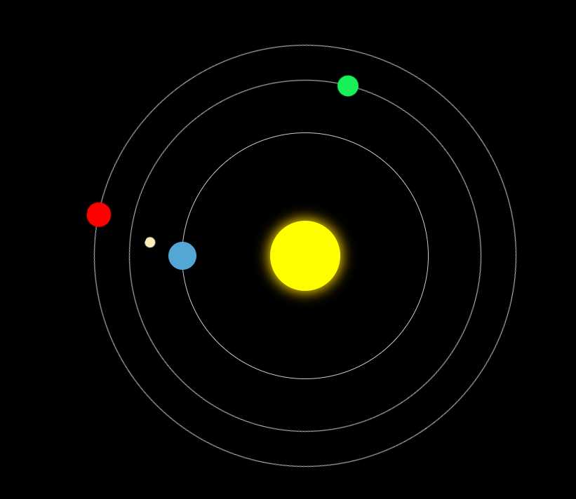
代码如下:
<!DOCTYPE html>
<html>
<head>
<meta charset="utf-8">
    <title></title>
    <style type="text/css">
    body{
        background: #000;
    }
    .sun{
        width: 100px;
        height: 100px;
        position: absolute;
        top: 50%;
        left: 50%;
        margin-left: -50px;
        margin-top: -50px;
        /*保证居中*/
        transform: translate(-50%;-50%);
        background: yellow;
        border-radius: 50%;
        box-shadow: 0 0 30px 3px gold;
    }
    .earth{
        width: 350px;
        height: 350px;
        position: absolute;
        top: 50%;
        left: 50%;
        transform: translate(-50%,-50%);
        border:1px solid #ccc;
        border-radius: 50%;
        /*animation: whirl 5s linear infinite;*/
    }
    .earth::before{
        content: "";
        width: 40px;
        height: 40px;
        position: absolute;
        top: 50%;
        left: 0;
        transform: translate(-50%,-50%);
        background: #54A6D5;
        border-radius: 50%;
    }
    .moon{
        width: 100px;
        height: 100px;
        position: absolute;
        left: 0;
        top: 50%;
        transform: translate(-50%,-50%);
        border-radius: 50%;
        /*border:1px solid #ccc;*/
        animation: whirl 5s linear infinite;
    }
    .moon::before{
        content: "";
        width: 15px;
        height: 15px;
        position: absolute;
        left: 0;
        top: 50%;
        transform: translate(-50%,-50%);
        border-radius: 50%;
        background: #F8EDBB;
    }
    .venus{
        width: 500px;
        height: 500px;
        position: absolute;
        top: 50%;
        left: 50%;
        transform: translate(-50%,-50%);
        border:1px solid #ccc;
        border-radius: 50%;
        animation: whirl 8s linear infinite;
    }
    .venus::before{
        content: "";
        width: 30px;
        height: 30px;
        position: absolute;
        left: 0;
        top: 50%;
        transform: translate(-50%,-50%);
        background: #17F056;
        border-radius: 50%;
    }
    .jupiter{
        width: 600px;
        height: 600px;
        position: absolute;
        top: 50%;
        left: 50%;
        transform: translate(-50%,-50%);
        border-radius: 50%;
        border:1px solid #ccc;
        animation: whirl 10s linear infinite;
    }
    .jupiter::before{
        content: "";
        width: 35px;
        height: 35px;
        position: absolute;
        top: 50%;
        left: 0;
        transform: translate(-50%,-50%);
        border-radius: 50%;
        background: red;
    }
    @keyframes whirl{
        0%{
            transform: translate(-50%,-50%) rotate(0deg);
        }
        100%{
            transform: translate(-50%,-50%) rotate(360deg);
        }
    }
    </style>
</head>
<body>
<div class="sun"></div>
<div class="earth">
    <div class="moon"></div>
</div>
<div class="venus"></div>
<div class="jupiter"></div>
</body>
</html>