<!DOCTYPE html>
<html>
<head>
<meta charset="UTF-8">
<title></title>
</head>
<style type="text/css">
/* 分别设置father和son的宽高和边框*/
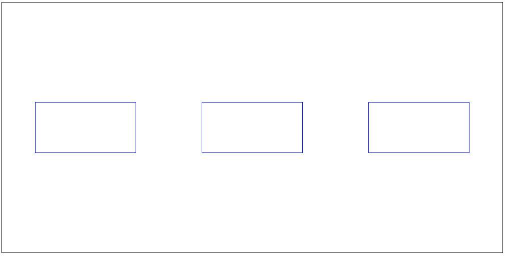
.father{
width: 1000px;
height: 500px;
border: 1px solid black;
/*在css中设置father为弹性盒子*/
display: flex;
/*让father的子元素在father中水平居中
justify-content: center;*/
/*让子元素空间环绕*/
justify-content: space-around;
/*让子元素垂直居中*/
align-items: center;
/*允许当父系元素宽度小于子元素总宽度时,多余的子系元素换行排列*/
flex-wrap: nowrap;
}
.son{
/*可去掉son的宽度,使用flex:N(n填写数字)参数,则每个son的宽度占父系宽度的 "N/总N"
* flex: N;*/
width: 200px;
height: 100px;
border: 1px solid blue;
}
</style>
<body>
<!--设置一个父系div,取名叫father-->
<div class="father">
<!--设置子div,取名叫son-->
<div class="son"></div>
<div class="son"></div>
<div class="son"></div>
</div>
</body>
</html>
效果图: