近期公司给我一个任务,就是利用arcgis api for flex实如今地图上点(业务数据)直接显示饼状图以及柱状图的专题图制作。而不是通过点击点显示气泡窗体的形式来实现。这个公司已经实现了。
经过一段时间的摸索,參照一些网上资源,眼下大概弄出来了,里面还有待完好的地方的。
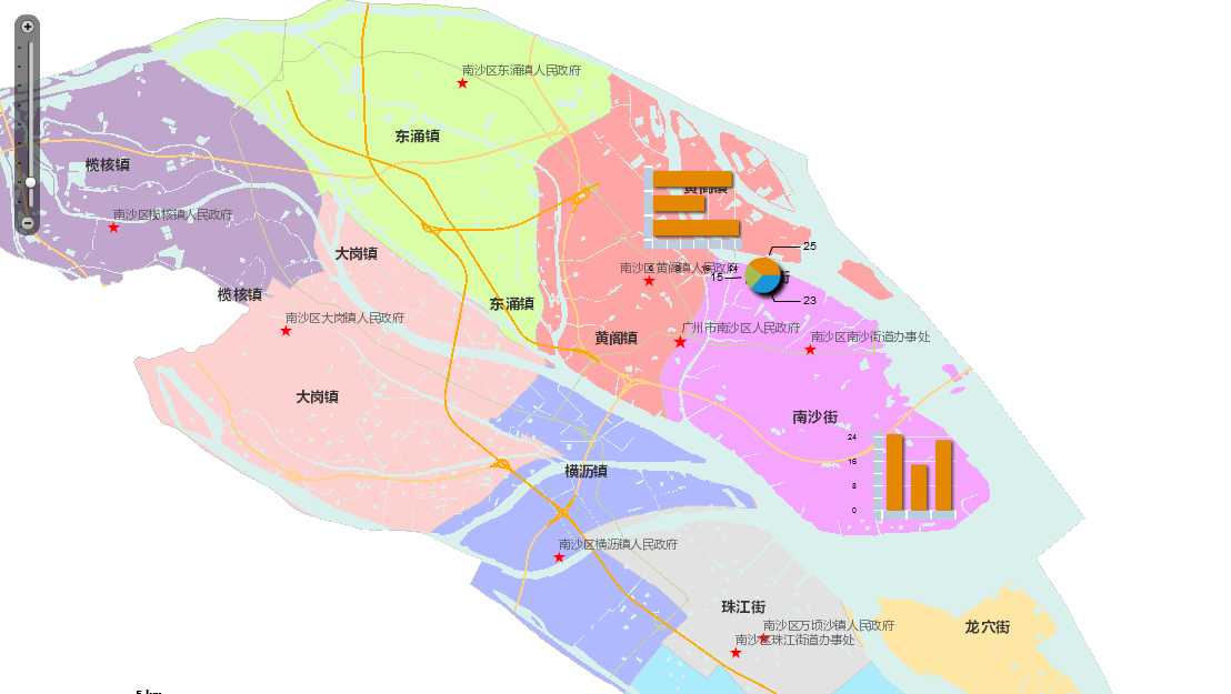
效果图例如以下:
(1)Chart.mxml,基本的展示地图专题图效果的页面
|
1
2
3
4
5
6
7
8
9
10
11
12
13
14
15
16
17
18
19
20
21
22
23
24
25
26
27
28
29
30
31
32
33
34
35
36
37
38
39
40
41
42
43
44
45
46
47
48
49
50
51
52
53
54
55
56
57
58
59
60
61
62
63
64
65
66
67
68
69
70
71
72
73
74
75
76
77
78
79
80
81
82
83
84
85
86
87
88
89
90
91
|
<?xml
 version=
"1.0" encoding="utf-8"?<s:Application
xmlns:fx="http://ns.adobe.com/mxml/2009" pageTitle="Charts
in infowindow" xmlns:symbols="com.esri.ags.symbols.*"> <fx:Style> .chartStyle { borderThickness: 0; infoPlacement:
center; backgroundAlpha: 0; infoOffsetX: 0; infoOffsetY: 0; paddingLeft: 0; paddingRight: 0; paddingTop: 0; paddingBottom: 0; } </fx:Style> <fx:Script> <![CDATA[ import com.esri.ags.geometry.MapPoint; import com.esri.ags.FeatureSet; import com.esri.ags.Graphic; import com.esri.ags.events.MapEvent; import com.esri.ags.tasks.QueryTask; import com.esri.ags.tasks.supportClasses.Query; import mx.collections.ArrayCollection; import mx.controls.Alert; import mx.events.FlexEvent; import mx.rpc.AsyncResponder; protected function myMap_initializeHandler(event:MapEvent):void { var pie:MapPoint
= new MapPoint(113.55185,22.82289); var column:MapPoint
= new MapPoint(113.59637985600011,22.758225999000047); var bar:MapPoint
= new MapPoint(113.52757794,22.84012158); var gpie:Graphic
= new Graphic(pie); var gcolumn:Graphic
= new Graphic(column); var gbar:Graphic
= new Graphic(bar); //g.attributes
= new Object(); var thematic:ArrayCollection
= new ArrayCollection( [ {
Name: "危化品1",
Rate: 25 }, {
Name: "危化品2",
Rate: 15 }, {
Name: "危化品3",
Rate: 23 } ]); //g.attributes.thematic
= thematic; gpie.attributes
= thematic; gcolumn.attributes
= thematic; gbar.attributes
= thematic; this.myGraphicsLayerpie.add(gpie); this.myGraphicsLayercolumn.add(gcolumn); this.myGraphicsLayerbar.add(gbar); } ]]> </fx:Script> <fx:Declarations> <esri:InfoSymbol
id="infoSymbolpie" infoRenderer="InfoRendererPieChart" containerStyleName="chartStyle"> </esri:InfoSymbol> <esri:InfoSymbol
id="infoSymbolcolumn" infoRenderer="InfoRendererColumnChart" containerStyleName="chartStyle"> </esri:InfoSymbol> <esri:InfoSymbol
id="infoSymbolbar" infoRenderer="InfoRendererBarChart" containerStyleName="chartStylee"> </esri:InfoSymbol> </fx:Declarations> <esri:Map
id="myMap" load="myMap_initializeHandler(event)"> <esri:extent> <esri:Extent
xmin="113.284171273203" ymin="22.6348519473499" xmax="113.774816132605" ymax="22.9103935318251"> <esri:spatialReference> <esri:SpatialReference
wkid="4326"/> </esri:spatialReference> </esri:Extent> </esri:extent> <esri:ArcGISTiledMapServiceLayer
url="http://localhost:6080/ArcGIS/rest/services/ns_new/MapServer"/> <esri:GraphicsLayer
id="myGraphicsLayercolumn" symbol="{infoSymbolcolumn}"> </esri:GraphicsLayer> <esri:GraphicsLayer
id="myGraphicsLayerpie" symbol="{infoSymbolpie}"> </esri:GraphicsLayer> <esri:GraphicsLayer
id="myGraphicsLayerbar" symbol="{infoSymbolbar}"> </esri:GraphicsLayer> </esri:Map> </s:Application> |
(2)InfoRendererBarChart.mxml、InfoRendererColumnChart.mxml、InfoRendererPieChart.mxml。各自是柱状图以及饼状图实现的页面
1.InfoRendererBarChart.mxml
|
1
2
3
4
5
6
7
8
9
10
11
12
13
14
15
16
17
18
19
20
21
22
23
24
25
26
27
28
29
30
31
32
33
34
35
36
37
38
39
40
41
42
43
44
45
46
47
48
49
|
<?xml
 version=
"1.0" encoding="utf-8"?><s:VGroup
xmlns:fx="http://ns.adobe.com/mxml/2009" clipAndEnableScrolling="true" creationComplete="creationCompleteHandler()" implements="mx.core.IDataRenderer" width="100" height="100"> <!-- This is used
by the QueryResultsWithChart sample. --> <fx:Script> <![CDATA[ private var _data:Object; [Bindable] //
implement IDataRenderer public function get data():Object { return _data; } public function set data(value:Object):void { _data
= value; } private function creationCompleteHandler():void { } ]]> </fx:Script> <mx:BarChart
id="columnChart" width="100%" height="100%" dataProvider="{data}" showDataTips="true"> <mx:series> <mx:BarSeries
id="barSeries" xField="Rate"/> </mx:series> <mx:verticalAxis> <mx:CategoryAxis
id="barAxis" categoryField="Name"/> </mx:verticalAxis> <mx:verticalAxisRenderers> <mx:AxisRenderer
axis="{barAxis}" showLabels="false"/> </mx:verticalAxisRenderers> </mx:BarChart></s:VGroup> |
2.InfoRendererColumnChart.mxml
|
1
2
3
4
5
6
7
8
9
10
11
12
13
14
15
16
17
18
19
20
21
22
23
24
25
26
27
28
29
30
31
32
33
34
35
36
37
38
39
40
41
42
43
44
45
46
47
48
|
<?xml
 version=
"1.0" encoding="utf-8"?><s:VGroup
xmlns:fx="http://ns.adobe.com/mxml/2009" clipAndEnableScrolling="true" creationComplete="creationCompleteHandler()" implements="mx.core.IDataRenderer" width="100" height="100"> <!-- This is used
by the QueryResultsWithChart sample. --> <fx:Script> <![CDATA[ private var _data:Object; [Bindable] //
implement IDataRenderer public function get data():Object { return _data; } public function set data(value:Object):void { _data
= value; } private function creationCompleteHandler():void { } ]]> </fx:Script> <mx:ColumnChart
id="columnChart" width="100%" height="100%" dataProvider="{data}" showDataTips="true"> <mx:series> <mx:ColumnSeries
id="columnSeries" yField="Rate"/> </mx:series> <mx:horizontalAxis> <mx:CategoryAxis
id="columnAxis" categoryField="Name"/> </mx:horizontalAxis> <mx:horizontalAxisRenderers> <mx:AxisRenderer
axis="{columnAxis}" showLabels="false"/> </mx:horizontalAxisRenderers> </mx:ColumnChart></s:VGroup> |
3.InfoRendererPieChart.mxml
|
1
2
3
4
5
6
7
8
9
10
11
12
13
14
15
16
17
18
19
20
21
22
23
24
25
26
27
28
29
30
31
32
33
34
35
36
37
38
39
40
41
42
43
44
45
46
47
48
|
<?xml
 version=
"1.0" encoding="utf-8"?><s:VGroup
xmlns:fx="http://ns.adobe.com/mxml/2009" clipAndEnableScrolling="true" creationComplete="creationCompleteHandler()" implements="mx.core.IDataRenderer" width="100" height="100"> <!-- This is used
by the QueryResultsWithChart sample. --> <fx:Script> <![CDATA[ private var _data:Object; [Bindable] //
implement IDataRenderer public function get data():Object { return _data; } public function set data(value:Object):void { _data
= value; } private function creationCompleteHandler():void { } ]]> </fx:Script> <mx:PieChart
id="pieChart" width="100%" height="100%" dataProvider="{data}" showDataTips="true" > <mx:series> <mx:PieSeries
field="Rate" labelPosition="callout" nameField="Name"> </mx:PieSeries> </mx:series> </mx:PieChart> </s:VGroup> |
上述的整体实现思路是这种:核心是InfoSymbol。InfoSymbol自己定义infoRenderer绑定专题图的模版。比方InfoRendererBarChart.mxml、InfoRendererColumnChart.mxml、InfoRendererPieChart.mxml;程序初始化的时候生成了一些带有统计信息的Graphic加入到地图上。这些Graphic对象的attributes属性集合来保存各个统计的对象,每一个统计的对象包括两个字段:Name表示危化品名称,Rate表示占有比重,以下我们会在InfoSymbol的定义中再次看到这两个字段。当定义好这些Graphic对象以后,我们就能够把它们加入到设置了InfoSymbol符号的GraphicLayer上了。在InfoSymbol的定义中,我们能够看到,在这个InfoSymbol中加入了一个饼图组件PieChart,这个饼图的dataProvider属性绑定的是{data},它代表的事实上就是Graphic对象的attributes属性。你能够简单地这样觉得:InfoSymbol中的data代表的就是其相应的Graphic对象的attributes属性。
其它的柱状图也是同理的。
既然在InfoSymbol中能够获得Graphic的属性信息,那么依据Graphic的属性信息来绘制不同的专题图就是水到渠成的事情了。
样式代码解析:
|
1
2
3
4
5
6
7
8
9
10
11
12
|
.chartStyle{ borderThickness: 0; /*显示专题图的边框宽度*/ infoPlacement:
center;/*显示专题图的位置,这里是中心*/ backgroundAlpha: 0;/*显示专题图的背景透明度。这里设置为0。是为了隐藏背景*/ infoOffsetX: 0;/*显示专题图的X偏移,设置0。不然会偏离原始点位置*/ infoOffsetY: 0;/*显示专题图的Y偏移,设置0,不然会偏离原始点位置*/ paddingLeft: 0;/*显示专题图的位置偏移,设置0,不然会偏离原始点位置*/ paddingRight: 0;/*显示专题图的位置偏移,设置0。不然会偏离原始点位置*/ paddingTop: 0;/*显示专题图的位置偏移。设置0,不然会偏离原始点位置*/ paddingBottom: 0;/*显示专题图的位置偏移,设置0,不然会偏离原始点位置*/} |
须要完好优化之处:眼下GraphicsLayer定义了三个(pie,bar。column),然后各自绑定不同的infoSymbol(pie,bar,column)。这样显的有点冗余了,事实上仅仅要定义一个GraphicsLayer,然后动态的推断绑定的是哪个infoSymbol。
备注:
GIS之家论坛(推荐):http://www.gishome.online
GIS之家GitHub:https://github.com/gishome/arcgis-for-js
GIS之家作品:https://shop116521643.taobao.com/shop/view_shop.htm
GIS之家兴趣部落:http://buluo.qq.com/p/barindex.html?bid=327395
GIS项目交流群:238339408
GIS之家交流群一:432512093