标签:20px 图片 hid bubuko yun sheet pos ati mes
HTM
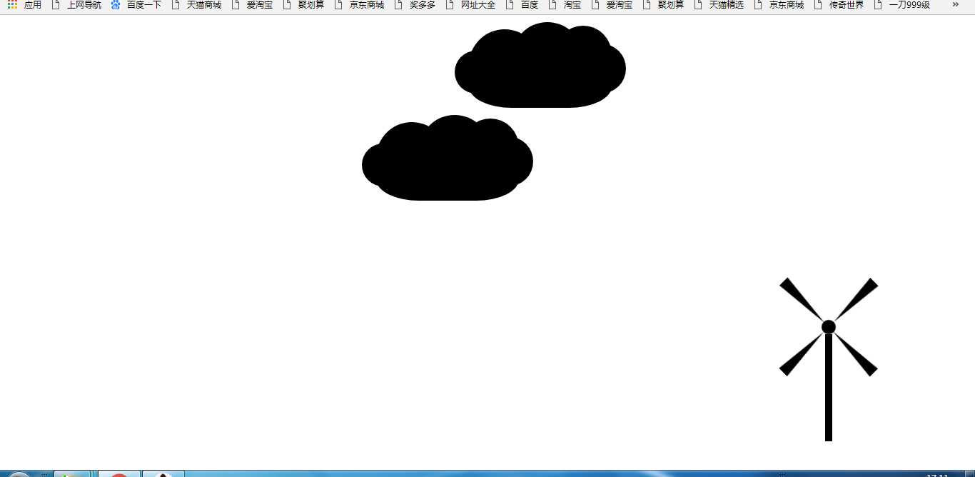
<!DOCTYPE html>
<html lang="en">
<head>
<meta charset="UTF-8">
<title>Document</title>
<link rel="stylesheet" href="qwe.css">
</head>
<body>
<div class="ggt">
<div class="box"></div>
<div class="box1"></div>
<div class="box2"></div>
<div class="box3"></div>
<div class="box4"></div>
</div>
<div class="hh"></div>
<div class="yun">
<div class="hun"></div>
<div class="hun1"></div>
<div class="hun2"></div>
<div class="hun3"></div>
<div class="hun4"></div>
</div>
<div class="yun1">
<div class="hun17"></div>
<div class="hun11"></div>
<div class="hun21"></div>
<div class="hun31"></div>
<div class="hun41"></div>
</div>
</body>
</html>
CSS
.box{
width: 0;
height: 0;
background-color: white;
/* margin:0 auto; */
/* margin-top:100px; */
border-left: 80px solid black;
/* border-right: 80px solid transparent; */
border-bottom: 8px solid transparent;
border-top: 8px solid transparent;
position: absolute;
left: 0px;
top: 82px;
}
.hh{
width: 10px;
height: 150px;
background-color: black;
position: absolute;
right: 200px;
bottom: 40px;
}
.ggt{
width: 180px;
height: 180px;
background-color: white;
margin:0 auto;
/* position: relative; */
animation: img 0.1s linear infinite;
position: absolute;
right: 115px;
bottom: 110px;
}
@keyframes img{
from{
transform: rotate(0deg);
}
to{
transform: rotate(360deg);
}
}
.box1{
width: 0;
height: 0;
background-color: white;
/* margin:0 auto; */
/* margin-left: 300px solid black; */
/* border-left: 300px solid black; */
border-right: 80px solid black;
border-bottom: 8px solid transparent;
border-top: 8px solid transparent;
position: absolute;
right: 0;
top: 82px;
}
.box2{
width: 0;
height: 0;
background-color: white;
/* margin:0 auto; */
/* margin-left: 300px solid black; */
border-left: 8px solid transparent;
border-right: 8px solid transparent;
border-bottom: 82px solid black;
/* border-top: 300px solid transparent; */
position: absolute;
bottom: 0;
right: 82px;
}
.box3{
width: 0;
height: 0;
background-color: white;
/* margin:0 auto; */
/* margin-left: 300px solid black; */
border-left: 8px solid transparent;
border-right: 8px solid transparent;
/* border-bottom: 300px solid black; */
border-top: 82px solid black;
position: absolute;
top: 0;
right: 82px;
}
.box4{
width: 20px;
height: 20px;
background-color: black;
border-radius: 50%;
position: absolute;
left: 80px;
top: 80px;
}
.yun{
width: 200px;
height: 100px;
background-color: black;
border-radius: 50% 50% 30% 30%;
/* overflow: hidden; */
margin:30px;
position: relative;
transition: all 150s linear;
animation: ll 20s linear infinite;
}
@keyframes ll{
from{
margin-left: 1px;
}
to{
margin-left: 1100px;
}
}
.hun{
width: 100px;
height: 100px;
background-color: black;
border-radius: 50%;
position: absolute;
left: 0;
top: -10px;
}
.hun1{
width: 60px;
height: 60px;
background-color: black;
border-radius: 50%;
position: absolute;
left: -20px;
top: 20px;
}
.hun2{
width: 100px;
height: 100px;
background-color: black;
border-radius: 50%;
position: absolute;
left: 60px;
top: -20px;
}
.hun3{
width: 80px;
height: 80px;
background-color: black;
border-radius: 50%;
position: absolute;
left: 120px;
top: -15px;
}
.hun4{
width:70px;
height:70px;
background-color: black;
border-radius: 50%;
position: absolute;
left: 150px;
top: 10px;
}
.yun1{
width: 200px;
height: 100px;
background-color: black;
border-radius: 50% 50% 30% 30%;
/* overflow: hidden; */
margin-top:30px;
margin-left: 400px;
position: relative;
transition: all 25s linear;
animation: lll 25s linear infinite;
}
@keyframes lll{
from{
margin-left: 1px;
}
to{
margin-left: 1100px;
}
}
.hun17{
width: 100px;
height: 100px;
background-color: black;
border-radius: 50%;
position: absolute;
left: 0;
top: -10px;
}
.hun11{
width: 60px;
height: 60px;
background-color: black;
border-radius: 50%;
position: absolute;
left: -20px;
top: 20px;
}
.hun21{
width: 100px;
height: 100px;
background-color: black;
border-radius: 50%;
position: absolute;
left: 60px;
top: -20px;
}
.hun31{
width: 80px;
height: 80px;
background-color: black;
border-radius: 50%;
position: absolute;
left: 120px;
top: -15px;
}
.hun41{
width:70px;
height:70px;
background-color: black;
border-radius: 50%;
position: absolute;
left: 150px;
top: 10px;
}
标签:20px 图片 hid bubuko yun sheet pos ati mes
原文地址:https://www.cnblogs.com/yj19930530/p/8848270.html