**<html>
<head>
<meta charset="UTF-8">
<title>CSS3 loading图标</title>
<link rel="stylesheet" href="css/loading.css" />
</head>
<body>
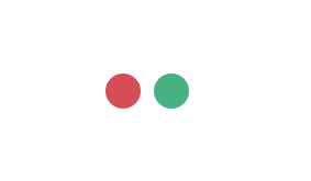
<div id="loading-3">
<span class="item item-1"></span>
<span class="item item-2"></span>
</div>
</body>
</html>
```**``
css部分:
div#loading-3{
position: relative;
width: 160px;
height: 80px;
margin: 100px auto;
}
div#loading-3 span.item{
display: block;
position: absolute;
top: 25px;
width: 30px;
height: 30px;
border-radius: 50%;
animation-duration: 1.2s;
animation-timing-function: ease-in-out;
animation-iteration-count: infinite;
animation-direction: alternate;
}
div#loading-3 span.item.item-1{
left: 25px;
background-color: #2ecc71;
animation-name: loading_green;
}
div#loading-3 span.item.item-2{
right: 25px;
background-color: #e74c3c;
animation-name: loading_red;
}
@keyframes loading_green{
0%{
left: 25px;
width: 30px;
height: 30px;
background-color: #2ecc71;
}
50%{
left: 100px;
width: 40px;
height: 40px;
background-color: #9b59b6;
}
100%{
left: 25px;
width: 30px;
height: 30px;
background-color: #e74c3c;
}
}
@keyframes loading_red{
0%{
right: 25px;
width: 30px;
height: 30px;
background-color: #e74c3c;
}
50%{
right: 100px;
width: 40px;
height: 40px;
background-color: #9b59b6;
}
100%{
right: 25px;
width: 30px;
height: 30px;
background-color: #2ecc71;
}
}原文地址:http://blog.51cto.com/13687572/2104795